redesign
Latest

Apple might force Facebook to change how its apps handle voice calls
A change coming in iOS 13 could force Facebook to change Messenger and WhatsApp. As The Information reports, Apple will no longer allow these apps to run Voice Over Internet Protocol (VOIP) in the background when it's not in use. At the moment, apps like Messenger and WhatsApp run VOIP continuously in order to connect calls faster, but doing so could also allow them to do other things, like collect user data. According to The Information, Facebook may have to redesign its messaging apps in order to comply.
Christine Fisher08.06.2019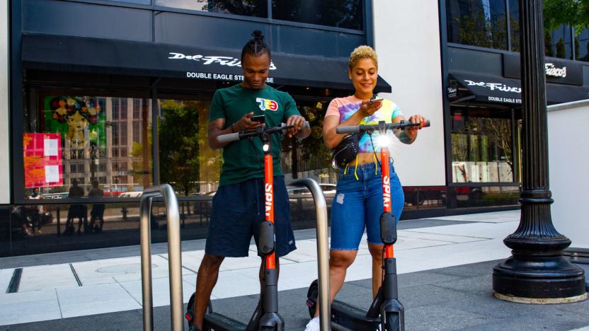
Spin's revamped e-scooters are coming to eight US cities
Spin, the e-scooter startup acquired by Ford, is rolling out its redesigned electric scooters and bringing them to more cities across the US. The new scooters have a larger frame with a wider and longer platform. They come with bigger, tubeless tires for better shock absorption, more intuitive bike-handle braking, a boosted rear drive for improved acceleration and security screws meant to cut down on tampering and vandalism. And with an extended battery life, they should travel up to 37.5 miles on a full charge.
Christine Fisher07.25.2019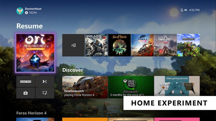
Microsoft tests a cleaner Xbox One Home screen (again)
Microsoft is rolling out a couple of tests that could change the look of Xbox One's Home section as well as how you control the console via Cortana. Xbox Insiders should be able to check out the updates in the next few days.
Kris Holt07.24.2019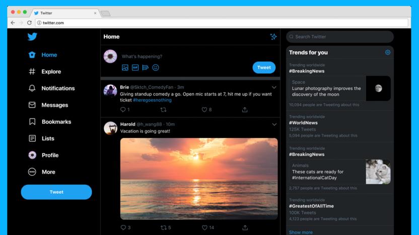
Twitter’s faster, redesigned site starts rolling out to everyone
It took quite some time, but the new Twitter.com is finally here. Months after teasing parts of it, Twitter has announced that it is now rolling out its redesigned site globally, which will bring people a web experience that's faster, easier to browse and more customizable. In addition to making conversations simple to follow, Twitter says the goal with this updated look and feel is for it to be more consistent with what you use on mobile devices. That's why the overhaul will make features like Explore, Bookmarks, Lists, Direct Messages and your Profile easier to access, removing the friction of having to switch between tabs, windows or screens to begin a new task or look at Top Trends.
Edgar Alvarez07.15.2019
Bloomberg: Galaxy Fold redesign is complete
Still waiting for Samsung's first foldable phone? Bloomberg cites anonymous sources saying that Samsung has completed a redesign of the Galaxy Fold in just two months. The protective film now covers the entire screen and stretches into the bezel so people can't pull it off by accident, and hopefully reduce the appearance of a seam in the middle. Also, the hinge has reportedly undergone tweaking to make it flush with the display, and pushing the film up when the device is opened.
Richard Lawler07.02.2019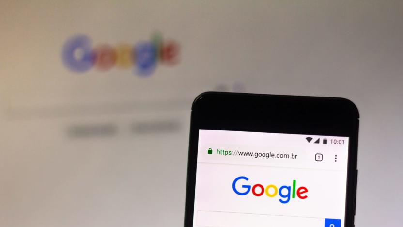
Google Search redesign adds website names and logos to results page
Google is bringing a new Search layout to mobile, and it's rolling out the changes beginning today. Now, when you search on your mobile device, you'll see a website name and logo at the top of each results card. If Google has a "useful ad" to show you, it will appear with a bolded ad label and the web address. The new design will also allow Google to add new actions, like the ability to buy movie tickets or play podcasts, to the results page.
Christine Fisher05.22.2019
Former Gmail designer builds Chrome extension to declutter your inbox
Despite Google's attempts to improve Gmail, the web version remains hectic and cluttered. While that might be frustrating to users, it's especially irritating for Michael Leggett, one of Gmail's former lead designers. Finally fed up, Leggett launched Simplify, a free Chrome extension meant to streamline your inbox.
Christine Fisher04.26.2019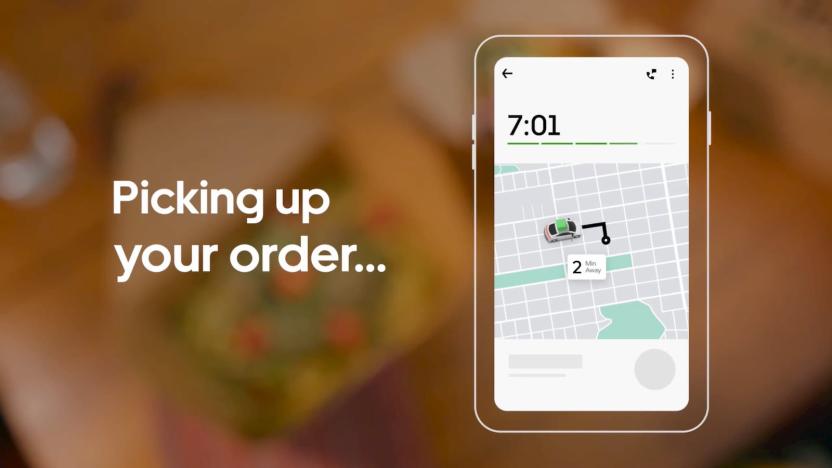
Uber Eats improves order tracking so you can see where your pizza is
Uber Eats is rolling out a redesign and new features to help you track your meal from the second you tap the order button until it's on your plate or in front of you in the container (no judgment here). Improved tracking will help you monitor the whole process, including the restaurant preparing your order, your courier's route to the pickup and their route to your home or office.
Kris Holt04.10.2019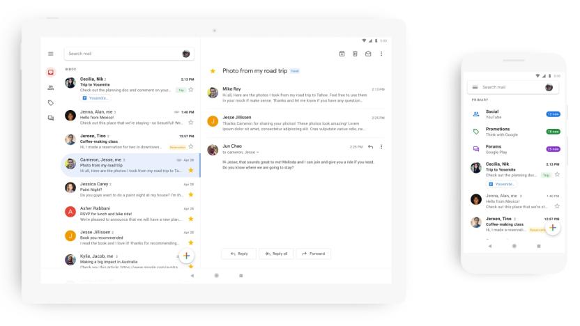
Google cleans up Gmail app with an all-white redesign
Google first unveiled its Material Design language back in 2014 (now called Material Theme), and last year saw an update to those design rules that removed the bold colors in favor of an almost entirely white look. A number of Google's most prominent apps and services have been redesigned over the last year, including Tasks, Photos, Calendar and Gmail -- the latter only on the web, though. That changes today: a redesigned Gmail for mobile starts rolling out today and will be available to all Android and iOS users in the coming weeks.
Nathan Ingraham01.29.2019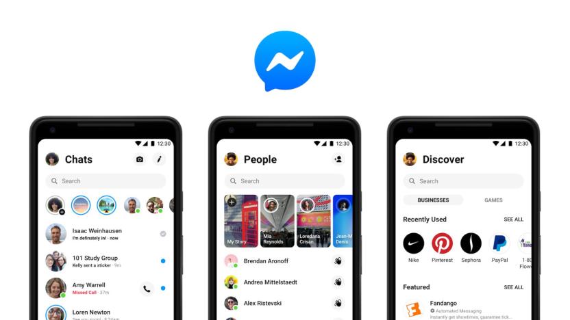
Facebook’s simplified Messenger app interface is rolling out to users
Facebook teased a Messenger redesign at its F8 conference back in May and then started slowly rolling out the simpler interface last October. Now, The Verge reports, the redesign is becoming available more widely, with both the App Store and Google Play Store listings displaying the new interface. The new design features fewer tabs, makes it easier for you to chat with friends and introduces contextual icons that let you know what's going on in a conversation.
Mallory Locklear01.18.2019
Hulu’s website looks different today
Hulu.com has a fresh face today, following a design update that emphasizes thumbnails and hovering. It's a clean, graphic look, and Hulu has worked to keep the number of clicks to a minimum.
Jessica Conditt09.20.2018
Twitter design test brings Explore and Bookmarks to the web
Twitter is testing a redesign that brings some features from its mobile app and browser to the desktop. The trial run, which the company says a small number of people are already seeing, adds the Explore tab and Bookmarks to the desktop site, along with some other features.
Kris Holt09.07.2018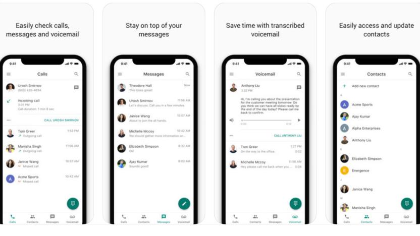
Google's redesigned Voice app is better at juggling your calls
Google recently added Voice to its enterprise G Suite, and the revamped app has now arrived for iOS users. As suggested by the redesigned icon (which strongly resembles the Hangouts Dialer icon), its main job is to give users calling features via standard telephony over and above what you'd expect on regular apps. As such, it can do things like email you about missed calls, transcribe messages, enable "do not disturb" based on your working hours and access contacts stored elsewhere in G Suite.
Steve Dent08.14.2018
Google redesigns Drive to look more like the new Gmail
Google has given Drive a surprise makeover with elements that make it look more like the new Gmail. The redesign doesn't come with new features, but when you get it, you'll notice that The Big G has changed the Drive interface background from gray to white for a cleaner look. Its boxes and icons now also have much rounded corners and look a bit taller than before, and Drive's logo now has a more prominent place on the top left corner of the interface. You'll also find that Google has shuffled Drive's icons around, with the Settings and Help Center icons now in the same line as the search bar.
Mariella Moon05.10.2018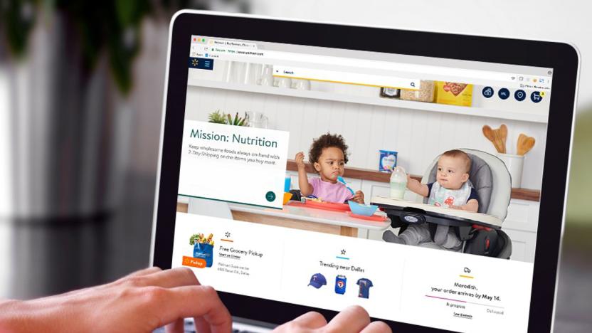
Walmart will roll out a cleaner, sleeker website in May
In a few weeks' time, you might not even recognize Walmart's website. The retail giant is giving it a total make-better -- that's a makeover in Queer Eye parlance -- with what it says is "an entirely new look and feel." Based on the image the company released with its announcement, we can expect a much cleaner interface with photos that look like they came from a lifestyle magazine. Walmart US e-commerce chief Marc Lore said, they're featuring relatable photography to "bring a more human element to the site."
Mariella Moon04.17.2018
Gmail's redesign may use 'Confidential Mode' for added security
We've been covering the rumors and leaks surrounding the new Gmail redesign that's coming in the next few weeks, and now The Verge has a new tip. Google is introducing a Confidential Mode, which will allow Gmail senders to prevent recipients from forwarding, copying, downloading or printing certain emails.
Swapna Krishna04.13.2018
Google's Gmail redesign will display your calendar or to-do list
Yesterday, Google warned G Suite administrators about an impending Gmail redesign. We weren't expecting to hear much more about it for a few weeks, but The Verge has gotten their hands on screenshots of the new design.
Swapna Krishna04.12.2018
Google plans redesign for Gmail on the web
Apparently, Google has been working on a redesign for the web version of Gmail, and G Suite customers are the first to know about it. While the public announcement hasn't gone out yet (it's coming to the Early Adopter Program for both regular Gmail and G Suite users in the next few weeks), here's what we do know.
Swapna Krishna04.11.2018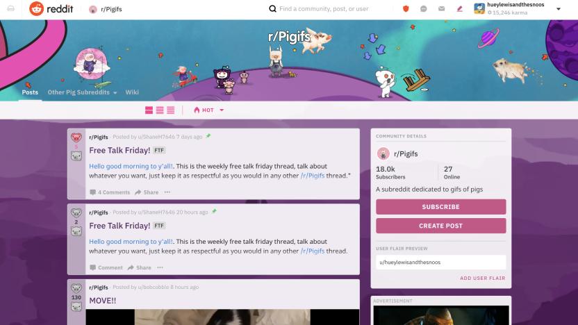
Reddit's first redesign in years is a major one
Reddit has looked pretty much the same these past years, barely changing from the time it first introduced subreddits in 2008. Now, it's finally rolling out its first major redesign in a long time -- it's now available to one percent of the website's population and will make its way to more people in the coming months. The social network has been working on a redesign over the past year, making sure not to stray too far from what it currently looks like, while making things much easier to use and navigate.
Mariella Moon04.03.2018
Snapchat swaps mess for money
Snap Inc. took a major risk when it completely redesigned Snapchat a few months ago -- it's no secret that people don't like change. But after constantly struggling to add new users since going public last February, the company decided it needed to make adjustments in order to attract people and keep others coming back. The solution was to refine the app with an easier-to-use layout and to separate friends' posts from media content. Suddenly Snapchat became a more refined app. It no longer feels like an overwhelming, discombobulated mix of stories from people you know, others you don't and publishers that are trying to get your attention. And based on Snap's Q4 2017 earnings report, the move seems to be paying off.
Edgar Alvarez02.07.2018