iPhone X review: Embrace the new normal
Apple’s latest reinvention will take some getting used to.
After years of mostly iterative design changes, Apple has changed what it means for an iPhone to be an iPhone. Home button? Forget it. Touch ID? Old hat. Bezels? You get where I'm going with this. And to be totally frank, when Apple first revealed the iPhone X, I was worried. These changes to the classic iPhone formula mean more chances for stuff to get screwed up.
Well, I didn't need to worry. The iPhone X is finally here, and while it's not perfect, it's proof that the old ways aren't the only ways.
Hardware and design
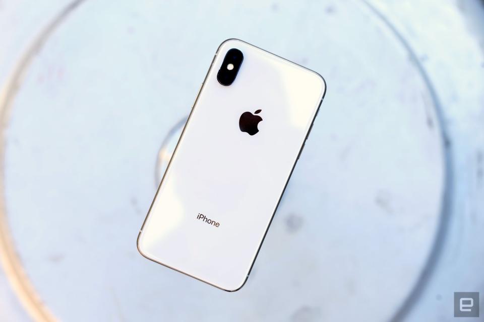
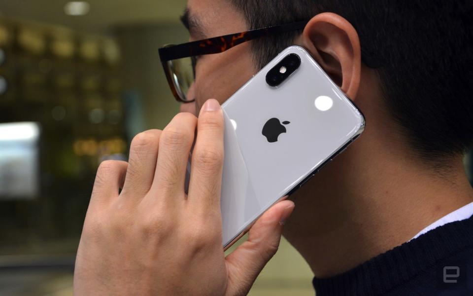
I've been an iPhone Plus user for years, but mostly out of necessity. The normal iPhone's screen is too small for me, and while the Plus's bigger display is more my speed, its design has always felt a little unwieldy. The iPhone X, meanwhile, lands right in the sweet spot. It's just a little wider and taller than the iPhone 8 to accommodate the expansive screen, but it's narrower than the 8 Plus, and much more comfortable to use and hold as a result.
What's more, the iPhone X is just a beautifully made device, even by Apple's exacting standards. The slightly contoured sheets of glass covering the front and back melt seamlessly into the stainless-steel frame that runs around the outside of the phone. The tight construction isn't just for looks — the iPhone X is rated IP67 for water and dust resistance, and it does just fine in the shower. (Don't ask.) That steel frame just might be my favorite flourish here: It adds some heft to a device that otherwise would be pretty light, and it lends the X a sense of gravitas. Some people have expressed concern that the frame would get scuffed like older iPod Touches, but only time will tell. The gleaming rim around the X still looks perfect after a week of use (unlike the screen, which I've already scratched), but I can't say what months of real-world treatment will do to this thing.
Oh, and there's no home button. This is the single biggest change to the way we interact with iPhones, and it's going to take some time to wrap your head around it. At least the sleep/wake key hasn't gone anywhere — in fact, it's bigger, and holding it down now fires up Siri. On the inside, though, it's just more of the same. The iPhone X is powered by Apple's A11 Bionic chipset and 3GB of RAM, and it's available with either 64GB or 256GB of storage, just like the iPhone 8 Plus.
This time, Apple paid more attention to the speakers than usual, and the iPhone X is all the better for it. You're still better off using a pair of headphones to listen to music, but the X actually sounds pretty great without them. Music and videos were surprisingly loud, with good channel separation. A little more emphasis on the lows would give the iPhone X some extra oomph, but that would probably require the phone to be a little bigger.
This is simply the finest iPhone Apple has ever made, and I'd expect nothing else from a phone that costs this much. Of course, there's a whole lot more to consider than just build quality.

The new display
I've been testing the iPhone X for a week, and basically every conversation I've had with someone about it started like this: "Wow, that looks really cool, but what about the notch?" Well, it's weird at first, but you eventually just stop noticing it. For me, that process took less than a day, mostly because all the action (especially in videos) tends to happen near the center of the Super Retina HD screen anyway.
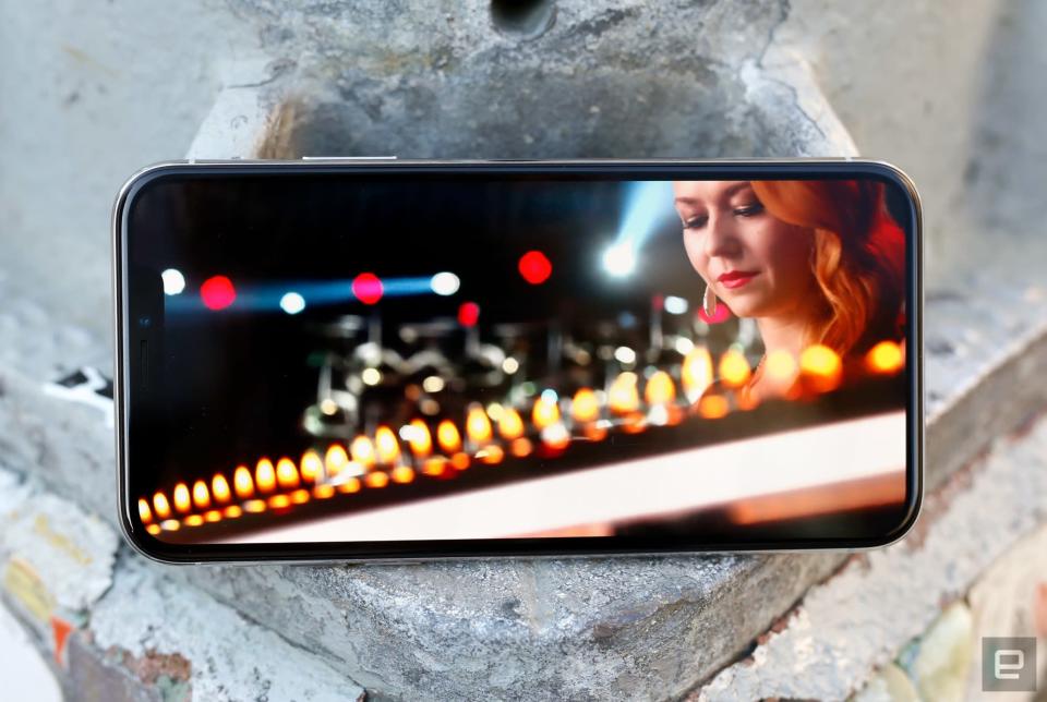
A commenter on our iPhone X preview alleged that if any other smartphone maker designed a screen with a notch cut out of it, they'd be roasted for it. I don't think that's the case. The question is ultimately one of value: Does that strange, strange design choice serve a worthwhile purpose? With the iPhone X, I'd say yes. In addition to the usual front camera, proximity sensor and earpiece, the notch also plays home to a flood illuminator, a dot projector and an infrared camera, collectively known as the TrueDepth camera system. Once engineers figure out how to squeeze that panoply of sensors into a smaller footprint, I could see Apple trying to squeeze everything into the bezel. For now, the notch remains, and it's less of a big deal than it first seemed.
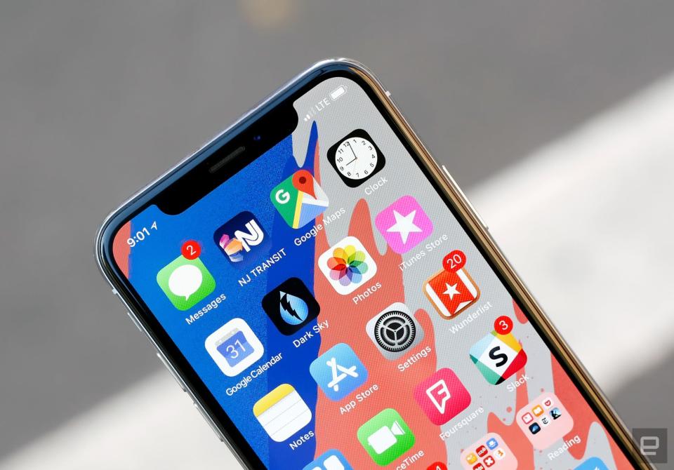
It certainly helps that the screen around the notch is one of the nicest I've used. Samsung actually produces the 5.8-inch OLED panel in the iPhone X, but it was designed to Apple's specifications. The result is a crisp (458 ppi), beautiful screen that definitely isn't as punchy as some of the others you'll find out there. That's apparently by design: Apple spokespeople have decried other OLEDs as being way too saturated, and said the company tuned this screen for more natural colors. The X's wide color gamut and support for HDR10 and Dolby Vision are certainly useful touches, but people like those punchier screens for a reason: They're more dramatic and exciting.
There are a few other things worth noting. Yes, the screen measures 5.8 inches diagonally, and that sounds more impressive than the 5.5-inch display on the 8 Plus. The thing is, the iPhone X's taller aspect ratio actually means the screen's total area is smaller. Personally, I think the fact that the X is more comfortable to hold makes it worth the trade-off. Also, like other OLED screens, the iPhone X's panel does go slightly blue when you look at it from an angle. It's not quite as bad as on the LG V30 or Pixel 2 XL, but it's there, and largely unavoidable.
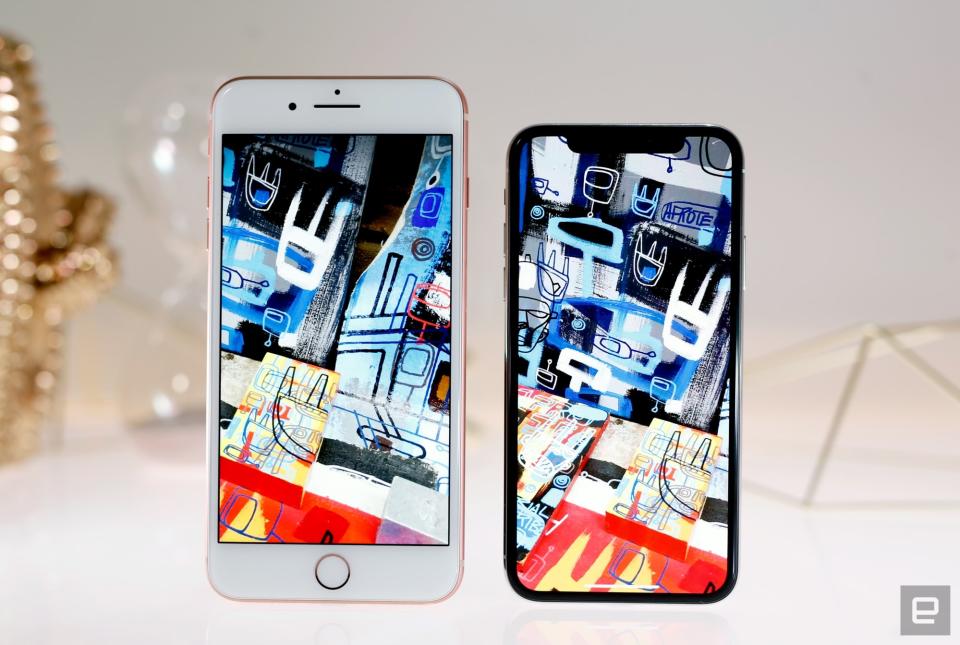
Whether or not this screen is better than, say, that of the Galaxy S8 is a matter of taste. They're tuned very differently. What I can say for sure is that the iPhone X's screen has spoiled me -- every other iPhone screen just looks disappointing by comparison.
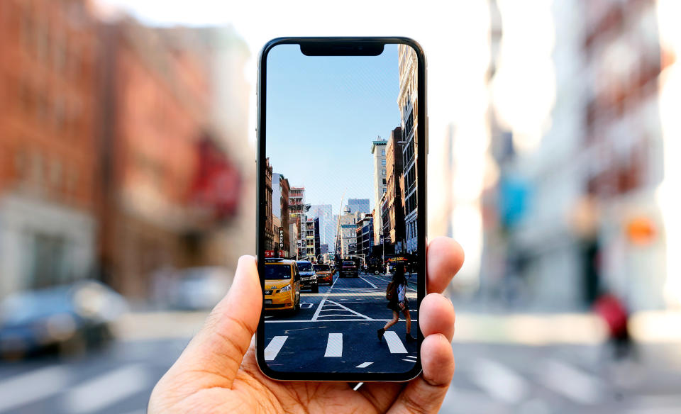
The big problem here (for now, anyway) is app support. Long story short, a lot of apps appear letterboxed, since they weren't optimized for this longer screen. In my day-to-day use, Google's apps have been the most disappointing, since they're the ones I lean on most. Chrome scales to fit the entire screen perfectly, but Gmail, Calendar and Docs are bound on the top and bottom by swaths of empty space. Lest you think these are the only apps that do this, I installed all available updates the night before this review was published and checked all 114 apps on my iPhone X: 49 of them don't use the full screen.
To be fair, it doesn't look bad so much as dated. Android phones with extra-long screens will stretch apps to use the entire display, but there's no such option here. If your favorite app doesn't scale, you just have to wait for the developer to fix it. More complex app designs will require more fine-tuning, which means it'll be a while before every app in your daily routine uses the iPhone X's screen to its fullest potential.
In use
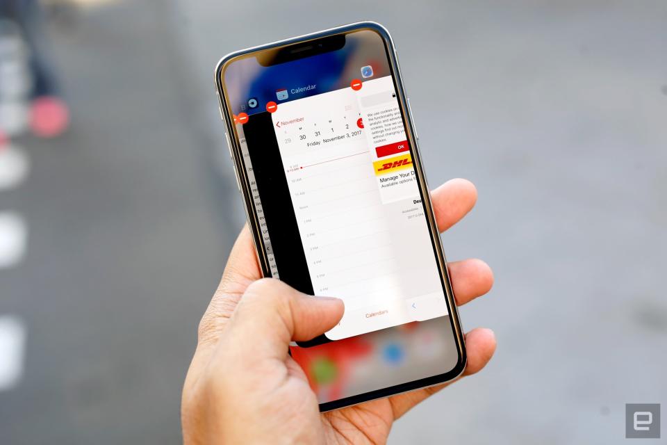
The iPhone X runs iOS 11, but not the version you've come to appreciate (or loathe) for months. Because Apple killed the home button, it had to drastically rewrite the rules for how we interact with iPhones. It, uh, takes a little getting used to.
Let's start with the basics. In lieu of tapping a home button, swiping up from the bottom of an app bounces you back to the home screen. To view all of your running apps in the app switcher, you have to swipe up from the bottom of the screen and hold for a split second — you'll get a haptic bzzzt as the row of app cards slides into place. Closing those apps takes an extra step now, though. You'll have to press and hold one of the windows, then either tap a tiny x in the corner or swipe it away. It's a necessary change, since swiping up brings you to the home screen, but it was definitely annoying at first. Swiping down from the notch (or just to its left) reveals your notifications. And see that little bar at the bottom of the screen? Swiping left and right on it cycles you through all of your currently running apps. It's a small touch, but an elegant one.
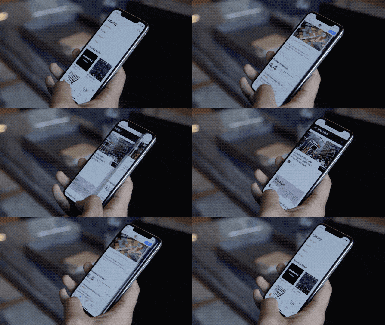
While most of this stuff became second nature quickly, some old habits still throw me for a loop. I never reach for a home button that isn't there, but I often swipe up from the bottom of the screen hoping the control center shows up. It never does, because you now have to swipe down from the space to the right of the notch. My muscle memory will eventually rewrite itself, but in the meantime, I look like a doofus every time I try.
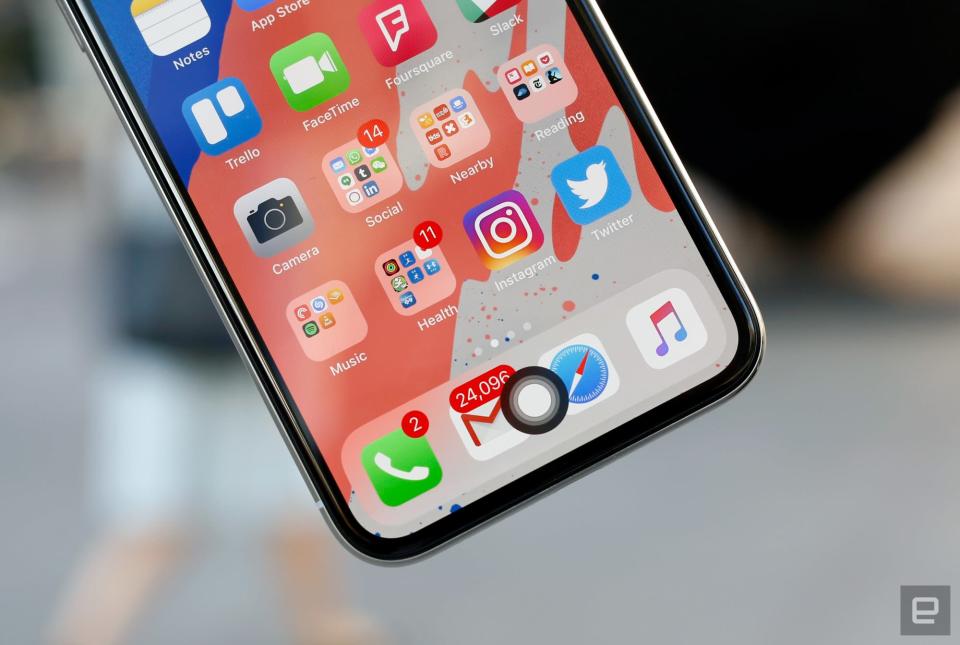
Now, if you're really concerned about not having a home button, a quick trip to the phone's settings might help. Pop into Settings>General>Accessibility and turn on Assistive Touch. Now you'll have a virtual key that brings up various controls when pressed. If you set the single-tap action to "Home," you're left with what amounts to an onscreen home button. It's far from a perfect solution, though, since every time you fire up a non-full-screen app, the home button flies to the top-right corner of the screen.
While we're talking about accessibility settings, there's one more you really should know about. Reachability is handy for folks with smaller hands, since it brings what's displayed at the top of the iPhone's screen down so it's easier to reach. The lack of a home button makes things more finicky, though — you'll have to swipe down on the very bottom of the screen to use it, and it's a little too easy to mess up.
Of course, iPhone X comes with two features that people haven't been able to stop talking about: Face ID and Animoji. The former replaces the Touch ID fingerprint sensor with an infrared camera system that turns the contours of your face into a password. The latter uses the same camera system to map your face's movements onto 12 emoji so you can make a cute yellow kitty say terrible, terrible things.
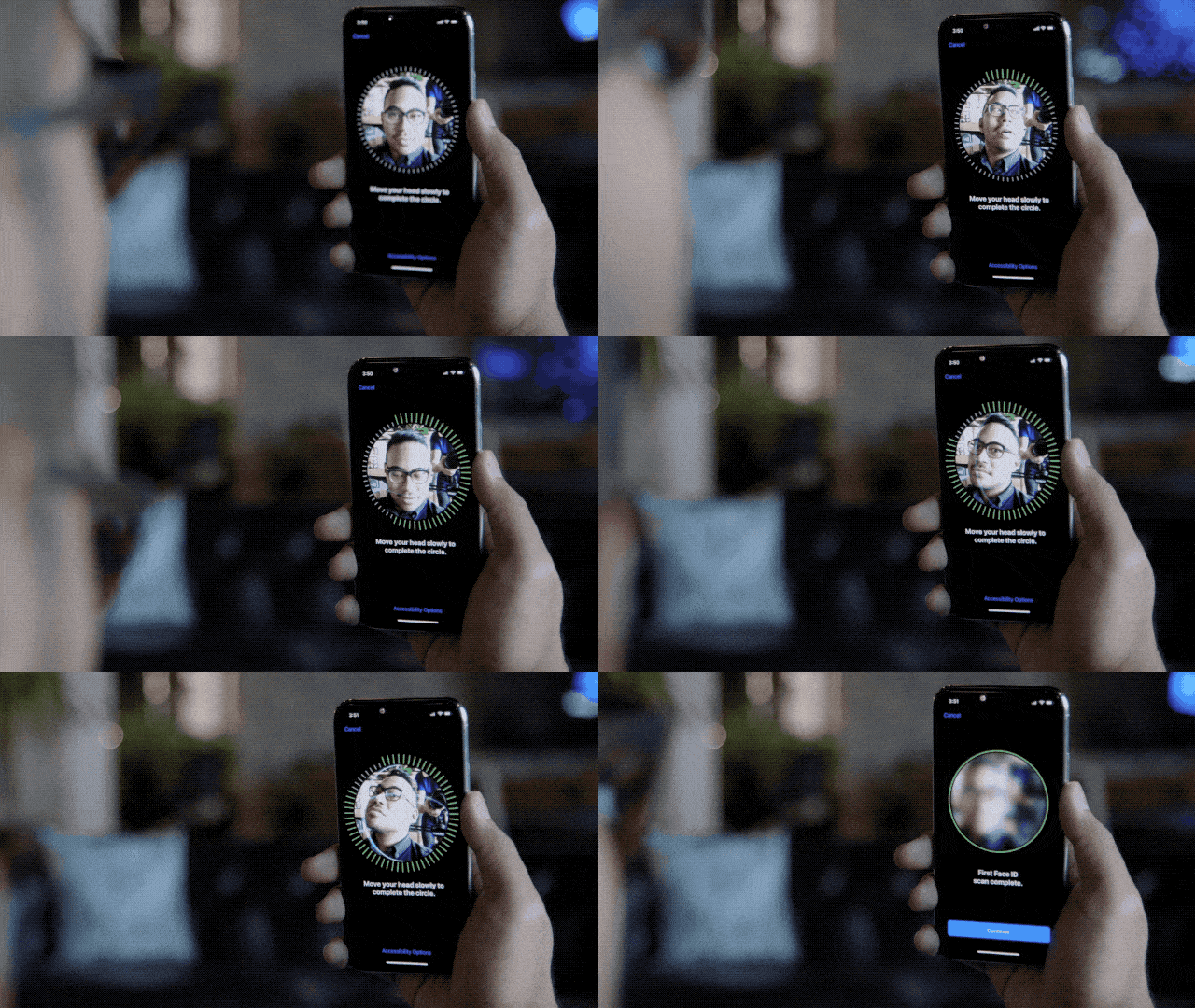
I'll be honest: I wasn't expecting much, but Face ID turned out to be a pleasant surprise. Enrolling a face (you can only have one) was painless, if a little awkward, since you have to roll your head around so the camera fully captures your face's nuances. After that, unlocking the phone with a glance worked nearly every time. Recognition generally takes about one second, but since you still have to swipe up to view your home screen after unlocking the phone, the whole process seems just a hair slower than using Touch ID.
If you're mulling an iPhone X purchase, you'd better be OK with using Face ID for everything. Scanning your face doesn't just unlock the phone; it also verifies login credentials in your keychain, so every app that used Touch ID now uses your face. For the most part, this is fantastic. Need to check your balance? Just launch your banking app and by the time you're prompted to sign in, Face ID will have recognized you and filled in your password. Authenticating apps and Apple Pay payments with just a glance works too. When everything works the way it's supposed to, Face ID feels like a frictionless bit of the future.
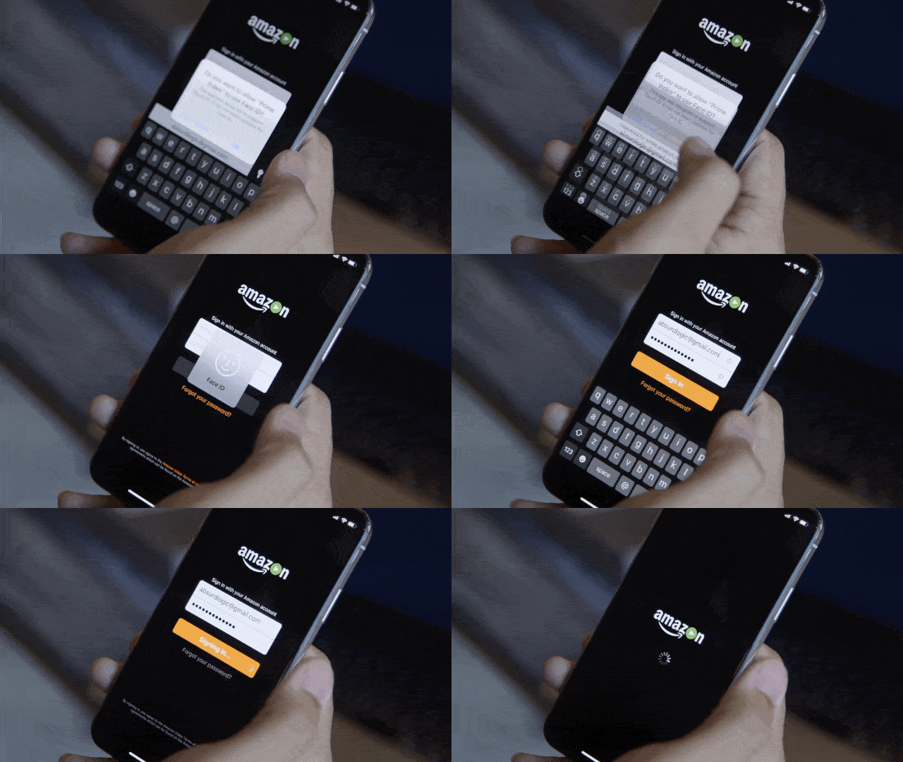
I've noticed Face ID faltering in only a few situations. For some reason, it doesn't always work immediately when I've just woken up — maybe it's because my eyes aren't fully open, or perhaps my face is puffier than usual. Either way, checking my email before I get out of bed takes more effort than I prefer. That could change, though. Your Face ID model isn't static and adapts over time. So if you keep trying to unlock the X while bleary-eyed, it should figure it out. Ditto if I lose weight or manage to grow a decent beard.
But what about security? In day-to-day use, it's a non-issue. For one, the iPhone X checks to see that you're alert and paying attention. That means that it won't unlock if your eyes aren't open, or if you aren't looking directly at the screen. I've heard from other reviewers that this doesn't always work as intended, but I never had any problems. That's generally good news for people afraid that someone else (say, a jealous significant other) would try to unlock the iPhone X with the owner's face while he or she is sleeping.
Beyond that, Face ID is just good at knowing what you look like. Most of the time I wear glasses and go clean-shaven. This week, I ditched my glasses for contacts and tried (mostly in vain) to grow some facial hair, and Face ID kept up just fine. It also refused to unlock when I held up photos of myself, or put the X in front of people I'm occasionally mistaken for ('sup, Edgar). I haven't been able to test this myself, but identical twins can indeed unlock each other's iPhone X -- this is an unfortunate side effect of the Face ID concept, and there's no apparent fix aside from hoping your doppelgänger isn't a total jerk. Thankfully, as the Wall Street Journal confirmed, a theater-quality mask of your face won't do the trick.

And then there are the Animoji. I've already accepted that the age of talking poo is here. The iPhone X's front-facing camera cluster does a good job at mapping facial gestures onto one of 12 cutesy emoji avatars, and I was a little shocked to hear how long and crisp the accompanying 10-second audio recordings were. I can't imagine these things won't get obnoxious, but I can't help but appreciate the technical achievement. There's one thing you should know, though: The longer you spend trying on all those adorkable avatar faces, the warmer the phone gets.
Cameras
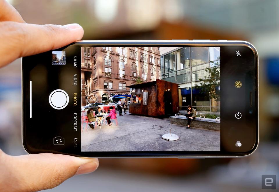
For the most part, the iPhone X's 12-megapixel dual camera is the same as the one we got in the iPhone 8 Plus. It's vertically oriented now (duh), but photos taken with the main, wide-angle camera don't really look different. Compared with the last generation of iPhones, X captures more vivid colors, and the way images are processed now makes more little details noticeable. I've grown to prefer the Pixel 2's computationally enhanced photos, but make no mistake: The iPhone X still takes excellent pictures.
The really important changes in the iPhone X mainly impact that other camera. The telephoto sensor now has a wider, f/2.4 aperture and optical image stabilization, both of which are really helpful when trying to shoot in low light. One of my biggest complaints about the 8 Plus was that, compared with Samsung's Galaxy Note 8, the resulting photos were a little darker and muddier. By opening up the aperture and mitigating some of the shaking that often screws up night shots, the iPhone X produces low-light photos that are noticeably crisper than the 8 Plus's. That's not to say it's perfect, though: In situations where there's a lot of movement (like, say, NYC's annual Halloween Parade), the X still has trouble focusing.

The telephoto improvements also help in broad daylight. I've never avoided using the iPhone's 2x zoom, but the results often just weren't as bright and nuanced as photos taken with the wide-angle camera. That gulf is still there, but it's way smaller than it used to be. Using Portrait mode with the telephoto camera is improved as well, since it lets you get really, really tight on a subject without having to worry as much about whether the ambient lighting is bright enough.
And speaking of Portrait mode, you can now use it to shoot bokeh-filled selfies. The same technology that the iPhone X uses to map your face is also used to calculate the depth of field for portrait selfies. The results are just all right. The thing is, the depth of field is rather narrow, so in just about every portrait selfie I've taken, my eyes, nose and mouth are pin sharp, but everything from the middle of my forehead up gets blurred just like the background. This also means that portrait selfies with multiple people in them rarely turn out great — unless you're all perfectly aligned, someone's going to be out of focus. This is the one area where a device like the Pixel 2 is clearly better.
Performance and battery
If you were hoping that a $1,000 iPhone would provide a significant boost in performance, well, sorry. Since the iPhone X uses the exact same A11 Bionic chipset as the iPhone 8 and 8 Plus, they're identical in terms of horsepower.
Allow me this in-the-weeds tangent: When the iPhone X isn't doing anything strenuous, it uses some combination of its four low-power cores. When you're doing something that really requires some juice, like playing games or fiddling around with a pretty augmented-reality app, the iPhone X starts to add its two performance cores to the mix. Essentially, the iPhone X (and other devices with similarly designed chips) are always using some combination of those six cores to keep everything seamlessly speedy.
Like the 8 Plus, the X also comes with 3GB of RAM, but I haven't noticed much difference between this iPhone and smaller ones with 2GB of RAM. I've heard that the extra RAM is used almost exclusively for the dual camera, but Apple — being Apple — has neither confirmed nor denied that. In any case, you really don't need to worry: This current generation of iPhones is incredibly powerful, and there's more than enough oomph here to get through just about anything.
iPhone X | iPhone 8 Plus | iPhone 7 | iPhone 7 Plus | |
|---|---|---|---|---|
3DMark IS Unlimited | 63,771 | 63,144 | 37,663 | 37,784 |
Geekbench 3 (multi-core) | 10,413 | 10,391 | 5,544 | 5,660 |
Geekbench 3 (single-core) | 4,233 | 4,245 | 3,295 | 3,306 |
AnTuTu Benchmark | 217,257 | 193,297 | 165,269 | 170,650 |
Meanwhile, the iPhone X's battery is just all right. I've been using the phone extensively this week and the iPhone X is generally good enough to stick around for a full day on a single charge. Bear in mind, these are pretty long days. I'd typically take the phone off its charging puck at around 8:00 AM, run the thing into the ground, and plug it in at home at around 9 or 9:30 PM. There was always enough fuel left in the tank to keep the iPhone X alive until morning on nights when I forget to charge it (thanks, low power mode), but I wouldn't recommend going that route.
For those keeping track, this is basically on par with what I squeezed out of the iPhone 8 a month ago. Apple says you can generally expect two extra hours using the iPhone X over the 8, but your mileage is definitely going to vary. As far as I'm concerned, the best solution would be if Apple made the iPhone X just a little bigger to accommodate a heftier battery, but that doesn't help anyone now. Ultimately, if you're in the market for a brand-new iPhone and longevity away from a power outlet is your biggest concern, you're definitely better off with an 8 Plus.
The competition
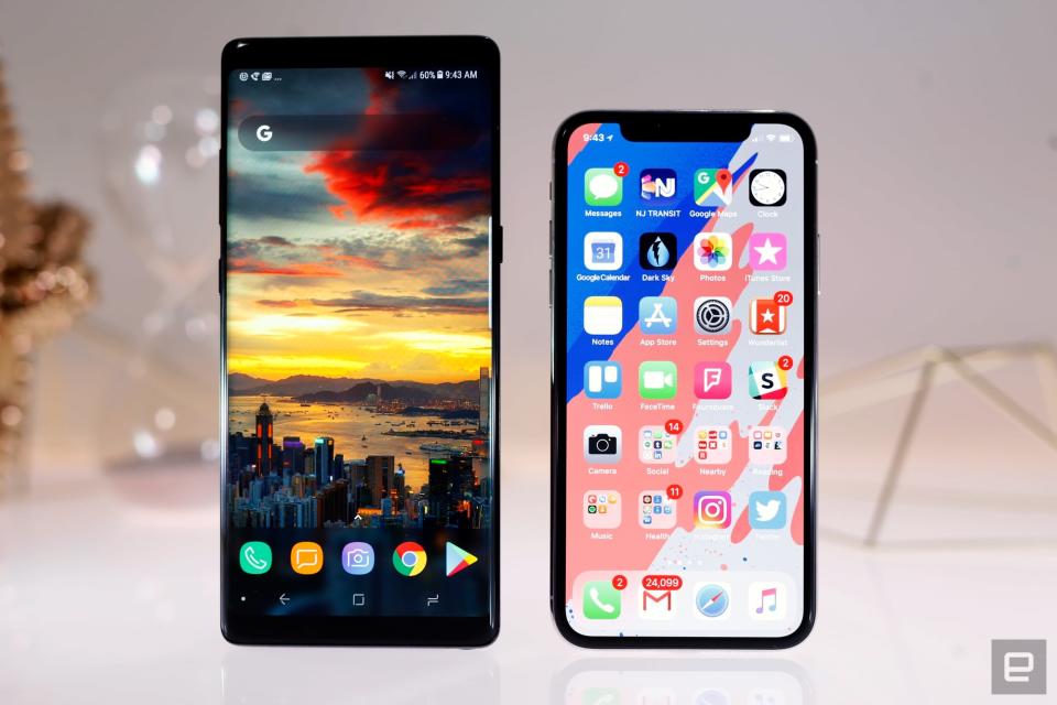
If you didn't bat an eyelash at the X's $1,000 price tag, you should know you have other options. Consider the $950 Galaxy Note 8 -- Samsung sank considerable effort into the Note 8 to make it the most powerful Android phone in its lineup. It's an incredibly fast machine (bolstered by a whopping 6GB of RAM), and its screen is one of the most beautiful you'll find, even if it's too punchy for Apple's delicate eyes. The S Pen is remarkably useful too, and it definitely makes a huge phone like the Note 8 useful in ways the iPhone X isn't.
Also worth considering is Google's new Pixel 2 XL ($849), which in my mind offers the best Android experience out there, period. It's really a showcase of what pure Android 8.0 Oreo is capable of, and it certainly doesn't hurt that its main camera is arguably the best all-around shooter you'll find on a smartphone. Even its front-facing camera has some distinct advantages over the iPhone X's — it shoots at a higher resolution, but, more important, its Portrait mode more accurately identified the boundaries of my head. The downside is, you'll have to deal with the Pixel 2 XL's screen. Our experience hasn't been as negative as other people's, but it's still a clear notch below the iPhone X.
Wrap-up

At the end of the day, here's what you've got to remember: this isn't just an expensive, ambitious offshoot of the classic iPhone lineage. It's the future of the iPhone itself. And to be clear, Apple didn't get absolutely everything right. The notch is weird. The interface needs a little more polish. Unoptimized apps look, and will continue to look, disappointing. Still, the fact that Apple redefined what an iPhone is and got this much right is a big deal. It'll probably be another year or two before the iPhone X's design and software that runs on it will come into its own, and that's alright. After my first taste of the iPhone's future, I'm ready to buy in.

