iPhone 8 and 8 Plus review: Change in small doses
They’re great choices for people who aren’t ready to forgo the home button.
It's no secret that smartphones have tended to get sleeker and less obtrusive over time. Screens are growing, but bezels are shrinking. In a very real way, the boundaries between us and our information -- our apps, our contacts, our very desires reproduced in pixels -- are melting away. Apple has sensed the industry shifting around it, and it made the iPhone X in response to that. But, in a bid to make the transition less jarring, Apple also made the iPhone 8 and 8 Plus.
They're familiar-looking phones that mostly operate the way people expect them to. They're conventional. But that doesn't mean they're inherently lacking -- far from it, in fact. While I suspect all iPhones will look like the iPhone X soon enough, the 8 and 8 Plus are expertly built, high-performance devices for people who want to ease into Apple's vision of the future. And who knows? These just might be the last conventional iPhones Apple makes.
Hardware
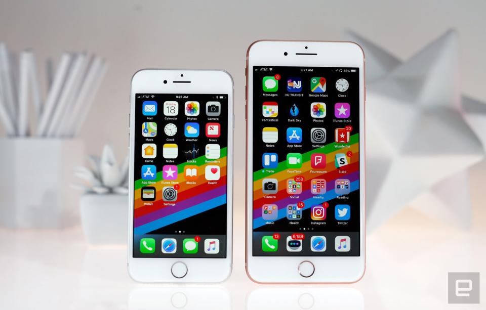
Like it or not, the iPhone X has dramatically changed Apple's approach to smartphones. Apple has painted us a picture of what its mobile future looks like, so is it any surprise the iPhone 8 and 8 Plus seem dull by comparison? To be clear, it's not that they're poorly designed. It's just that the iPhone's aesthetic hasn't changed much since the debut of the 6 and 6 Plus three years ago.
Rounded edges, camera humps, Lightning ports, volume buttons -- they're all exactly where they've always been. More recent carryovers include IP67 water resistance, capacitive home buttons, stereo speakers and a distinct lack of headphone jacks. The iPhone 8 and 8 Plus are nothing if not familiar -- whether that's a bad thing is really a matter of taste, but I would've preferred a new look.
That's not to say the iPhone formula hasn't changed at all, though. The 8 and 8 Plus come in a trio of updated color options, and both have bodies made of steel wrapped up in a 7000-series aluminum band. Most notably, they both have glass backs -- the better to inductively charge through, my dears. Some have expressed concern about Apple's shift away from mostly metal bodies, and they're right to be. Who hasn't seen someone still using an iPhone with a cracked screen? Apple claims to have sidestepped those issues by using the "most durable glass ever in a smartphone" to build the 8 and 8 Plus, and they've held up well over a week of sometimes careless testing. I managed to accidentally gouge the Jet Black iPhone 7 within the first 24 hours, but these glossier, glassier 8s are still nick-free after a week of being tossed into the hellscape that is my backpack.
Another benefit of glass over metal is that radio signals can careen right through it. As a result, the subtle antenna bands we saw wrapped around the 7 and 7 Plus are totally gone. When you're looking at the phone from behind, all you get is a glimpse at the camera, the shiny Apple logo and the "iPhone" branding; even the "Designed by Apple" text has been excised. The result is the cleanest iPhone I've ever seen. It might just be me, but I also prefer the way these glass backs feel. They're a little grippier and warmer than bare metal, though they're just as prone to sliding around on tables.
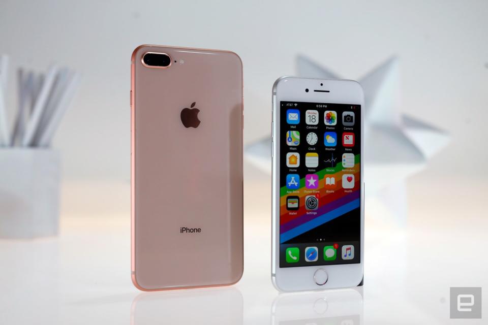
All of these elements come together in bodies that are longer, thicker and weightier than before. For those keeping track, the 8 is as thick as the 7 Plus, and the 8 Plus is the heaviest of them all. You wouldn't think half an ounce would make a difference, but it does: The smaller 8 is still comfortable to use for long periods of time, but the combination of its weight and bezels make the 8 Plus one of the more uncomfortable big smartphones I've tested lately. Consider the rest of the field: The Galaxy S8 Plus and the LG V30 both have bigger screens, and they both feel much nicer.
Thankfully, there's a lot to like about what's inside these phones. Apple finally dropped the 32GB storage tier, leaving 64GB at the low end and 256GB on the high-end models. This is also the first year Apple has designed its own GPU to work alongside the new A11 Bionic chipset, and -- surprise, surprise -- both phones run very well. As usual, though, the bigger battery and improved dual camera make the 8 Plus the more tantalizing option if you can deal with the increased size.
Display and sound
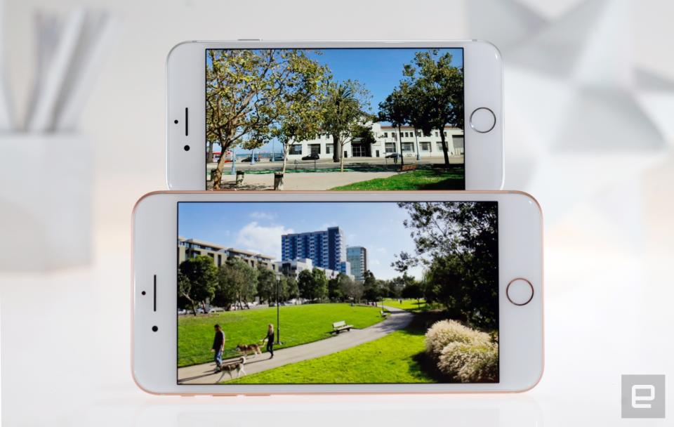
Stop me if you've heard this before: The iPhone 8 uses a 4.7-inch IPS LCD screen running at 1,334 x 750, while the 8 Plus has a 5.5-inch, 1080p display. Those are exactly the same sizes and resolutions we've seen in earlier models, and the similarities don't stop there. Both of these new screens adhere to the wide, DCI-P3 color gamut like the iPhone 7 did, and neither of the iPhone 8 displays are brighter or higher-contrast than last year's versions. In other words, the screens used in the iPhone 8 and 8 Plus are mostly the same as the ones they were meant to replace.
Apple transplanted one of the iPad Pro's most helpful features into its new phones. It's called True Tone, and it uses an ambient light sensor to interpret your current lighting conditions and tweak the display's color temperatures to keep whites and colors looking balanced no matter where you are. You're encouraged to turn the feature on during initial setup, and I'm with Apple on this one: You should have it on. Sure, objectively speaking, the feature makes the display less accurate -- as I write this, I'm in our dim studio and the iPhone 8 has adjusted its display to be a little warmer than normal. The flip side is that the colors I see now seem a little more accurate in this context, and everything is generally easier on the eyes too.
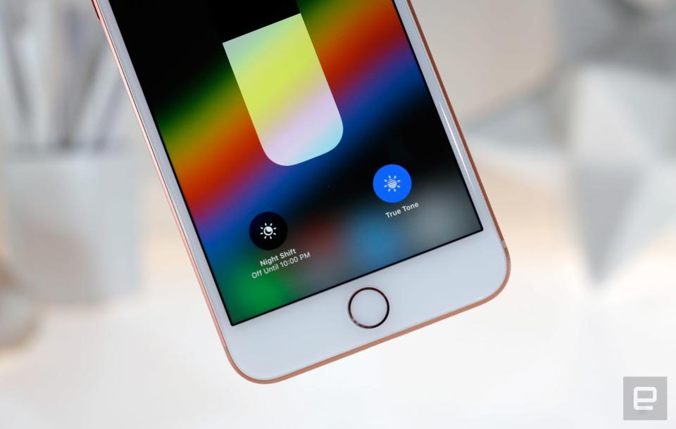
As with last year's models, the wide color gamut supported by these displays give certain visuals (like photos taken with these updated cameras) a little extra oomph and liveliness. In particular, reds and yellows tend to pop a little more dramatically, while blues appear smoother and deeper. Landscape shots benefit most from this expanded color space, but no one could blame you if you found some of these changes hard to notice.
You'll definitely notice a difference in sound quality, though. The iPhone 8 and 8 Plus use a louder, more powerful set of stereo speakers than the ones we got last year. Apple says they're around 25 percent louder than before, and honestly, there's no way my ears are ever going to be that discerning. Still, louder is always better in my book, and my podcasts and music came through with more volume and a little more clarity. It would've been nice if these new iPhones packed a more immersive speaker setup (e.g., like the four-driver array used in the iPad Pros), but at least the speaker in the earpiece is better able to keep up with the main speaker on the phones' bottom edges.
Software
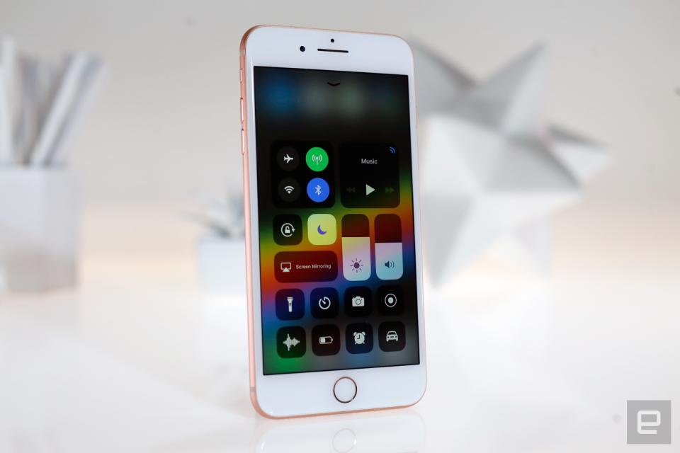
If you're reading this review the day it was published, iOS 11 will have just been released to the world. There's obviously a lot to unpack in Apple's new update, and since I'm writing this prior to the official launch, there are a few key features we haven't been able to test yet -- I'm looking at you, AirPlay 2 and peer-to-peer Apple Pay transactions. We're working on a full review that'll represent our definitive opinion on the matter, but in the meantime, let's take a look at how the update's biggest changes work on the 8 and 8 Plus.
First off, yeah, it still looks like classic iOS at first glance. That illusion shatters as soon as you start to poke around: The emphasis on bolder text that began with Apple Music last year has rapidly spread, so you'll see big, punchy headers in Messages, Photos and beyond.
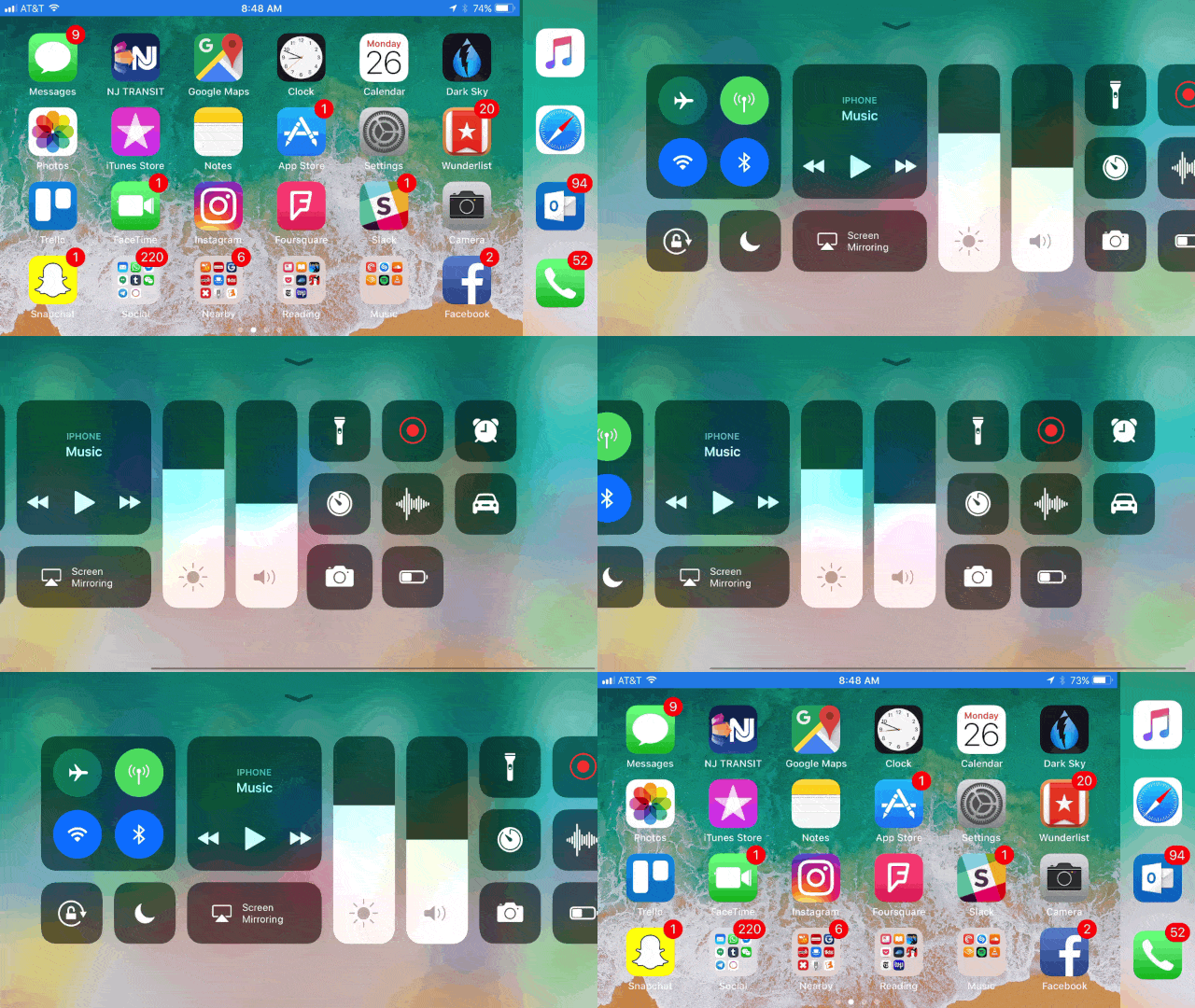
iOS's Control Center also looks nothing like it used to -- what once was a simple panel of options has evolved into a cluster of customizable controls that offer toggles for new features like the True Tone display and Do Not Disturb for Driving. That latter toggle is going to come in especially handy; in theory, the feature does a good job of blocking notifications from rolling in when you're in a moving car, but there's no way for the phone to tell if you're the driver or just cruising along as a passenger. Control Center's new look hasn't rubbed everyone the right way, especially since it's still easy to accidentally fiddle with screen brightness or device volume when you're trying to close the panel itself. Fortunately, it doesn't take that long to get used to.
Meanwhile, the classic notification center doesn't really exist anymore -- swiping down from the top of the screen basically just shows off notification on the lock screen. Sorry, the "cover sheet." You can still 3D Touch notifications to get an expanded view, but I was hoping an update as big as iOS 11 would bring with it a smarter way to handle notifications en masse. Clearing all of them in one shot is simple (if not immediately obvious), but would it have killed Apple to include an option to group notifications by app?
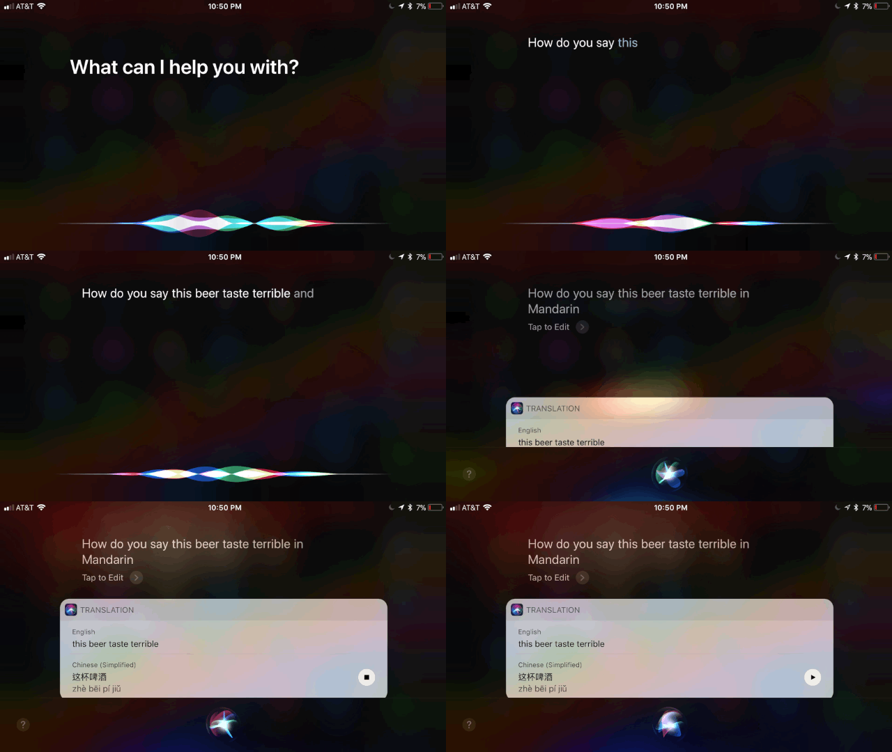
Apple's virtual assistant has received some major upgrades, too. For one, she or he (depending on your preference) sounds a hell of a lot more natural than before -- Siri never sounded terrible, per se, but it finally feels like you're talking to a person instead of a simulacrum made of algorithms running on a remote server. Siri's smarter now too -- I've been trying (and failing) to learn Mandarin for a while, so its multi-language translations and replayable pronunciations have been awfully helpful. Siri is also better at more abstract requests like "Play me some sad music," which I've been asking for more frequently now that summer is basically over.
It's worth noting that you can type out queries for Siri now too, but that doesn't mean you should. The option is tucked away in the Accessibility settings, and pecking out commands almost always takes longer than just asking Siri directly. I wish there was an easier way to switch between these interaction modes, or even a way for them to coexist in the Siri interface, but I'm not holding my breath.
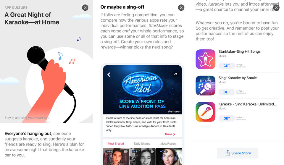
As we've discussed in our iOS 11 preview, the App Store has also been massively overhauled, with a bigger focus on video in app listings and daily editorial posts about upcoming apps and the culture surrounding them. Don't expect Apple's internal journalists to break any news, though; this space is less about PSAs and more about general software cheerleading. And now that we have more storage space for our stuff, Apple's new Files app should come in handy, right? Well, it's a start -- I don't think most people think of iPhones as devices that need a whole lot of in-depth file management, but it's been nice to drag and drop files around in my iCloud Drive. The app also supports external storage services like Dropbox and Google Drive, but you can't manipulate them much right now.
iOS 11 also has its share of small, helpful flourishes. Holding down the volume-down key and power button doesn't force a reset anymore for instance -- it now brings up a version of the shutdown screen with an Emergency SOS option that also forces you to use the passcode to unlock the phone.
It's a very handy addition for unfortunate situations, but the replacement force-reset process is pretty ridiculous: You have to hit the volume-up and -down keys in quick succession, then hold the power button down for about 10 seconds. This won't matter for everyone, but I'm the kind of person who occasionally just resets my phone when things aren't working correctly, and I can see this button combo getting annoying after a while. Oh, and there's now an option to shut down the phone from inside the device settings, and I have no clue why.
Camera

For their main cameras, the iPhone 8 and 8 Plus share a 12-megapixel sensor. It's faster, the company claims, and they have deeper pixels (you know, for greater clarity and color accuracy). Though I had my doubts, Apple's big talk seems mostly warranted. These are excellent cameras, especially if all you care about is shooting from the hip and getting attractive shots.
My test shots came through with more impactful colors and slightly more detail than the same photos taken with a 7 Plus. Nuances that the iPhone 7 Plus's camera smoothed a little too much appeared more crisp with Apple's new cameras. In most daylight shots, the iPhone 8 and 8 Plus captured more detailed photos than Samsung's Galaxy Note 8. The differences were subtle, but definitely there.
That said, the different ways these phones handle colors are interesting: The iPhone 8 and 8 Plus consistently churned out photos that looked more true to life, but the Note 8's shots looked a little brighter and more... idealized. They seemed to reflect the world the way I wished it appeared, rather than the way it did. Bear in mind, that's with HDR enabled on both cameras -- the 8 and 8 Plus now shoot HDR by default, though you can turn it off if you really want to. In low light, the Note 8 churned out photos that were marginally brighter without a flash, but Apple also built in an improved quad-LED flash that very quickly flashes after a longer exposure. I generally don't love shooting with the flash, but Apple's approach helped change that for me. Given Samsung's excellent work with its cameras, the fact that Apple's camera is just as good -- if not a little better in some ways -- is something to behold.
Of course, the iPhone 8 Plus has a second 12-megapixel telephoto camera, and it's a touch less impressive. It's not quite as good in low light, because it has an f/2.8 aperture, as compared with the wider f/1.8 aperture seen in the wide-angle camera. Still, having both cameras here allows for some extra tricks. Portrait mode is back, and it's much improved over the version we first tested last year. This time, your subject can be within eight feet of your camera, and the 8 Plus does a better job of figuring out where the edges are blurring out the background behind them. Apple's original portrait mode also suffered from poor performance in low light, and thankfully that's less of an issue with the 8 and 8 Plus; it helps that you can now use the flash for these portraits.
And then there's Portrait Lighting. This feature is exclusive to the 8 Plus and X, and make no mistake: It's very much still in beta. That becomes almost painfully obvious after a few minutes playing with it. Natural Light offers the standard portrait photos I've described. Studio Light does a good job brightening up the subject's face. The next three modes can be more problematic. Contour Light is meant to make faces pop with more dramatic lighting, but it typically just made me -- a brown-skinned man -- look even darker and more ominous than before. (In an informal poll of co-workers I've shot in this mode, nearly all of them said it accentuated features they wished hadn't been.) Stage Light and Stage Light Mono both black out everything behind a subject, and they really just highlight how difficult it can be to separate what's in the foreground and background. A lot of my photos shot with these modes just look awkward, and I hope they get much better soon.
Anyway, the 8 and 8 Plus also have considerably upgraded video chops. In addition to shooting 4K video at 60 frames per second, they can now record super-slow 240fps video at 1080p. When the conditions are just right, it's almost surprising how crisp and impressive fluid 4K footage can look on these screens. I'm generally not much of a slow-motion shooter, but Apple has done some very good work here -- it's nice to be able to pick out minute details in the frame right when things start to slow down.
Performance and battery life
We can keep this part relatively short: Thanks to Apple's new hexa-core A11 Bionic chipset (side note: how silly is this name?), the iPhone 8 and 8 Plus run very smoothly. Fine, that's generally the case for most iPhones at launch. What's more impressive is how the architecture of this new chipset helps ramp up performance when it's really needed. If you're coming from an iPhone 7 or 7 Plus, don't expect to see any differences when you're just swiping through home screens or launching apps; there really aren't any.
That's by design, though. There are certain situations, like the one I've described, where the 8 and 8 Plus simply cruise along on some combination of its four "efficiency" cores. When things get more intense, like when playing games or during some furious multi-tasking, the A11's two "performance" cores start to light up. At any given time, the 8 and 8 Plus are likely running a combination of performance and efficiency cores, and the result is essentially seamless speed all around. As usual, though, the 8 Plus seems better equipped to handle high-intensity tasks, because it packs 3GB of RAM, as compared with the 8's 2GB.
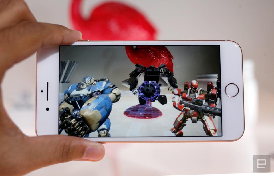
All that extra horsepower really comes in handy when you're trying to augment reality. I got to test two non-final AR apps -- Ikea Place and the Machines game demoed at the launch event -- and both ran almost surprisingly well. I've been curious about how well Apple's ARKit apps would run, compared with software designed for Google's Tango and all its additional hardware. At this very early stage, I'm quite impressed. The 8 and 8 Plus seemed to do just as well (if not a little better) at rendering virtual objects onto physical planes, and those objects tended to "stick" to surfaces better than similar simulacra in Tango apps. Granted, two unfinished apps can't accurately foretell the future of Apple's AR endeavors, but they're enough to make me more than cautiously excited.
iPhone 8 | iPhone 8 Plus | iPhone 7 | iPhone 7 Plus | |
|---|---|---|---|---|
3DMark IS Unlimited | 63,413 | 63,144 | 37,663 | 37,784 |
Geekbench 3 (multi-core) | 10,250 | 10,391 | 5,544 | 5,660 |
Geekbench 3 (single-core) | 4.227 | 4,245 | 3,295 | 3,306 |
AnTuTu Benchmark | 202,920 | 193,297 | 165,269 | 170,650 |
I was more concerned about battery life, especially since some internet sleuthing suggests the 8 and 8 Plus use smaller batteries than their immediate predecessors. Apple declined to confirm this, but it doesn't really matter: As advertised, I squeezed just about the same amount of life out of these phones as I did with last year's 7 and 7 Plus. In our usual video stress test, where the phones loop an HD movie at 50 percent brightness, the 8 managed to stick around for 12 hours and two minutes -- that's just minutes shy of what the 7 did last year. Meanwhile, the 8 Plus hung in there for 14 hours and 26 minutes, which is actually a little more than what the 7 Plus was capable of. In day-to-day use, I could count on the 8 to last through a full workday and have a little juice left over the next morning. The 8 Plus's larger battery helped it stick around even longer; in general, I could get nearly a day and a half of use if I was careful, and it could potentially come close to two days when things are quiet.
Unfortunately, the 8 and 8 Plus don't come with Apple's high-speed chargers, but I'm glad the company finally jumped on the Qi wireless charging bandwagon. Oh, and in case you were wondering, you can indeed wirelessly charge these iPhones while they're wearing cases. The 8 and 8 Plus don't seem to charge any slower while inside the cases Apple gave us, and they should -- should -- work with any Qi-compatible charging pad you'll find out there.
The competition

We can't talk about the competition without bringing up Samsung's 2017 lineup: the S8, S8 Plus and Note 8. All of them pack gorgeous, nearly bezel-less "Infinity" displays, great cameras (or dual cameras, in the Note's case) and some of the best performance you'll find on an Android device. Of course, there's a decent chance that if you're reading this, you've already decided on an iPhone. That's fine -- just know that Samsung is Apple's biggest competitor for a reason.
The Essential PH-1 is also an option if you want to see what a truly bezel-free phone looks like. Essential and Android founder Andy Rubin specifically built his new phone with Apple's iPhone business model in mind, and it shows: It's a beautifully crafted machine that just oozes style. It's a reliable performer, too, though the iPhone 8 and 8 Plus definitely have the edge when it comes to cameras.
While we're talking about cameras, I have to bring up the LG V30. It's by far the most attractive phone the company has made in a long time, and though it packs a bigger screen than the 8 Plus, it still manages to feel sleek and light. Most important is the dual camera; while I think the iPhones are still better all-around shooters, the V30's camera interface is second to none, especially if you're trying to shoot video on the go.
And then there's the iPhone X. A $999 phone is a tough sell by any stretch, but it's barely more expensive than a top-of-the-line iPhone 8 Plus. It's also a physically smaller machine than the 8 Plus, but it still packs the same impressive camera and A11 chipset. That said, you're getting only 64GB of storage for that price, while the $949 8 Plus nets you 256GB of storage and many of the same features. Oh, and you won't have to wait around for your new iPhone either -- according to the Apple Store at the time of this writing, there are still plenty of 8 Pluses in stock for launch day, but demand for the X is crazy right now.
Wrap-up

When I first picked up the iPhone 8 and 8 Plus, I immediately decided they were actually just the iPhone 7s and 7s Plus. I was wrong: They're definitely much more than that. They're just saddled with a less exciting design. If you subscribe to the maxim that it's what's inside that really counts, the 8 and 8 Plus are big improvements. They pack more storage, great cameras, improved software and absolutely first-rate performance into some highly familiar packages. The iPhone X will continue to suck the air out of the room for the foreseeable future, but one thing has become clear after my week of testing: They might not have the X's style, but the 8 and 8 Plus are truly excellent phones that won't let Apple die-hards and new customers down.


