Google to roll out redesigned News tab
The new look is less busy and features publishers prominently.
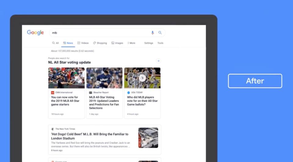
Google will soon unveil a refreshed News tab that places a priority on publishers, rather than headlines. The company today tweeted a preview of the redesigned news section for the desktop version of its search engine, which will roll out to users over the next few weeks. The change falls in line with recent efforts by the search giant to be more responsive to the needs of publishers and cut down on fake news.
While it's too early to tell what exactly the revamped News tab will accomplish, it's clear that it's a step in an entirely different direction. A look at the "Before and After" GIF of the News tab reveals that prominent news publishers are highlighted clearly on top, and the staggered look of numerous news headlines stacked on top of each other is gone. Instead, the tweaked News tab resembles the card format of the main Google news page or the Google news experience on mobile.
Over the next couple weeks we're rolling out a redesigned News tab in Search on desktop. The refreshed design makes publisher names more prominent and organizes articles more clearly to help you find the news you need. Check it out 👇 pic.twitter.com/xa2aZfO4Qd
— Google News Initiative (@GoogleNewsInit) July 11, 2019
Instead of several similar stories being grouped together under one card, each story appears to have its own card. For example, a search for "MLB" hones in on the most timely MLB topic (National League All-Star voting results) and the stories of three mainstream publishers (CNN, the Washington Post and USA Today) are featured front and center, highlighted in boxes. There are fewer links per page, but individual stories are featured more prominently. There is more white space, but readers will be able to see more of a preview of each story.
According to Google, in addition to making publisher's names more prominent, the updated News tab also organizes articles more clearly. While it's clear that the new design is a lot less busy than its predecessor, it'll be harder to get an idea of the breadth of coverage or read related news stories. Like all major redesigns of Google's products, this one will likely take some time for people to get used to.


