How Riot rebranded its European esports league
The LEC's new look was dreamed up by DesignStudio, the company that rebranded the English Premier League and UEFA Champions League.
Esports is growing up. The stages and broadcast packages are becoming more glamorous to entice viewers and traditional advertisers. Teams are investing heavily in merchandise, coaching staff and training facilities. Players, meanwhile, are commanding higher salaries, forming unions and cultivating personal brands that might help them thrive once they "retire."
For the last six years, however, the top League of Legends competition in Europe, the EU LCS, has looked mostly the same. The teams, "meta" (an evolving consensus on which characters and strategies are best to use) and fresh-faced competitors have changed, but the logo and wider branding have barely evolved.
Riot Games, the developer behind League and the EU LCS, knew that a visual redesign was long overdue. So the company spent the last year working on a rebrand that goes into effect tomorrow when the 2019 season kicks off. It shows how the popular MOBA (multiplayer online battle arena) game and the esports industry generally are establishing an identity that is both similar and distinct from traditional sports.
First, and perhaps most importantly, the EU LCS has a new name: the League of Legends European Championship, or LEC for short. It gives the competition a clear distinction from its North American counterpart, which is now simply called the LCS. For the longest time, NA and EU have been positioned as rivals: domestic titans vying for dominance and proof that their teams have the best chance of winning Worlds, a prestigious tournament featuring the top sides from China, Korea and beyond.
The friendly feud, while great for competition, has given EU a "little brother" image, according to Joe Pecchia, a senior development manager at Riot Games. It's done a disservice to the region, which produced a Worlds finalist last November and, potentially, restricted viewership across the continent.
The goal of the rebrand was simple: create something unique, eye-catching and ultimately reflective of the esports community in Europe.
"We approach every job without preconceptions or assumptions."
Riot considered the various vendors and design agencies it had worked with before. The company quickly realized that these relationships, while reliable and efficient, wouldn't produce the radical change that the European league required. Looking for fresh inspiration, the team put esports aside and looked at design trends permeating lifestyle and entertainment brands. The research led to conversations with roughly 30 brand and design agencies across the world. Riot eventually whittled these down to a "handful," according to Pecchia, which were invited to pitch in Berlin.
To the team's surprise, most agencies came in with a vision, and possible treatments, already prepared. It showed initiative but felt premature given how little the design firms knew about esports and the way Riot Games was thinking about its future. DesignStudio, an international brand and design agency, was one of the few that didn't pitch any concrete work. The agency's cofounder Paul Stafford and project manager Paul Irwin simply walked in and said they wanted to understand the business first.
"We approach every job without preconceptions or assumptions," Eric Ng, a design director for DesignStudio, explained. "And an attitude of, 'We know nothing.' That allows us to have an open mind." Pecchia felt it was "a really humble approach" that aligned with Riot's values of "being player-focused and really understanding what our audience needs, wants and desires."

The stellar first impression wasn't a huge surprise. DesignStudio has worked for a number of big brands in the past, including Airbnb, Deliveroo, Evernote, Logitech (now known as just "Logi") and Twitter. It also spearheaded the colorful and once-divisive rebrand for the English Premier League in 2016.
DesignStudio also had a bunch of employees who used to love playing video games. "We were gamers when we were younger," Ng said. "But, obviously, adult life got in between it. We still play games, but we just slowly drifted away. So, when this job came in, a lot of us got exposed back into this world."
There's a link, of course, between esports and traditional sports. Game developers like Riot are trying to cultivate leagues that have the same rivalries, passion and heart-stopping moments as soccer or basketball.
Pecchia saw the Premier League rebrand as both an advantage and risk for working with DesignStudio. The work was definitive proof that the company could visualize a competition with charismatic stars and a young, fervent audience. Esports, however, has unique characteristics that should be recognized and accentuated in every part of the branding. "It's taken me a while to learn that," Pecchia said. "It's easy to let outside agencies who have worked in the traditional sports space come in and say, 'Oh, we've done FIFA or UEFA,' or whatever. While that's great, just because you've done traditional sport [doesn't] mean you can work in esports. That's not always the case."
"They were backstage with the broadcast guys, the full works."
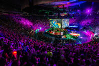
DesignStudio was officially given the job last April. At the time, Riot was wrapping up the first half, known as the Spring Split, of the EU LCS. Before touching a document or opening Adobe Illustrator, DesignStudio undertook an "immersion phase," according to Ng, where it soaked up everything to do with Riot Games, League of Legends, and its top-level competition in Europe. The team worked out of Riot's offices and attended games at the EU LCS studio, a permanent venue that hosts all of the regular season matches. DesignStudio employees also played the game using a small LAN (local area network) set up in their own office.
"That's the way to really immerse yourself in League, right? You've got the play the game," Pecchia said.
The design agency spoke to as many people who worked on the broadcast, social media, set design and roadshow events as possible. It also chatted with players, the game's designers and Riot management. "They were backstage with the broadcast guys, the full works," Pecchia said. "They really tried to understand how every single cog in the machine works before putting pen to paper." Of course, DesignStudio also spoke with fans through a variety of channels, including Reddit, Twitch and dedicated interviews at EU LCS studio. "Because they're the ones who love this league," Ng said.
Unsurprisingly, Riot and DesignStudio looked at other esports, including Fortnite and the Overwatch League. The pair didn't want to copy them -- the games are vastly different and the LEC is a strictly European competition -- but simply to understand their approaches.

The immersion phase was necessary because Riot needed more than a new logo, or mark, for the league. It required a visual identity that would be part of the physical studio in Berlin and cover every frame of the broadcast, including match previews, champion select (a pivotal sequence where players choose their characters) replays and post-match analysis. The new brand would also be used on social media and, potentially, all-new merchandising. "It's a full 360," Pecchia explained.
That "360" should envelop the viewer from the moment they open a live stream on YouTube, Twitch or the Riot Games website. Even if they're joining mid-match, the fan should know from the visuals and commentary that it's an LEC joint.
The new branding, of course, had to appeal to existing League viewers and players. To grow the LEC, however, Riot needed a style that would appeal to casual viewers too. It also had to stand on its own so that Riot could offer the LEC as a product, or clearly defined opportunity, to potential sponsors and advertisers.
The latter might sound dull, but it's important to the long-term viability of esports. More revenue means more resources for the teams in the LEC. The extra cash can also be fed back into the production side, entertaining fans with flashier venues, stages and opening ceremonies. The bottom line, though, is that money makes esports sustainable. The industry is growing, but Riot Games has admitted it needs more revenue to maintain its current levels of investment. "If revenue does not pick up enough, our budget will need to decrease by some amount," the company said on Reddit last August.
This year, the LEC is introducing a franchise model similar to the NFL. The NA LCS went through the same process last year, formalizing a 10-team league that can neither be promoted nor relegated. The system should, in theory, encourage LEC organizations to make long-term investments -- training facilities, coaching staff, team houses and more -- and help them build larger fan bases across the globe. These teams paid a large sum to join the franchising setup -- €8 million for existing teams and €10.5 million for new entrants, according to the Esports Observer -- and no doubt want to see Riot reinvesting that money.
What better way to reassure them than with a jaw-dropping rebrand?

DesignStudio presented its first ideas to Riot in June. The company had nailed down a "proposition," or mood, according to Ng, for the rebrand called "unleash together." It was meant to encapsulate the competition, and celebration, of two teams going head-to-head in Summoner's Rift, the fictional map where every League of Legends game takes place. The motto was also intended to represent the tapestry of countries that play in the league and make up its audience.
The design agency had explored the proposition through a number of visual concepts, or "creative territories." One of these was a crown -- a symbol representing victory and the clash of teams vying for supremacy. "The first one we saw wasn't right, not by a long stretch," Pecchia said. Riot could see the direction the designers were heading in, however, and how it might evolve.
DesignStudio then went into "full exploration mode" around the crown, developing hundreds of different permutations. One day, Pechia walked into the agency's office and immediately saw what would become the LEC logo. "They were hiding it away. I gave my editor in chief, Zanne Wong, a nudge, and I said, 'That's the one.' I just knew it."

The final logo comes in two forms: a static mark and an animated icon that slowly rises from the floor like a magician's spell.
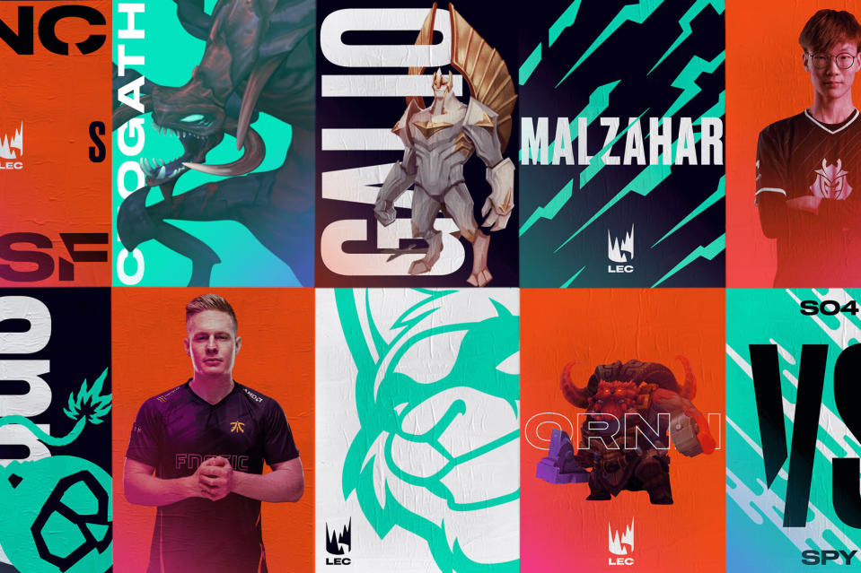
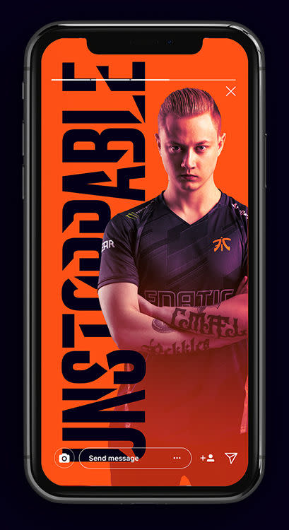
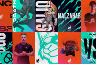
"Unleash together" evolved into a broader design language called "clash." DesignStudio created five different textures, or graphical styles, inspired by different attacks and abilities in the game: rush, surge, strike, blaze and blast. They look almost like tribal tattoos. It's a young, confident aesthetic that reflects the swagger of many teenage and twenty-something esports pros.
The graphics are usually portrayed with two vibrant, contrasting colors, such as orange and black or white and teal. These choices are bold and far removed from the often cold and muted tones of previous seasons. "I don't think people would normally put those colors together, but we loved how they played off each other," Ng said. "They kind of nodded to the red and blue teams [note: teams play on the 'red' or 'blue' side of the map] but at the same time, there was this kind of visual clash and vibration that you get when you put them together."
"I don't think people would normally put those colors together."
"Clash" was a byproduct of the immersion phase. DesignStudio concluded that esports is a sport, just with a different type of player, venue and equipment. They felt, however, that a lot of esports broadcasting was "kind of a hangover from them trying to make esports legitimate," Ng said. "They were trying to copy traditional sports to make it feel like it's professional." DesignStudio, meanwhile, thought it was the emotion, not the visual cues, that made esports and sports similar. For the LEC rebrand, then, it decided to focus on the emotion and passion that fans show during every game in Berlin and stream chat.

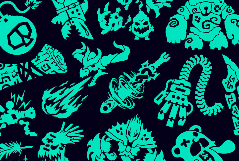
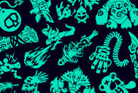
As part of its treatment, the agency hired freelance designer Daggers for Teeth to draw a staggering 141 illustrations for each League of Legends character. These were inspired by tattoo flash and could be used on stream or as part of theoretical merchandise. Ng explained: "We were like, 'How can we create something that was so exciting and that someone can actually put on their bodies?' That is the ultimate branding, isn't it?"
The final element of the rebrand was typographic. DesignStudio used Gattica, a clean sans-serif font, and Druk, which is reminiscent of old European boxing posters. The agency worked with Commercial Type, a font specialist, to spruce up Druk's characters with some stylized cuts and slashes.
The rebrand was then packaged up into a broadcast toolkit that Riot could tweak and implement on its own. DesignStudio will be staying on, however, to help with any teething problems and slowly evolve the brand. "They really are pretty much an extension of our team by now," Pecchia said. "And that's what we were looking for all along. A partner that could be an extension of the production, broadcast and publishing teams here."
To coincide with the rebrand, Riot is revamping the Berlin studio that hosts LEC matches. Pecchia is keeping the specifics a secret but did reveal that Misty Buckley, a set designer who has worked with Coldplay, Biffy Clyro and Victoria's Secret, is involved with the rebuild.
On November 20th, 2018, Riot unveiled the new LEC branding in a minute-long sizzle reel. At the time of writing, the video has over 340,000 views on YouTube, with an overwhelmingly positive thumbs up (5,500) to thumbs down (299) ratio.
Some fans, unsurprisingly, don't like the change. "Who the heck is responsible for this lol, the logo, the teams, the name, everything is disappointing," user Rechidna wrote. "This is cool and all but holy christ change the logo," another, Commander Dodgers, commented.
And despite DesignStudio's best efforts, some viewers think the branding is too similar to the English Premier League. "Looks like [the] premier league ," one comment reads. "The animations [and] overall branding looks like a Chinese copy of the Premier League. They didn't even care to change the pattern," another user [Mauro Perez] wrote.
Support for the rebrand is strong, however, and growing. "I like it," Reddit user DrJackl3 wrote. "Distances ourselves from the NA double LCS name, clean design, good logo. It's gonna take some time to get used to LEC but it'll happen." Another, fjellheimen, said: "I think it's [a] very nice logo. Clean and recognizable. Much better than the [old] LCS logo. This one works in both small and large versions, it captures the two sides facing each other on the rift, a crown is associated with victory and Europe is of course known for their monarchies."
You can't please everyone, of course. But it seems Riot has achieved its goal of radically updating the European league's image. One that is aware of traditional sports branding but takes strides to embrace everything that's so unique and attractive about esports.


