Samsung Galaxy Note 10+ review: Weird, but in a good way
Samsung's latest giant phone is eccentric but excellent.
I have to suspect that back in 2011 when the original Galaxy Note was released, not even Samsung knew it would become as popular as it did. By the standards of the time, the Note and its 5.3-inch screen were massive, and styluses were considered the mark of an inferior device. Instead of beelining toward the smartphone graveyard, though, the original Note helped redefine what we expected from phones and kicked off a series of hits (plus one spectacular miss).
I'll be up front with you though: The Galaxy Note 10+ ($1,099) isn't perfect. Some of the decisions Samsung made here will take a bit of getting used to, and some features felt like they were created for the sake of having something new to talk about. But Samsung has been polishing the Note formula for nearly a decade now, and it's still an incredibly potent one. If you've never felt much affection for the S Pen, I'm not sure the Note 10+ will change your mind. Even so, the Note 10+'s blend of performance, hardware quality and a genuinely useful stylus mean that it's still the best big phone you can buy right now.
Author's note: Some of the features Samsung promised as part of the Note 10+ experience, like the 3D scanner demoed at Unpacked and the PlayGalaxyLink local game-streaming service, weren't ready while we were preparing this review. We'll update this review once we've been able to fully evaluate these new features, but we stand by our assessment and score as is.
Hardware and design
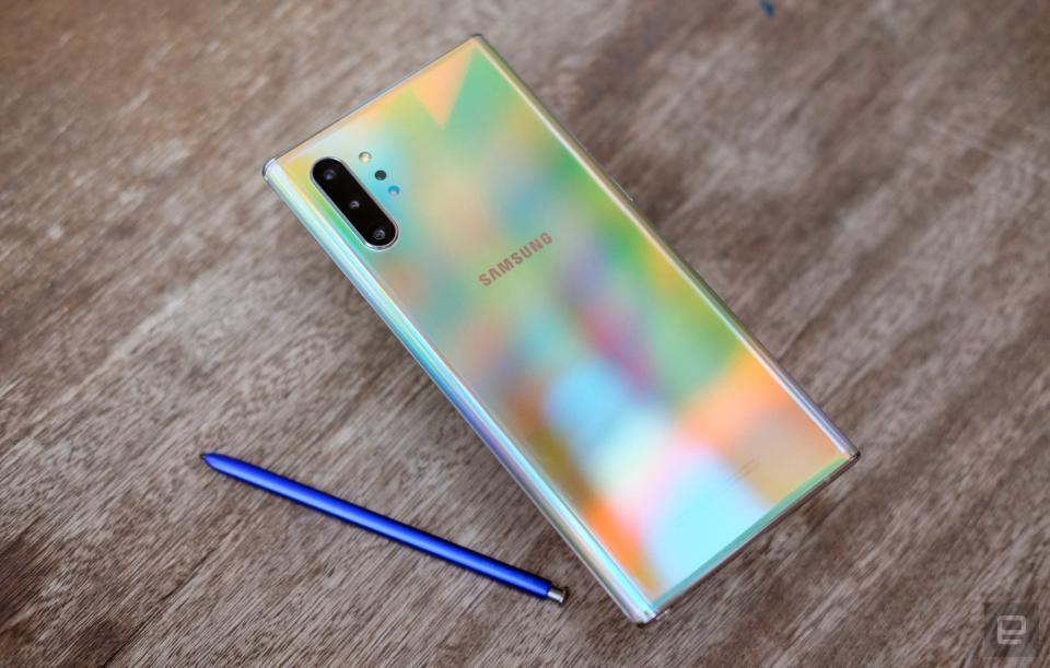
After years of incremental improvements, it probably won't come as a surprise that this year's Galaxy Note 10+ is a beautiful phone. The bezels around the 6.8-inch Dynamic AMOLED display are nearly nonexistent. The metal frame and the front and rear glass panels fit together perfectly. And the Aura Glow finish on our review unit is absolutely eye-catching -- the best word to describe it shifting from blue to yellow and everything in between is "trippy." Unfortunately, apart from sparking conversations, the other thing this finish is really good for is showcasing how greasy your hands are.
At the risk of sounding a little too obvious, the Note is also a big phone: You're going to need two hands to use it. But Samsung has made better use of all this space by squeezing an even bigger screen into the Note 10+. DisplayMate has a rigorous breakdown of what makes it so excellent, and I'd suggest you read through if you're aching for technical detail. That said, this HDR10-certified display is excellent for curling up in bed and bingeing on movies, and it's more than bright enough for reading and note-taking under harsh sunlight. I do wish the company embraced the kind of high-refresh-rate displays used in devices like the Razer Phone and the OnePlus 7 Pro though. They make motion look so buttery smooth and spoil more-traditional displays for you.
Going into this, I was concerned that Samsung's decision to move its camera cutout into the center of the screen would be distracting. Nah. That hole is (thankfully) much smaller than the cutout used in the Galaxy S10s, and it's far enough out of the way that it's pretty easy to ignore. You'll still notice it from time to time, like when you're watching videos with brightly lit scenery, but trust me -- you'll find your eyes glazing over it quickly.
There is one thing I have to gripe about though. Compared to Samsung's last big phone, the Galaxy S10+, the Note 10+'s screen has narrower bezels and follows the curve of the glass a little too far down the phone's side. These are minute changes, but they're enough that the fleshy part of my hand near the thumb joint touches the bottom corner of the screen accidentally. I'll be scrolling through my Instagram feed and -- oops, I'm looking at my profile instead. And a few times, when I reached for the notification shade, I launched the camera by mistake. After talking to a few people who have also been testing the Note 10+, this might be more of a "me" problem. Still, you should test out a Note 10+ before you decide to buy one.

The Note 10+'s construction and mostly excellent screen are proof that Samsung is at the top of its game, but a few annoying design choices lead me to believe the company didn't think some things through. For instance, in 2017, Samsung effectively mandated that all of its premium smartphones would have a dedicated Bixby button to activate its homegrown virtual assistant. Too bad it was lousy and the button was easy to press accidentally. To Samsung's credit, the Bixby key is officially gone this year. Unfortunately, Samsung also moved the Note 10+'s power button to the left side. That probably doesn't sound like a big deal, but when was the last time you used a phone with all of its physical controls on the left? The decision runs counter to years of accepted smartphone practice, and even after a week, I still found myself reaching for the sleep/wake button on the wrong side.
The lack of a headphone jack is another thing. Now, I get that Bluetooth headphones have become nearly ubiquitous. Fair enough. What gets me is that in my conversations with Samsung, the company has been keen to portray the Note 10+ as a tool for creators. And I've heard from a fair number of creators who would have preferred that the headphone jack remain, so they could plug in accessories like external microphones. This is a niche case, but the Note line has always been niche. It would've been nice if Samsung left it in place for the power users the company has always pitched the Note to. In any case, Samsung made up its mind, and we have to live with it. Thankfully, the pack-in AKG USB-C earbuds are pretty good, and so are the Note 10+'s built-in speakers: They emphasize mids more than the Galaxy S10 speakers did, leading to slightly richer sound.
Life with the S Pen
In the old days, the S Pen wasn't much more than a stylus you'd use to doodle on a Note's screen. Then, with the Note 9, it became a handy Bluetooth remote for certain apps. This year, the Note 10+'s S Pen doubles as a magic wand of sorts.
But we'll get to that in a second. First, I should point out that this year's S Pen is a little shorter and chubbier than earlier models. Samsung says these changes were mostly for usability, and it does help -- gripping this thicker version makes even idle sketching a little more comfortable. There's no change to the on-screen latency or the overall performance of the S Pen; there's just more stuff inside, like a new accelerometer, gyroscope and tiny battery. All those new bits are used to make Samsung's Air Actions possible, and they're, let's say, a work in progress.
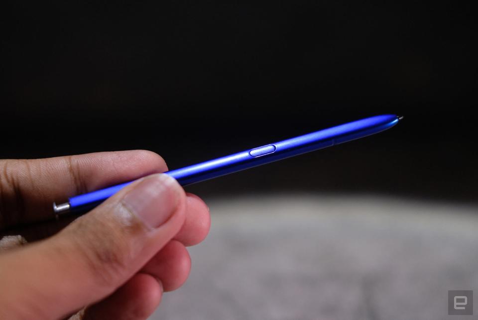
Instead of performing actions inside apps with the S Pen's button, you can also invoke them with swishes and flicks in the air. If that sounds a little silly, well, you're right, but they do work. For now, though, their reach is pretty limited: You can use them to skip between tracks in your media player, but they're mostly used for manipulating the camera and swiping through your photos. The latter, I could live without -- it might be nice for flicking through a slideshow. Gesturing up and down toggles between the front and rear cameras, and swishing left and right selects different camera modes. You can also draw little half circles in the air to zoom in and out.
The first time I tried to zoom in on something using the air gesture, I instead took like 50 photos without realizing it. Every other time after that it worked perfectly, though it's only helpful if you have your Note 10+ mounted on a tripod. You can customize these air gestures a bit, but I wish Samsung offered deeper control. I'd much rather switch among the three rear cameras than jump between the front- and back-mounted ones. And for now support for non-Samsung apps is pretty much nil: The only other app I had installed that worked with Air Actions was Google Chrome, which lets you scroll through web pages by waving the S Pen in the air.

That's my real issue with the S Pen's Air Actions: They're not a bad idea, but none of them feel essential. It's almost like Samsung developed them because it needed the S Pen to do something new this year. Samsung says it has an SDK ready so app makers can add support for Air Actions. I'm not sure how many developers will bother with this, but if they did and gave us some nuanced controls, I could see myself falling in love with Air Actions.
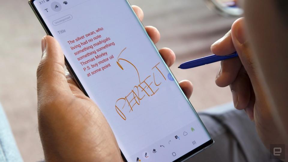
Fortunately, it takes much less time to appreciate the Note 10+'s improved handwriting recognition. When you're finished jotting something down, a quick tap at the bottom of the screen gives you the option to convert it all into easily readable text. My handwriting is atrocious, and the Note rendered my attempts correctly more often than not. It's not flawless though. It sometimes had trouble spacing words correctly and once thought the word "dishwasher" was spelled "disthwar'sher." Still, it's usually close enough that editing those few errors is relatively painless. The fact that you can export these as Word documents or PDFs is icing on the cake.
I was more impressed with how quickly the Note 10+ started to interpret and index my handwritten lists and story ideas. There's basically no delay between the moment you finish writing and the phone figuring out what you've written. That makes for near-instantly searchable notes, so you'll never forget whether you added laundry detergent to your grocery list. For me, at least, this is the Note 10+'s killer app.
In use
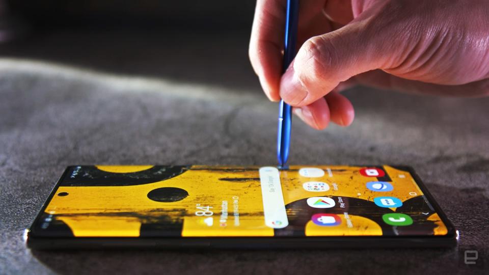
Our Galaxy Note 10+ review unit is the base model, with a Qualcomm Snapdragon 855 chipset and 12GB of RAM inside, along with 256GB of internal storage. It's the same basic configuration found in a host of other premium Android phones, and that's not a bad thing. While it would've been nice to see Samsung use the slightly tweaked 855+ chipset, there's still more than enough power here to handle everything you could throw at it. It certainly helps that Samsung has dramatically improved its software over the years, and its One UI running on top of Android 9.0 is actually kind of a joy to use.
If you're the kind to put stock in synthetic benchmarks, then the Note 10+ edged out the Galaxy S10+ and the OnePlus 7 Pro in PCMark and Geekbench. That's fine and all, but the most important takeaway here is that regardless of who beats whom, the level of horsepower available on the Note 10+ certainly won't leave you wanting.
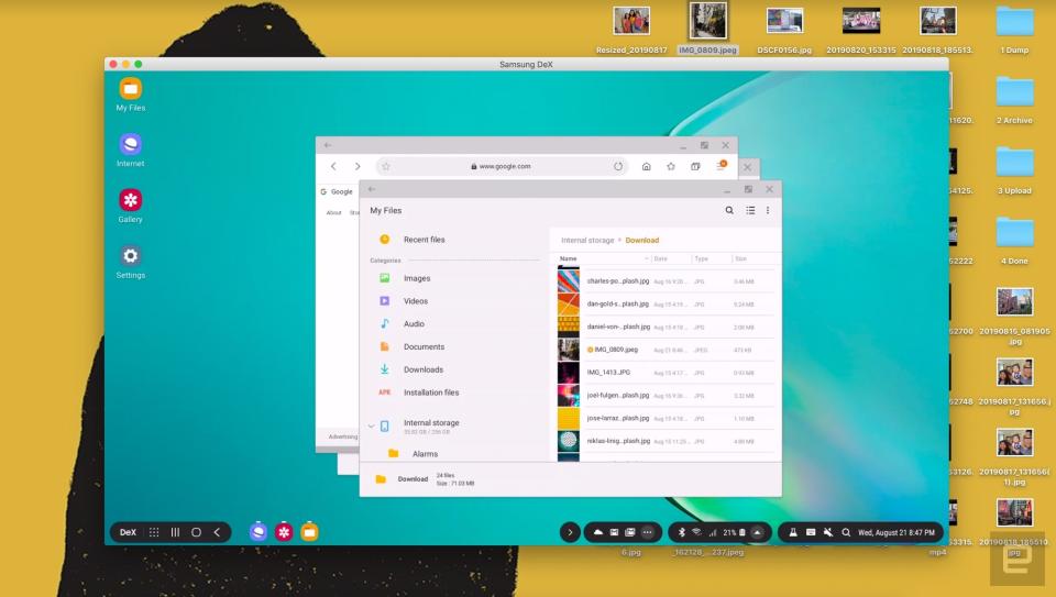
The horsepower here is especially important if you decide to use the Note 10+ as a computer. Samsung's DeX desktop interface isn't new, but now you don't have to keep a spare monitor and keyboard on hand. Once you've installed a companion app on your Windows or Mac machine, you can plug the Note 10+ in with a USB-C cable to get that full desktop experience... on your desktop.
I know, it seems a bit ridiculous. Samsung thinks people could use it to connect their phone to a public computer and use the DeX interface to get some work done while making sure their personal data stays safe on their own devices. That's a decent suggestion in theory, but it falls apart in practice. You probably can't install the necessary software on a computer in, say, your local library. And even if you could, you'll need even more software to make the most of it. I tested DeX on my work and personal Macs, and I was warned both times that I needed to have Google's Android File Transfer app installed to move files between my phone and computer. I already did, but Mac owners who have tried using File Transfer on their machines know how finicky it can be.
Once all that's finished, DeX feels surprisingly usable. My MacBook Pro's keyboard and trackpad worked as expected, and the Note 10+ tapped into the laptop's speakers without any issue. And once you figure out its quirks, transferring files between phone and computer is actually pretty useful. I'm not going to pretend that these are game changers. I'm pretty sure most people will never bother using their phones like this. Still, after a touch-and-go setup process, DeX has proved itself to be solid enough in case you ever do need it.
Of course, making use of all the Note 10+'s strange little features requires power. I have to say that I was hoping for a bit more out of its battery. After all, the 4,300mAh cell here is the largest Samsung has ever packed into a Note, and if you buy the party line, it had to get rid of the headphone jack to make it happen. In general, I could count on the Note 10+ to stick around for a little under a day and a half on a charge. On heavier days with more prolonged use (or on days when I had the screen set to Quad HD+ resolution instead of the default Full HD+), I blew through the battery before bedtime. Realistically, you're not going to have to worry about running out of power before you step out for a night on the town, but this isn't a phone you can get away with charging every other day.
Speaking of charging, the Note 10+ can power up at rates as high as 45W if you have the right setup. Some of our friends at Android Central and Android Police have dug into this situation more thoroughly, and it turns out getting the best charge speeds can be tricky, since it requires not only a specific kind of charger but also an e-marked cable, which is tough to come by. Unless you're willing to put in the work (or shell out some money), you're best off using the Note 10+'s included 25W charger, which takes the battery from bone dry to full in about an hour and a half.

Cameras and video
If it ain't broke, don't fix it. That's the philosophy Samsung embraced for the Galaxy Note 10+'s three rear cameras. As with the Galaxy S10 and S10+, there are a 16-megapixel ultra-wide, 12-megapixel wide and 12-megapixel telephoto around back. The few changes Samsung did make were minor: The aperture on that zoom camera has been widened slightly to f/2.1 to help in low light, and the Note 10+ inherited the depth-sensing time-of-flight array we first saw on the Galaxy S10+ 5G. Ultimately, though, the difference in photo quality is negligible.
That's not necessarily bad. The S10 family proved to have solid cameras, and the Note 10+ is just as good, especially in broad daylight. You can expect loads of detail and lots of bright, vibrant colors. And Samsung's auto HDR is remarkably helpful when you're shooting outdoors, since it prevents well-lit parts of your scene from being blown out. Beyond that, I'm always thankful when a smartphone packs an ultra-wide camera; this one captures a 123-degree field of view that's helpful for shooting landscapes. The Pixel 3's machine-learning-powered camera produces slightly nicer photos with less fuss, but the flexibility these three sensors offer can't be dismissed.
You can also use a handful of LiveFocus effects, which either attempt to blur your subject's background or add neat filters like a noir-ish monochrome or a trippy glitch effect. These worked surprisingly well, though the "big circle" bokeh effect tends to eat into people's heads.
Here's the bummer: Since they basically share the same cameras, the Note 10+ has the same low-light limitations as the S10s. You'll get the best results out of that 12-megapixel wide camera, and the telephoto camera does slightly better than its predecessor because of that new, wider aperture. (It's still not great though.) Your ultra-wide shots will be uniformly disappointing, though, so get used to seeing soft, smeared-over details and a lot of blur.
I hate to say it, but the included Night mode isn't all that effective either. Yes, it'll give you a brighter photo, but for several reasons that's not ideal: The results don't have that nighttime feel you might be looking for, and the details are so over-processed that they can look downright cartoonish. It's pretty annoying to use too. While night mode on other cameras gives you a sense of how long you're supposed to hold still, it doesn't on the Note 10+. You just have to stand there, wait and hope you didn't screw things up.

The real improvements come into play when you're shooting video. Just like with stills, an improved live-focus video mode blurs out your backgrounds, and it's the seemingly unnatural effects like glitch that work the best. The standard and big-circle-bokeh options look unnatural and are pretty unsatisfying, especially because bits of the background come into focus when the person in the frame moves around. It's clear that this is software trickery, but it's easier to accept when the effect isn't supposed to duplicate some natural optical phenomena. Personally, I'm more a fan of the super-steady video mode, which is noticeably better than what we got in the Galaxy S10 series. You can't zoom while you're walking around and shooting, but the results are impressive.
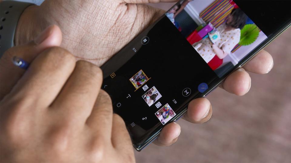
Samsung also seems proud of its new native video editor, which works well enough. It's fine for piecing together short clips for social media, but I take issue with Samsung's suggestion that this is the kind of tool that full-on creators would want to use. You can add some nifty transitions and background music to your vacation videos, and it renders footage quickly enough. Still, if you're serious about using your phone to produce more-professional-quality video, there's a version of Adobe's Premiere Rush tailored for Samsung phones. If nothing else, it makes arranging clips with the S Pen a little less frustrating.
You might get more use out of the camera's zoom-in mic feature, which amps up the volume of your subject once you start zooming in on it. Don't count on using it to spy on conversations from across crowded rooms though. It works as intended, but the effect is pretty subtle, and it also amplifies the ambient sound directly around your subject. It's a clever addition that delivers on its promise, but using it also means you need to make decisions about balancing video and sound quality. For example, Samsung says that zooming in four times should raise the volume of your subject by about nine decibels, but you'll notice some grain and noise when you're pushed in that tightly.

Oh, and there's AR Doodle, this year's big augmented reality gimmick. (Thankfully, it's much less terrifying than the AR Emoji Samsung introduced last year.) It sounds silly, but AR Doodle lets you draw all over people's faces and sketch objects into your view of the world around you. Those marks are supposed to stick wherever you've drawn them, but that doesn't always happen in practice. The goofy, unerasable pen strokes you draw "stick" to human faces well but disappear when the face is obscured.
The feature is much less impressive when you try to add, say, a flower pot to a coffee table. Even after panning around to give the depth sensor a taste of my surroundings, the things I drew never stayed where I wanted them to. I did find some more-practical uses for it though: I've slowly been putting up art in my apartment, and I used AR Doodle to roughly plot out where I want things to go. I was hoping that this would wind up being more than a party trick, but it turns out that's what the feature is best for right now. No, literally: It helped me entertain a gaggle of kids at a birthday party.

Wrap-up
It's probably clear that the Galaxy Note 10+ doesn't get everything right. More than a few things here require an adjustment period or don't feel as polished as they should. Meanwhile, some of the phone's marquee features aren't available to test yet. As far as I'm concerned, though, the Galaxy Note 10+ is the still the best big-screen phone out there. The foundation here is solid enough that those issues and temporary omissions don't ultimately detract from the experience of using the Note 10+. And beyond all that, I'm continually impressed by how useful the S Pen winds up being, even though I'm not normally a stylus person.
If you just want a big phone, you can easily pick up a OnePlus 7 Pro or a Galaxy S10+ for much less money, and you'll probably have a great time with them. But if you want a big phone that lets you do more than the smartphone basics and don't mind dealing a few quirks, you won't do better than the Galaxy Note 10+ right now.

