Samsung cleans up its Android skin with 'One UI'
It's also about making big phones more comfortable to use.
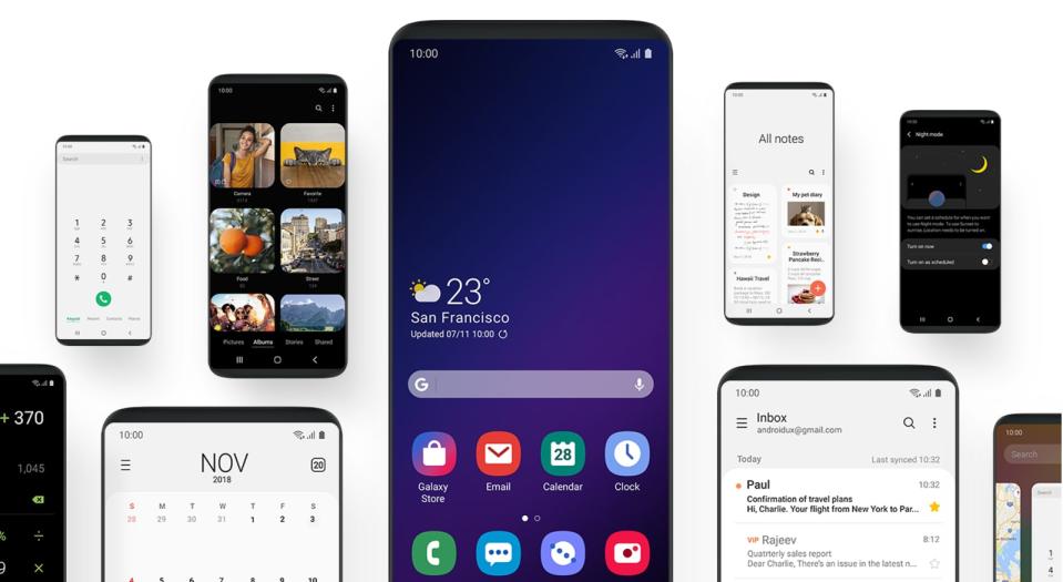
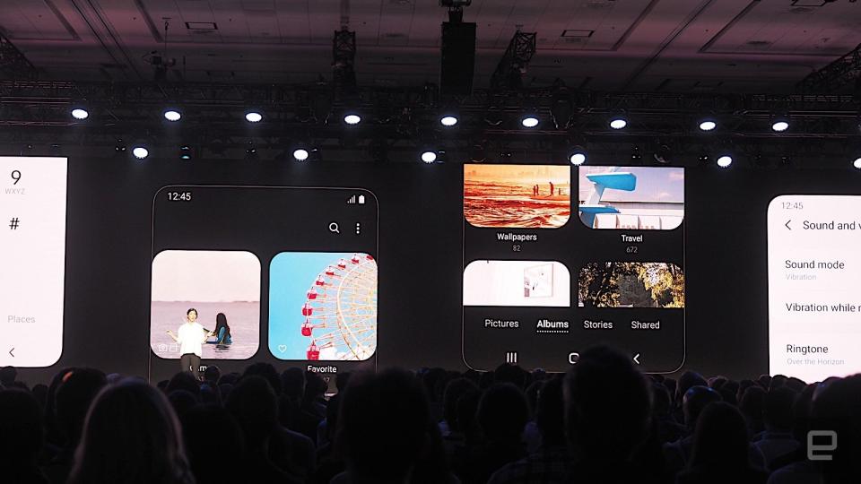
In addition to unveiling its much-rumored folding phone at its developer conference today, Samsung also shared its plans for a cleaner Android skin. The new look will be called One UI, and feature not only a refreshed design with rounded corners in its icons, but also a minimalist aesthetic that the company said will draw users' eyes "to what matters."
This appears to be a successor to the Samsung Experience, which itself replaced TouchWiz, the company's early name for its Android skin. One of the highlights of the new interface is "Focus Blocks," which groups things like related settings together so they're easier to get to. And since so many of Samsung's phones like the Note 9 and S9+ have massive screens, One UI also makes it more comfortable to navigate larger displays.
One example the company showed off is in the Messages app, where the top third or so of the screen becomes a so-called "viewing area" and the rest is an "interaction area." You can tap on messages in the bottom section and a preview shows up above.
Other tweaks include moving things like Share buttons to the bottom of the screen where it's easier for your thumb to reach. There aren't a lot of specific details on what else is changing just yet, but Samsung claims to have seriously decluttered so you can "reach what you want," with "content and features at your fingertips."
There's also a Night mode that uses a black background for easier reading in the dark, which bears some similarity to Google's UI for the Pixel Stand. Samsung's new software will also color-match the hardware. So say you're using the lilac Galaxy Note 9 and want an all-purple phone, you could theme One UI to the same hue.
Based on slides that the company posted, the new home screen for Galaxy phones indeed looks a lot cleaner. The weather widget is smaller, for one thing, and the Google search bar has a more-subtle translucent grey background instead of the current white fill.
We'll need a deeper dive before knowing for certain how much easier One UI is to use than its predecessor, but from what Samsung has shared so far, the new look is refreshing. Many elements appear to be borrowed from Android Pie and iOS, but mimicry in the name of improving user experience is something I can get on board with. It's timely, too, since Samsung's existing software is starting to look dated. Expect to see the redesign in next year's phones, most probably in the Galaxy S10 that should launch in February.
Nicole Lee contributed reporting.


