Apple Watch Series 4 hands-on: Subtle improvements
Apple's fourth-generation smartwatch brings a bigger screen and haptic feedback.
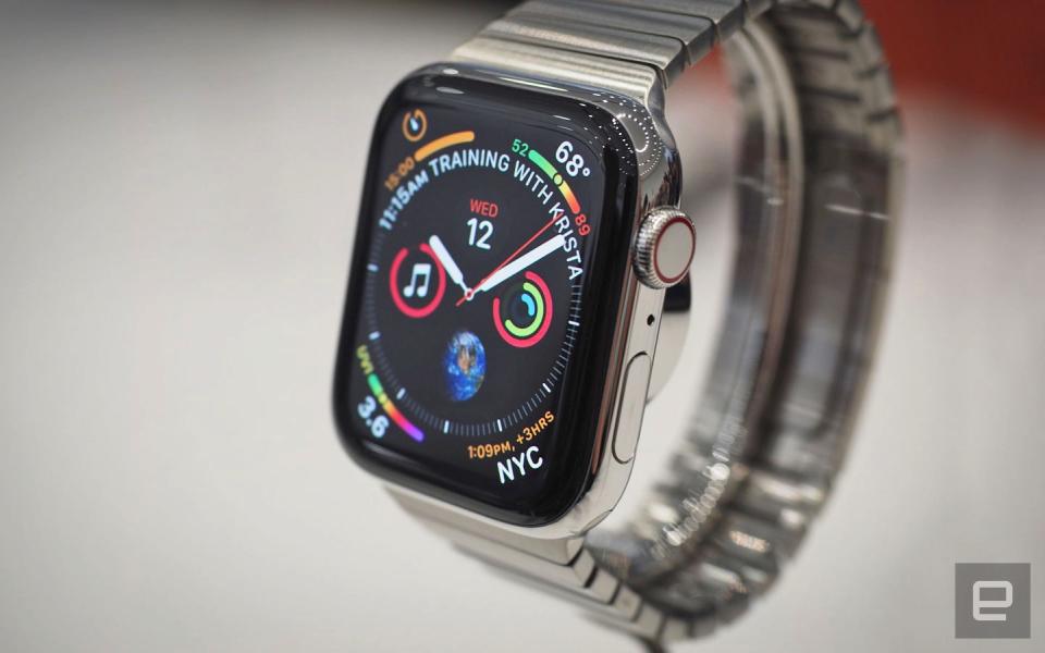
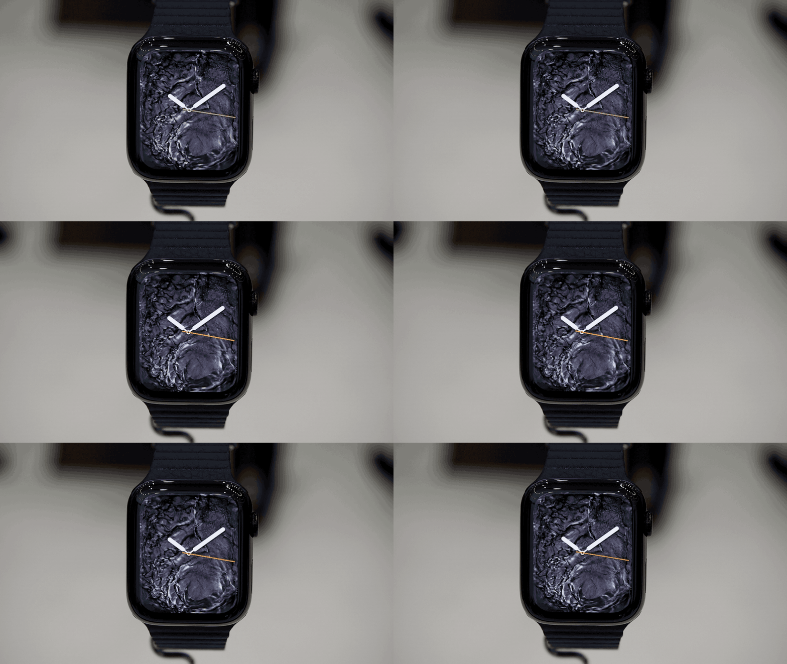
Apple has just wrapped its Gather Round press event, and as expected, we got our first glimpse at the new Apple Watch, the Series 4. As promised by some press phots that leaked ahead of the keynote, the watch has a larger screen than what we became used to on the first three editions: It's 35 percent bigger on the smaller 40mm model and 32 percent larger on the 44mm edition. It's also thinner, with haptic feedback, a louder speaker, longer battery life, more watch faces, a Mindfulness app and some new build materials: ceramic and sapphire. It ships next week, on September 21st, but I just strapped one on my wrist at the Steve Jobs Theater to bring you some early impressions. As is often the case with leaks, though we first saw the Series 4 in what turned out to be an authentic press shot, that photo did not, in fact, tell the whole story. That bigger screen almost feels like a footnote to me. Yes, those rounded edges and barely there bezels are pleasing to behold, but it's ultimately an aesthetic (and iterative) upgrade. That screen is also home to some new watch faces, including one for Apple's Mindfulness app, as well as a few trippy animated ones that "interact with" the watch's edges (think water bubbling up against the sides). I took some still photos of those and also added a gif inline because sometimes a gif says a thousand words. In addition, there's a new watch face that shows up to eight complications, with details that include high and low temperatures for your area. Swipe left to cycle through watch faces and potentially see more details on a given thing, like your fitness progress for the day. Under the hood, a new chip, the 64-bit, dual-core S4 promises faster performance. We'll revisit that in our full review, but in my brief hands-on time, at least, I was satisfied with the watch's responsiveness. More significant than the upgraded display, I think, is Apple's revised approach to the Digital Crown, that small rotating knob on the upper-right side that has always been integral to the user experience. It now provides haptic feedback, which Apple claims will be especially useful for apps like Apple Music, where you're likely to crave precision when scrolling through items in a list. When I first heard about this in the keynote, my mind immediately went to the old-school iPod Classic. What's old is new, right? More importantly, wouldn't that get annoying -- an emphatic click every time I hit a new track on a list? Fortunately, the haptic feedback is subtle, both in sound and feel. While wearing the watch in Apple's demo area, I opened the Apple Music app to give the new controls a try. I was pleased to find that my wrist wasn't being zapped by incessant vibrations. I was just receiving some subtle extra confirmation that I was navigating toward what I meant to. On the wrist, the watch felt lighter to me, which it isn't -- at least not in a significant way. It is, however, thinner. Perhaps that's what I was picking up on. Either way, it felt less physically intrusive on my arm than I remember from the last time I wore an Apple Watch. (My daily driver is a much uglier, much sturdier Garmin running watch.) In terms of aesthetics, eagle eyes will also notice that the Digital Crown now has a red ring, not a glowing dot. That's a small detail but one that makes the watch feel that much less like a computer strapped to your wrist, which it obviously is. And what a computer this is. In fact, this would be a good time to say that there is one important feature that Apple was not showing off in its demo area today. Chief among them is an app that allows users to perform electrocardiograms on themselves to identify heart conditions, making this what Apple claims is the first over-the-counter, direct-to-consumer device that can do such a thing. The feature isn't available yet, though it has been cleared by the FDA. Other health features include a low-heart-rate warning, background tracking for atrial fibrillations and fall detection. For that last feature, you can have the watch automatically alert emergency services and pre-selected loved ones. That will be especially useful for those with elderly parents and relatives who want peace of mind when they're not in the room with them. As I said, Apple's new watch arrives next week, with prices starting at $399. Like last year's model, it's available with an optional built-in cellular radio; those start at $499. You'll see lots of familiar aluminum and stainless steel finishes with backward compatibility for all of your old watch bands. That said, there is a new gold-ish stainless steel finish; that would be one way to signal to people you have the latest and greatest edition. Once we do get a review unit in, there are lots of bullet points from today's keynote that we'll want to test in a more long-term way. Think the claimed 18-hour battery life, six hours of exercise time and the built-in speaker, which is said to be 50 percent louder. Those things are difficult, if not impossible, to test in a crowded hands-on area. All told, though, we're looking at a series of iterative changes, inside and out, with the main exception being that built-in ECG test. I'd even go as far as to declare this a boring update, though in a way, it doesn't matter. Apple already claims that the Apple Watch is the No. 1 watch of any kind, smart or not. The new model doesn't need to be a leap forward. It needs to be just as good or slightly better. Assuming that's true, something tells me Apple is in for another strong holiday season, regardless of how impressed we reviewers are. Follow all the latest news from Apple's 2018 iPhone event here!


