Android P introduces iPhone X-like navigation swipes and gestures
Who needs buttons?
First it was the notch, but now Google is taking a more functional cue from Apple's iPhone X: a swipe-based navigation system. (Which, naturally, has its roots elsewhere, long before last year.) As rumored, the Android home 'dot' has morphed into something a little longer and a little more useful. Google says the change is a response to phones growing taller and the issues that creates for one-handed smartphone steering.
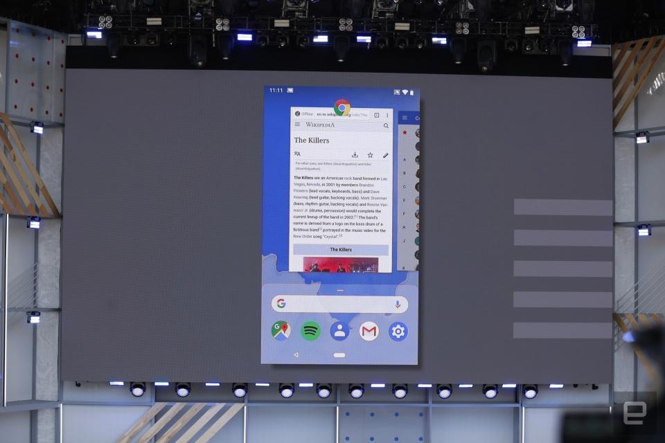
Your next Android phone has a new way of driving, but how does it all work? On Android P, a tap will send you to the home screen, while a long press takes you to Google Assistant -- no button needed. A little swipe up takes you to the overview screen (your new multitasking switcher with search bar), while a full movement up opens your app drawer. Sliding to the right works a lot like the iPhone X, allowing you to swipe through your recent apps. If you're regularly app hopping, you'll like Smart Text Selection, which will parse the meaning of text you're looking at (or attempting to copy and paste) and suggest things to do with it, which could be an address for Google Maps, YouTube videos or more. This works in Overview too.
And finally, the back button is still around, but it looks like it will only appear inside apps. It's worth noting that Huawei's P20 phones went for a similar approach, albeit with a physical button that could detect swipes instead of taps. Android's built-in version is an all-software solution.
It's a major change to the interface of Android phones and we can't wait to give it a try ourselves. Fortunately for early adopters out there, Android P is coming to 11 different phones as public beta, so the testing starts now.

Click here to catch up on the latest news from Google I/O 2018!


