YouTube music app gets a streamlined now playing screen
It looks more like a traditional music player and may hint at future updates.
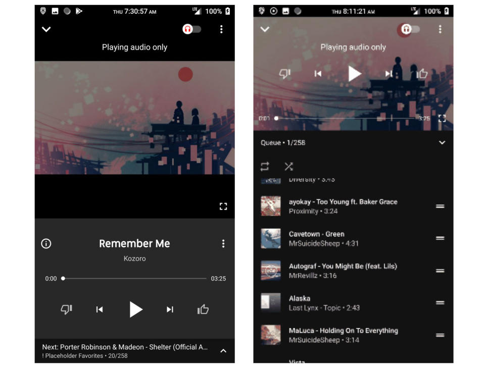
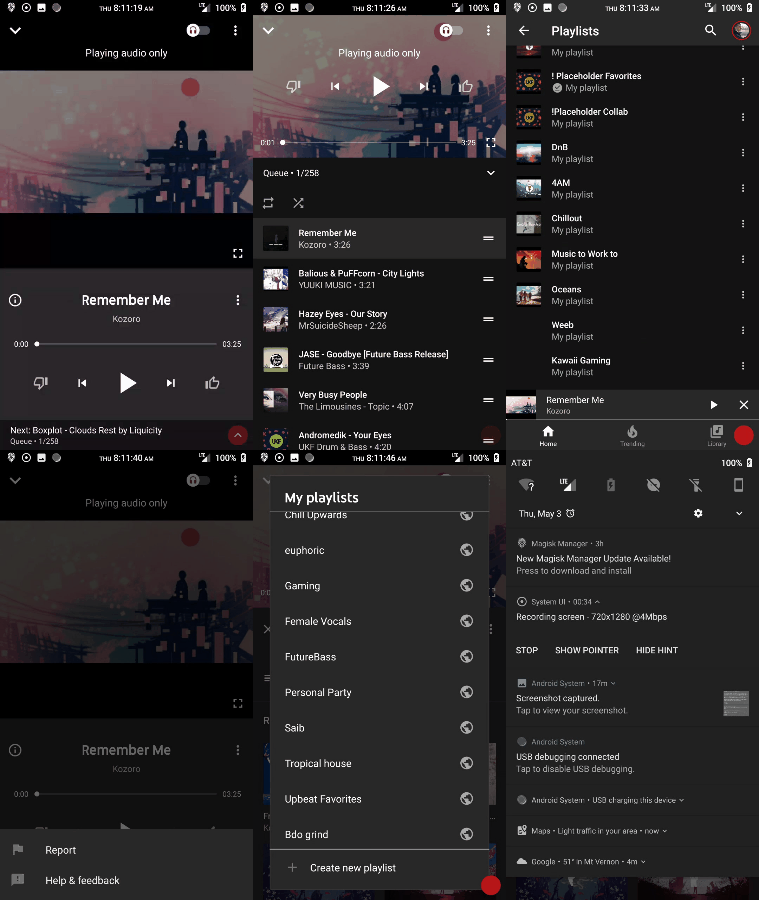
With YouTube Remix on the horizon and Google Play Music on its way out (not to mention Google I/O next week), it's not a surprise that YouTube Music, the app that the company rolled out in 2015, is getting a bit of a refresh. Originally spotted by Redditor c2fifield, the redesign includes some streamlined changes to the "now playing" interface as well as the queue lists below it. Only some users are seeing this new update, so be patient.
We were able to try out the redesign ourselves and confirmed that the screenshots from Reddit are indeed accurate, for both iOS and Android. The new player window looks more like other music apps, and the Now Playing queue can be easily rearranged. Whether these changes presage a YouTube Remix takeover or whether there will be a new app is unclear. For now, though, you can at least enjoy the changes while you listen to your tunes via YouTube.


