Microsoft's latest Windows 10 experiment: Running apps in tabs
"Sets" is a new spin on Windows multitasking.
When it comes to multitasking, few UI upgrades were as helpful as browser tabs. Instead of juggling dozens of windows on your computer, they let you place multiple websites in a single pane. It's the sort of thing we take for granted today -- especially if you don't remember the pre-tab dark ages.
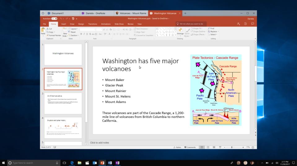
With its latest feature in Windows 10, currently dubbed "Sets," Microsoft has taken some major cues from what browser makers learned years ago. Basically, it lets you group together Windows apps in tabs. That might sound simplistic, but Sets (which isn't the final name yet) could fundamentally change the way we work in Microsoft's OS.
If you've seen the way the Edge browser handles tabs, you've already got a handle on Sets. You open a new tab within a window by clicking the plus button in the title bar. Once you've done that, you'll see a landing page listing your most frequently used apps, recent documents and a search bar for local files and the web. As you'd expect, whatever you end up opening appears right alongside the original app you were using. So, if you started with a Word document, you could easily have a Powerpoint file, web pages and your Mail app sitting alongside it. It feels similar to how Chromebooks handle multitasking, an OS that has an interface almost entirely made up of browser tabs.
Conceptually, Sets goes hand-in-hand with the upcoming Windows Timeline, which lets you jump backwards to continue working on past projects. While the two features were conceived separately, according to Microsoft, they could make for a powerful combination. It's easier for the OS to tell that a collection of tabs within a single window are related to one project. For example, if you were making a presentation on South American rain forests, you could have a Word document taking notes, several web pages with relevant research, and a Powerpoint file all in the same window. That also makes it simpler for Timeline to get you back up and running when you switch devices. Additionally, Windows will be able to open up the Set you typically use with a particular document.
While Sets might seem like an obvious UI evolution for Windows, it's still a significant move for Microsoft. For one, it marks the biggest change we've seen to the title bar since Windows 95. Even the drastic UI overhaul in Windows 8 didn't affect that much. Perhaps that's why Microsoft is clearly positioning it as an experiment. Initially, only a handful of Windows Insider participants will get access to it. The company will also perform a controlled study on how people use the feature. While Microsoft says everyone in the Insider Program will eventually have access, it'll likely be a while before that happens.

Initially, Sets will work with Universal Windows apps like Mail, Calendar and Edge. After that, the company will work on bringing simpler apps like Notepad onboard, and it's also developing a Sets-compatible version of office. Supporting more complex apps, like Photoshop and Premiere, will take even longer. You'll eventually be able to access Sets in Microsoft's mobile apps, as well. And if none of this sounds compelling, you'll be able to turn off Sets (or whatever it ends up being called) in your Control Panel. Microsoft also plans to offer granular control for the feature, allowing you to turn it off for specific apps.
What's most interesting about Sets is how Microsoft is carefully rolling it out. Unlike Windows 8, which dramatically killed off the Start Menu and replaced it with something slower and clunkier, the company is taking care not to disrupt how we normally work in its OS. It's a humbling admission by Microsoft that it might not always know what's best for its users. But this time, at least, it's prepared to learn.


