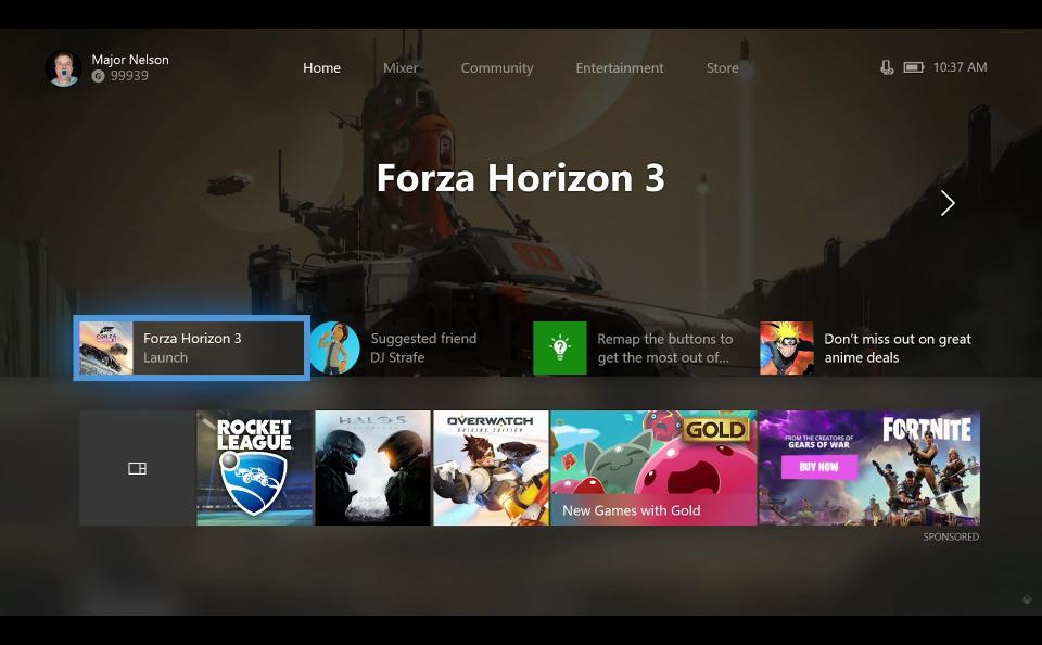
Xbox One is getting a completely new customizable interface
Prepare for a very refreshed UI.
Microsoft just updated its suite of products for online gamers a month ago, adding a few quality-of-life features to Xbox Live and its streaming service Mixer (previously Beam). But today, they've announced an even bigger overhaul, revamping the user interfaces Xbox One and Windows 10 users.
The Home screen has been restructured, adding suggestions for new friends (and maybe an ad or two), but the big change is the new hot bar at the bottom. The first button sends users straight to their game library, but the next few are recently-played games or apps -- a nice addition, if available elsewhere, that keeps you from having to dig around for your last-loaded title.
Microsoft also added a feature Xbox One fans have long desired: The freedom to customize their Home screens. Users can manually add games, and the system will automatically drop in related content like developer news releases or show when your friends start playing that title. The Guide's a bit quicker and its smoother layout aims to make navigation easier, letting players switch between layered tabs with bumpers, the left joystick or the d-pad.
The Community page has also gotten a facelift, with new functionality that lets users peek into Activity Feed moments or comments and make them full-screen. There's new filters for the feed itself, too. These updates are only coming to the first ring of Xbox's Insider program for now before expanding slowly into wider groups of players as a sort of beta test, but a wider release is expected in the coming months.
Windows 10 players get a few new options added directly to the Game Bar, like a Game Mode switch. Mixer users also get a few sound toggles, allowing them to switch between game-only and system-wide audio straight from the bar. Unlike the Xbox One changes, these are assumedly rolling out immediately.


