Tinder's app tweaks make profile stalking more intuitive
A new update introduces a cleaner design and new navigation options
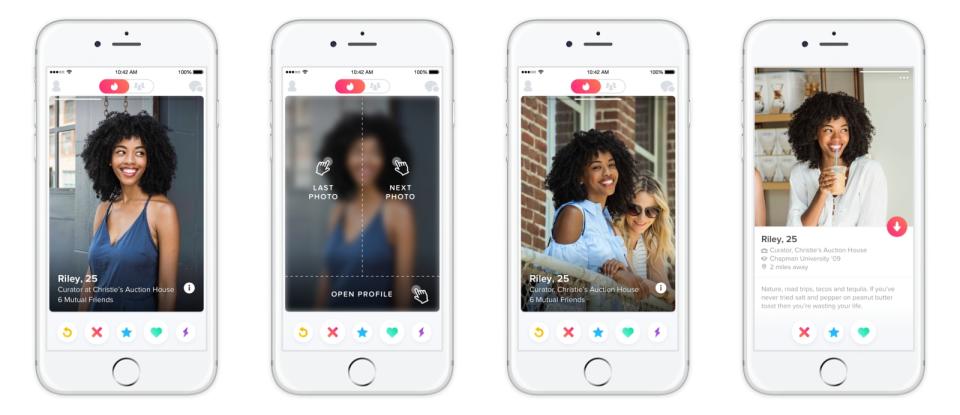
If you regularly use Tinder, you may notice that the app looks different than it used to. The online dating service is rolling out an updated interface that includes new navigation and larger photos.
With the new interface, you can simply tap the left or right edge of a profile photo to navigate through a person's pictures. Hitting the bottom will open a complete profile. It's aimed at making profile information easier to access and Tinder navigation more intuitive. The update also comes with larger photos that extend to the edges of the screen.
Engineers used Swift 3 and a new architecture called DISCOVER to build the new Tinder app from the ground up. The update will roll out worldwide starting today, so it should hit your devices in the coming days and weeks.


