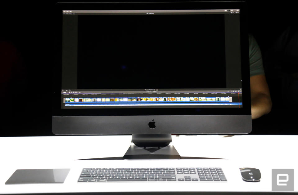
The iMac Pro puts a darker spin on a familiar design
It looks nothing like the Mac Pro, and that's probably for the best.
The cylindrical Mac Pro was a gorgeous feat of engineering, but that beautiful design also made it tough for Apple to update it regularly with fresh components. No wonder Apple essentially ditched it -- with the newly announced iMac Pro, the company squeezed seriously high-end components into a familiar body. The company has gone as far as calling it the "most powerful Mac" ever, which seems at odds with the iMac Pro's classic, consumer-friendly aesthetic. After all, aside from the space gray finish, the iMac Pro looks a lot like a machine that would set you back less than $2,000.
That is, until you see it in person. You won't be able to get an iMac Pro of your own until this December, but Apple had one setup waaaaay in the back corner of its WWDC demo area. Unfortunately, the spot where Apple installed the machine was almost as dark as the iMac Pro was. We couldn't touch it -- or even touch the table it was on, for that matter -- but the sleek, dusky design does wonders to make the iMac Pro seem distinct from the rest of Apple's desktops. Go on, take a closer look:
Get all the latest news from WWDC 2017 here!


