Microsoft's redesigned Xbox dashboard is now available to all
It's all about speed and simplicity.
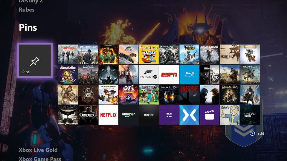
Microsoft's next big update to the Xbox dashboard is now ready for public consumption. The first "Fluid Design" interface comes with a redesigned Home page, which is all about simplicity and customisation. The top-level section has four shortcuts (your current game, two personalised suggestions, and a deal from the Microsoft store) and a horizontal carousel underneath. The biggest change, however, is the new "Content Blocks" that sit below this screen. Scroll down and you'll find a series of large, visual panels dedicated to games and friends. These are completely customisable and act like miniature hubs for your favorite titles and communities.
The quick-access Guide has been tweaked for speed, with small, horizontal tabs that you can slide between with the Xbox controller's LB and RB bumpers, D-pad or left thumbstick. If you launch the Guide while you're streaming or part of an active party, you'll also see the corresponding broadcast and party tabs by default. Other Guide tweaks include a new Tournaments section in the Multiplayer tab, which will summarise any official, professional or community tournaments that you've entered.
In addition, Microsoft has overhauled the Community tab with a modern, grid-based layout. It's also tweaked the idle and screen dimming features that kick in when you walk away from the console momentarily. These might sound like small changes, but together they represent a pretty significant visual overhaul. We first heard about them in August, when Microsoft rolled the update out to Xbox One Insiders on the alpha ring. Starting today, however, they should be available to everyone. Microsoft has long-struggled with the look and feel of the Xbox dashboard, but now, finally, it seems to have landed on something simple and cohesive.


