With the Prius Prime, Toyota delivers nearly the perfect tech car
The automaker finally designed a hybrid that doesn’t look like a potato on wheels.

The Toyota Prius made hybrids mainstream. In cities like San Francisco, you can't swing an artisanally carved reclaimed-wood stick without hitting at least one of these midsize cars rolling down the street. By sheer numbers (nearly four million sold!), it helped usher in the acceptance of internal combustion engine/electric motor combos. But more important, it made the idea of the electric car palatable to a wider audience. Its influence is impossible to overstate. Yet, from day one, I've found it to be an absolutely hideous-looking vehicle.
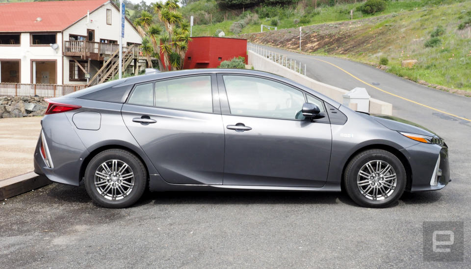
It didn't matter that the car could potentially save me hundreds of dollars a year in gasoline and that its fans equated ownership with saving acres of rainforest while simultaneously hugging a polar bear. It looked like a wedge of Brie with wheels. It was ugly, case closed. That is, until I saw the $27,100 (before federal tax credits) 2017 Prius Prime plug-in hybrid.
The Prime looks more aggressive than previous Prius models. The lines resemble an actual car instead of a wind tunnel experiment. The front running lights are aligned like little stars in a straight line to illuminate your path. The improved design language carries to the back of the vehicle as well. The rear window, with its concave dip in the center, is subtle but stylish. As a whole, it's not a complete departure from its roots, but it's a huge evolutionary leap. It's not a Porsche, BMW or Jaguar, but for a Prius, it's quite striking.

Not only does it look good, but as soon as you sit down and press the accelerator, it's apparent that the car is the culmination of decades of on-the-road hybrid experience. The ride is incredibly smooth -- far smoother than most of the other cars in this segment. This has to do with the addition of a one-way clutch, some software wizardry, and the fact that the Prime defaults to pure electric mode when the battery is charged. During acceleration, the car didn't feel sluggish or lurch forward. It's a mellow transition from stationary to in motion. The responsive steering and handling was also a pleasant surprise and made hitting freeway on-ramps and roundabouts more fun than expected.
In addition to that, the Prime comes with a plethora of safety features (pedestrian detection, lane departure alert, brake assist and auto stopping) and adaptive cruise control. Throw in some comfy seats and this Prius almost feels like a luxury car.
But once you use up the portion of the 8.8-kWh battery set aside for EV mode, the gas engine roars to life -- and kills a bit of the tranquility in the process. It's rated at 133 MPGe and 54 MPG. So no matter the car's mode, you're in an economy car first and foremost. Toyota says the Prime has a pure electric range of 25 miles. Indeed, during my tests in mixed driving conditions (city streets, highway speeds and in traffic), I averaged about 22 miles before the car entered hybrid mode.

Combined, the two modes will keep the Prius on the road for 640 miles. In other words, it's likely your body will need a break before the car needs some gas. In the week I had the car, I barely dipped into the gas tank, and then only because I didn't plug the car in two nights in a row. In fact, during my time with the Prime, my 16-mile round-trip commute was almost entirely powered by electrons.
The car does support the industry standard Level 2 charging. But I ended up charging it at night at home with the included Level 1 charger via a 120-volt outlet. With a 5-hour-50-minute charge time, it was easy to plug it in when I pulled into the garage, knowing that by the time I left in the morning, the Prime would be ready to silently take me to work.
Really, the only issue I had with the car while driving was the incredibly annoying backup alert that plays inside the car while it's in reverse. That's right, it doesn't alert anyone outside the car that it's about to drive backwards, only the driver and passengers. The worst part about this was that I couldn't figure out how to turn it off. I looked through the car's menu about 10 times and checked the owner's manual. Nothing.
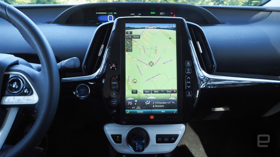
Still, the car looks great, it drives like something more expensive and it's full of some exciting battery and drivetrain technology. What's not to love? Well, it all falls apart when you reach over to the 11.6-inch touchscreen display in the center of the dash.

Toyota's infotainment system looks like it was developed six years ago and never updated. It defaults to navigation, which, unless you have the patience of a saint, is frustrating to use. Typing in an address takes entirely too long, but, worse, the voice recognition system doesn't recognize natural language. You can't say, "Navigate to 123 Main Street, San Francisco, California." Instead, you enable it, then say "Navigation," then say the address, then say the house number, street and city. But that information never seemed to stick with the system, and the car made me repeat the house number, then the street and finally the city again, all via their own individual prompts.
Toyota's companion app, Entune, adds services like Pandora, Facebook, Yelp and others to the vehicle. Like the in-car display, the app doesn't look like it's been updated in a while. In fact, Entune was updated during my review, and I really hoped it no longer looked like iOS circa 2010. Sadly, it still did upon launch.
All of this would be fine if the Prius Prime supported CarPlay or Android Auto. It doesn't. What you're left with is a very large, irritating infotainment system that will play music and work with the Ensure companion on your smartphone, but not much more than that.
The whole infotainment system seems wildly out of place in a car that's the crown jewel in Toyota's hybrid line, which by default is really the automaker's most technologically advanced vehicle. It's a bit like building a spaceship, then putting a CRT television next to the controls. The saving grace is that you can display the energy consumption of the car on the screen and see exactly what's driving the wheels and when you're generating electricity for the battery.

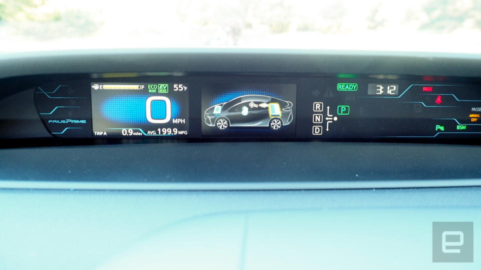
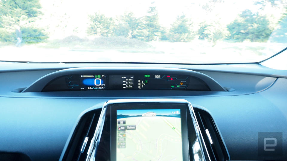
Meanwhile, the instrument cluster (which, annoyingly, is placed in the center of the dash) looks like the high-tech control center for a missile launch. I will admit that initially I felt like it shared an overwhelming amount of information. But after a few days, I found myself quickly navigating through menus via the steering wheel controls while at stoplights. I even started to get used to its placement in the center of the dash, although I'd much rather have all that information in front of me instead of off to the side. But unlike the infotainment system, the navigation and data layout felt modern and sophisticated enough to be worthy of a high-tech vehicle.
Anyone interested in the Prius Prime will have to make a decision about how important a modern infotainment system is or if they want to just put their smartphone on a windshield mount and call it a day.

Yet even with its comically annoying infotainment system, the Prius Prime is an example of how a niche vehicle can evolve into a car that will impress not just tree huggers and the thrifty, but also the average consumer looking for a quality car that looks good. Ironically, the tech savvy might balk at the lack of CarPlay and Android Auto. But hey, Toyota improved the exterior design. Maybe next year they'll fix the dash.
Update: An earlier version of this article indicated that the Prius Prime ships with a Level 2 charging cable for your home. The vehicle ships a Level 1 charging cable.


