Android Wear 2.0 was worth the long wait
The much-anticipated update makes Google’s watch OS faster and easier to use.

When Google introduced Android Wear back in 2014, the smartwatch industry was young. The only players worth noting were Pebble, Samsung (with its Tizen-based offerings) and a few other niche options (like Sony's proprietary SmartWatch OS). Google, however, aimed to kick the door wide open with the same approach it had taken with phones: Instead of making both the watch and the software, it would court different hardware manufacturers, cultivating a diverse set of designs along with a robust third-party app ecosystem.
Three years later, the bet seems to have paid off. Although it's had to fight off tough competition from the Apple Watch, Android Wear has survived and, according to Google, thrived. "If you compare the holiday season of 2016 with the holiday season the year before, we saw more than 70 percent growth," says Android Wear VP David Singleton (not that that's necessarily saying much). And so with all that success comes time for the second iteration of Google's wearable OS, Android Wear 2.0. It'll be available first on the newly announced LG Watch Style and Watch Sport on Feb. 10th and will roll out to compatible existing hardware in the coming weeks.
This update, according to Singleton, is the platform's biggest one since the birth of Android Wear, three years ago. "With 2.0, we really looked hard at what people are using their watches for," he said. "We saw that usage was really focused around watch faces, messaging and fitness. So we really optimized 2.0 for those things." But Google improved a lot of other aspects of Wear as well, including the user interface, navigation and notifications.
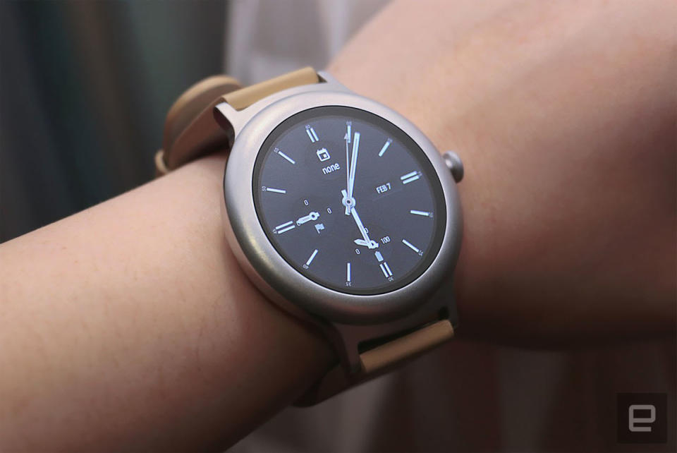
First, let's talk about watch faces. As with the previous iteration of Android Wear, you can swap in whatever face you like, either by selecting it on the companion Android Wear phone app or by adding it directly on the watch. But with Wear 1.0, there was often a trade-off: You could either choose the stylish but barren design or the complex but informative one.

With Wear 2.0, however, you can have the best of both worlds. That's because any watch face, as long as it supports complications, can now be customized with data from any app. Swapping out a complication is as easy as long-pressing it and then picking its replacement, which can be anything from calories burned to an app shortcut.
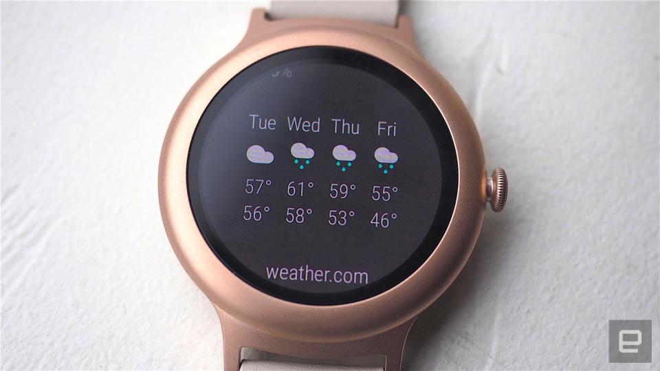
As with Wear 1.0, tapping on each complication brings up the related information card. So for example, tapping the calendar launches the agenda for the day, while the step counter shows how much progress you've made toward your 10,000-step goal.
And say you want different complications for different times of day -- you want the Nest function when you're at home, but not in the office, for example. You can customize different watch faces for different use cases. Switching watch faces is as easy as swiping left or right on the active watch screen, so you can simply change from one to another depending on where you are.
Indeed, the Android Wear team took care to make navigation a priority with the 2.0 update. "We really condensed and simplified things," said Jeff Chang, an Android Wear product manager. "We measured the number of taps and swipes between things, to get that down to as few as possible." So for example, oft-accessed settings are now combined into one display. Swipe down from the active screen and you'll see toggles for airplane mode, Do Not Disturb and as a settings shortcut.

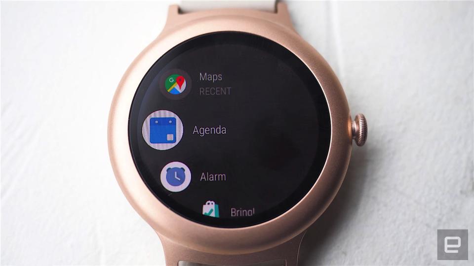
One press of the side button launches the app menu, and navigating through the list can be done either via a rotating crown (if your watch has one) or the touchscreen. If you'd rather not scroll through your lengthy list of apps, you can also long-press a favorite to pin it to the top. The menu will list recently accessed apps first, followed by favorites and then the rest by alphabetical order.
Notifications have changed drastically as well. Instead of glaring white cards that take up the bottom half of the screen, there are now subtler notification icons. Also, the notifications themselves are now color-coded and contextual. So Gmail notifications have a red background, for example, while Hangouts are green. They only appear when you bring the watch up to your eyeline; a few seconds later, the watch face resurfaces again. If you like, you can access all of your recent notifications by swiping up on the main screen. The watch's overall UI is also much darker. "It's not only easier on the eyes, and it's a lot easier on battery life as well," Singleton says.
As for those incoming message notifications, replying is as easy as tapping; do it once and you'll immediately be brought to the reply menu. (Though bear in mind this is the experience on Android; the feature is extremely limited on the iPhone.) In addition to using your voice or drawing an emoji, Wear 2.0 introduces a full-on touch keyboard as well. At first this sounds pretty ridiculous on such a small screen, but it's surprisingly intuitive. You can either swipe through words like you can on Swype or SwiftKey, or you can use handwriting recognition. Either way, I found the word detection to be surprisingly accurate, with only a few errors.
Another way to reply to messages is through Smart Reply, which is powered by Google's machine learning. You'll see a list of what it thinks your reply will be depending on the context of the message. Much like the feature of the same name in Inbox, Smart Reply should be able to offer smarter and better responses over time as it learns more about you.

Speaking of machine learning, Android Wear 2.0 also finally brings Google's Assistant to the watch. Say "OK Google" or long-press the power button and you can ask all sorts of queries, like "How did the Warriors do against the Cavaliers?" or "How many tablespoons are there in a cup?" or "Is it going to rain today?" It can also be easily integrated with third-party connected devices like the Nest thermostat and Philips Hue lights or services like Uber and OpenTable.
Now onto fitness. Android Wear 2.0 has Google's preinstalled Fit app just as before, but the experience is much improved. You can see your calories, pace and distance as you sweat it out, and if your watch has a heart rate sensor, you'll see your beats per minute too. It also keeps track of how much you've been walking and cycling throughout the week and offers gentle reminders to get going toward your goal if you haven't met your mark. Plus, it will congratulate you when you succeed.
The new Google Fit is also a lot better suited to indoor workouts as well. Simply say you're on a treadmill or a stationary bike and it'll track your workout accordingly. Another great feature for strength training fans is that it can also now count reps when you're weight lifting and coach you through push-ups and sit-ups. "The watch actually recognizes that you're doing it," Singleton says. "So there's no cheating."

There's also a special treat if your Android watch has LTE. With Wear 2.0, you'll finally be able to stream music to the watch without having to download the songs first. The default option would be with Google Play Music, but Spotify should be compatible soon as well. You'll probably want to use Bluetooth headphones to listen to your tunes, unless you want to blast your playlist to the world around you as you're running.
Oh, and say you'd like a refreshing drink after you're done with that run. Well, if you happen to be close to an establishment that accepts Android Pay, you're in luck. That's because Android Pay is finally coming to Wear 2.0. So if your watch happens to support NFC, you can just tap it to the reader to pay for that bottle of water.
Last but certainly not least, Wear 2.0 has a completely reimagined app store model. Before, the only way to load apps onto the watch was via a companion app. Not anymore. Now you can browse the Play Store right on the watch and even download certain apps directly, without the need for a corresponding phone app. This is especially useful if you have an iPhone: You'll finally be able to download and use third-party apps regardless of what phone you have. Of course, not all apps can be operated as standalone -- some will still require an Android phone for full functionality. But if you are an iPhone user, you won't see them in the Play Store anyway; only compatible apps will show up on the watch.
On the whole, Android Wear 2.0 is a welcome improvement. It not only looks better but also is much easier to use than before. What used to take several taps and swipes now takes one or two. The new messaging and fitness features are welcome as well. But it's the introduction of Google Assistant and the standalone app store that takes Wear 2.0 from good to great. It makes Android Wear not only much less dependent on the phone but also much more compatible with iOS -- making it the toughest contender against the Apple Watch yet.


