Android Wear is getting a massive overhaul this fall
Better iPhone support, third-party complications and an on-screen keyboard are coming soon.

It's been over two years since Android Wear was introduced, but smartwatches are still very much an unproven commodity. But Google has been making plenty of tweaks and refinements to its watch-based OS to hone the features owners find most useful. Today at its annual I/O developer conference, Google is announcing what Android Wear VP David Singleton is calling its "biggest platform update yet": Android Wear 2.0. It's a visual and functional overhaul organized around the three things Google has found to be most important for Android Wear users.

The core uses for Wear so far are glanceable information, messaging and fitness. Each of those parts of the OS have been improved, but the changes actually reach far beyond just that. "For the very first time, we've been able to take a holistic pass across the design of the entire system and UI to really hone and tune the interactions around key things that people want to do," Singleton says.
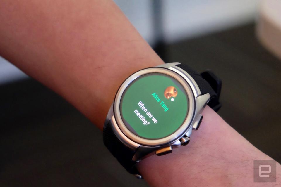
Some of the most profound changes to Wear come under messaging, so let's start there. Many of the changes Singleton outlined go far beyond messaging apps, most notably notifications in general. Gone are the white cards that you'd swipe through to see what info Android Wear is pushing to your watch. Now each card has a dark but colored background as a visual cue to what app wants your attention. Hangouts is dark green, Gmail is red, and so forth.

The bigger change is that notifications no longer take up the bottom 10 percent of your watch face. Instead, if you receive a notification, the next time you raise your watch to your eyeline, you'll see the card slide up into the display as a visual cue. It then recedes and gives you a clean view of the watch face. "It's an obvious but also quite subtle cue that there's something to take action on in the stream of cards, but then it goes away again," Singleton explains.
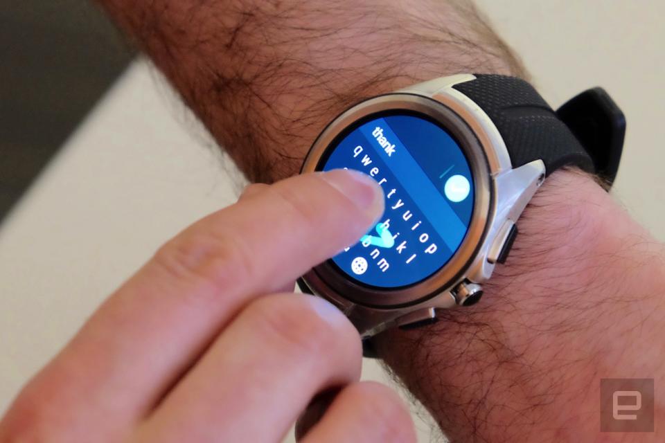
Of course, you can still swipe up from the bottom of the watch face to go through your various notifications and cards -- and there's a host of new features if you want to reply to a message. You can already reply by voice or with the emoji-sketching feature introduced last year, but now Google's gone mad and added a full keyboard, handwriting recognition and smart replies to Wear. All are available to third-party apps, as well.
All three of these new reply features are powered in large part by Google's machine learning. Smart reply works like the same feature in Inbox: After reading your message, the app will suggest salient possible replies that you can just tap to send. If those smart replies don't say what you want, you can sketch letters on the watch screen or use a tiny keyboard to swipe out a message. You can hunt and peck if you want, but swipe seems like a much better experience on such a small screen.

"We've worked really hard to make this work well for small screen devices," Singleton says about handwriting recognition. "Our machine learning techniques recognize both the strokes that I draw, but also if I draw multiple strokes it can actually adapt the word that's being recognized based on the context of what went before." And once you type or swipe a single word with the on-screen keyboard, Wear will start suggesting words to follow it, again based on machine learning. In a lot of cases, you should be able to type or swipe out a couple words and then tap the suggested options to complete your message. I was extremely skeptical of a watch-sized keyboard, but in the brief demo I saw, it worked far better than I would have expected.
There are a few other UI changes, as well. Across the entire system, Google is using swipe-up-and-down gestures to hide navigation and actions. If you pull from the top of the screen, you'll get the "wearable navigation drawer," which lets you move through the various screens in an app. Pulling from the bottom brings up the "action drawer," which is where you'll find buttons to perform specific functions. "Having to give over a lot of real estate to moving between screens or taking actions means that the user has to do more scrolling," Singleton says. "It's harder for apps to just show at a glance the information that you care about."
The next major change to Android Wear was introduced as a fitness feature -- but the implications go far beyond fitness. Any app for Wear can now operate in a "stand-alone" mode, running on the watch itself with unfettered network access. Whether pulling data from your phone's connection, a WiFi network or a built-in LTE connection, these apps can now operate fully untethered from your phone. If you want to go running with just your watch, for example, this means you can stream music from Spotify without having to sync songs in offline mode first.
Furthermore, stand-alone apps mean you'll be able to find and install apps directly from your watch. Previously you had to go through your phone to add new apps. Perhaps the most notable thing about this change is that iPhone users with an Android Wear watch will have access to far more apps. Right now Wear is extremely limited if you're pairing it with an iPhone. But with 2.0, you'll be able to browse and install stand-alone apps straight to your watch, regardless of what phone you pair it with. So far it's been hard to recommend Wear devices to iPhone users, but that may change when Wear 2.0 arrives.
The big fitness-focused change here is a new API called the activity recognition API. As you might expect, this lets the watch better identify what your body is doing at any given moment and launch the appropriate app to track your activity. "If I just start running, within about 10 seconds [fitness app] Strava can launch and show my time, my distance and my pace for my run," Singleton says. "It just launched itself, in the right context." Unfortunately, it sounds like the API only recognizes walking, running and biking, at least for now.

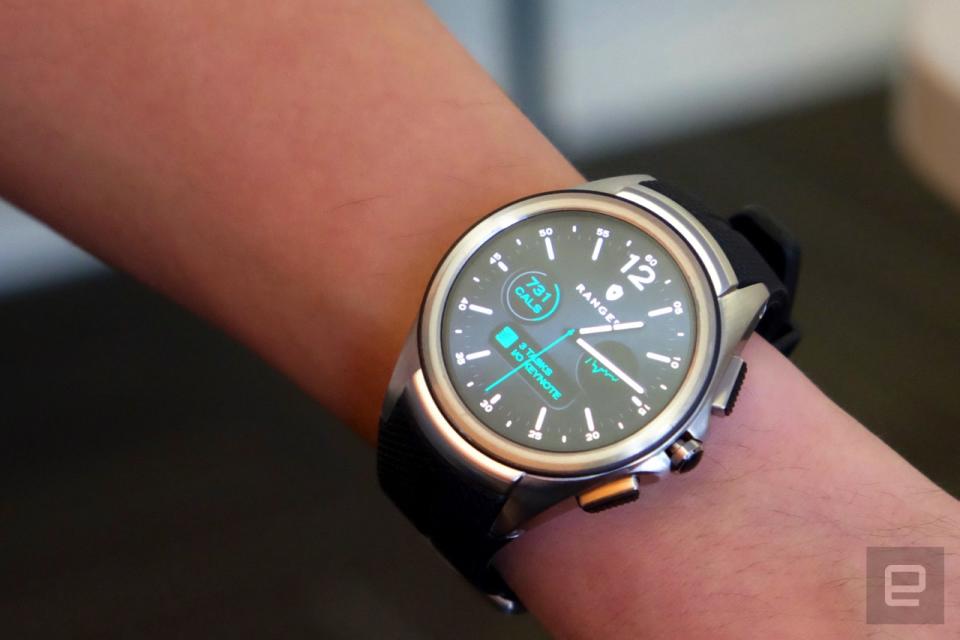
As for glanceable information, Google has built a new complications API that'll let any third-party app display whatever it wants on any watch face. The watch face has to support complications, but once it does, any app can plug into it and share information there. The app developer decides what (if any) data it wants to make available. But if you're building a watch face, as long as it's designed to support complications, any app will work with it.
That's a big change from how things have worked: Developers needed to design and build their own custom faces to share data from their app. And there was no way to have a variety of complications from different apps. Now end users will have a lot more options for customizing their watch to show the info they want to see.
Ultimately, Android Wear 2.0 doesn't radically change the OS: It's still based primarily on your notifications and Google Now cards, with richer app experiences becoming more common. That said, Google is definitely improving what it sees as Wear's most important features. That should benefit all users. The updated UI, notifications and complications will be useful to everyone with a Wear device, and compatibility with the iPhone should take a big step forward. Unfortunately, you'll need to wait a bit to get your hands on version 2.0. Google is seeding it to developers today, but consumers won't get to try it until later this year.
For all the latest news and updates from Google I/O 2016, follow along here.
