Apple CarPlay review: A useful companion, even in its early stages

It's been two years since Apple announced its plot to put your iPhone's core features inside the dash of your car, but only now is its CarPlay software becoming available in lots of new models. In brief, CarPlay allows you to connect your trusty iOS device to a vehicle's infotainment system to make things like texts, maps and music accessible from the console. Sure, the goal is to provide an easier way to use your phone on the road, but it also nixes the distraction of swiping through screens on the phone itself. To put CarPlay through its paces, I hit the highway for a 7.5-hour road trip in a 2016 Camaro SS, a model that'll arrive soon at your local dealer. From Philadelphia to Raleigh, North Carolina, I used it to navigate, find food and stream in-car entertainment along the way. This first version of Apple's software for the car is certainly useful, but as I found, there's room for improvement.
What is CarPlay?

If you missed the chatter surrounding Apple's in-car project, here's a brief refresher. CarPlay makes the items you use most on your phone accessible through the vehicle's built-in touchscreen infotainment system. This means that your contacts, text messages, music streaming, podcasts and, of course, calls are all available without having to pick up your handset. What's more, the phone and text options are voice-controlled by default to further cut down on the would-be distractions. Apple's software doesn't replace the infotainment setup that comes with your car, though. Instead, it adds the option to the existing kit, with the stock features always just a few taps away. If your phone is plugged in when you start the vehicle, however, CarPlay will load over the standard system.
Chevrolet isn't the only manufacturer that's putting CarPlay inside some of its vehicles -- Honda, Cadiallac, Audi, Jeep, Ford, Subaru and others plan to offer it -- but Chevy is one of the first to market. If you're not ready to buy a new car, aftermarket systems from Alpine, Kenwood and Pioneer can bring the software to your current ride at a fraction of the cost. Of course, CarPlay itself is completely free to use; you just need a vehicle or stereo deck that's equipped to handle it.
Setup

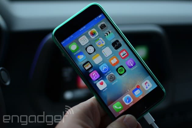
When you first settle into the driver's seat, you have to plug your iPhone in using a Lightning cable and one of the car's USB jacks. After saying "yes" to the push notification asking for the okay to launch CarPlay, you're up and running. That's really it in terms of setup. There's no app you have to download or a switch you have to flip in the phone's settings. You simply plug it in and it works. I've reviewed Bluetooth speakers that took longer and were way more complicated to get working. If you're familiar with the iPhone, you can easily use CarPlay without having to learn how it works or how to set it up. And yes, Apple and automakers are working toward nixing the required cable, but chances are if you get behind the wheel of a CarPlay-equipped vehicle anytime soon, you'll want to make sure you have that accessory handy so you can connect.
In use

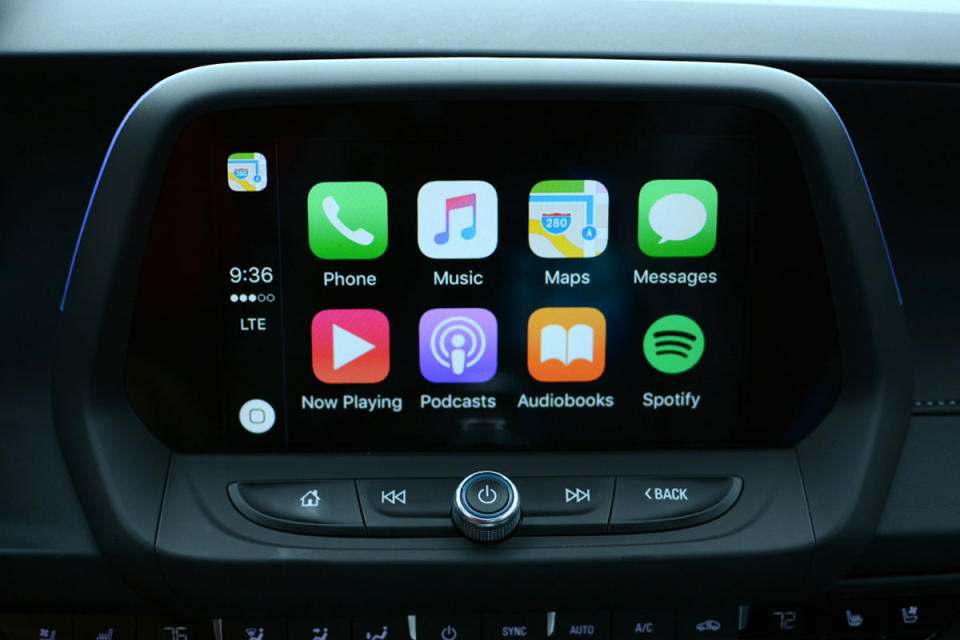
Let's start at the home screen. It's here where you'll see options for making calls, sending texts, finding directions and playing those all-important road trip tunes. As I've already mentioned, you can head back into the car's proprietary system at any time, but as long as your iPhone is connected, CarPlay will appear as a menu item when you need to return. In addition to the calling and texting tools, there are shortcuts to Apple Maps, Apple Music, podcasts, audiobooks and whatever's currently playing over the speakers. If you have CarPlay-compatible apps on your phone (Spotify, in my case), those will appear here as well. As for third-party apps, big names include Audible, Audiobooks.com, CBS News, iHeartRadio, MLB At Bat, Overcast, Pandora, Rdio, Spotify and Stitcher. Don't expect to employ Google Maps, though, as Apple's navigation software is the only option. Yeah, I was bummed about that, too. To be fair, Apple Maps is far better than it used to be, but it's still not as good as Google's navigation software -- in my opinion, anyway.
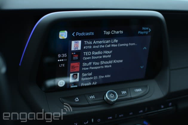
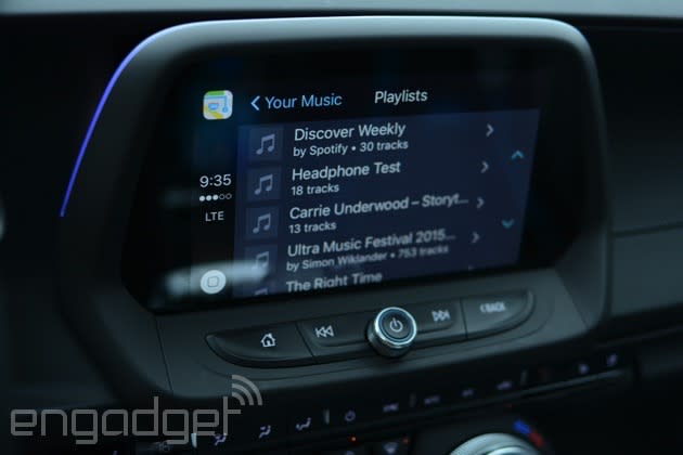
While the app icons are just a tap away on the car's touchscreen, the options and content that CarPlay actually pipes in are quite limited. Normally, this would be a bad thing, but I found it's another feature that cuts down on distractions. Sure, you have to pre-plan a bit if you don't want to choose from the top 10 podcasts from iTunes or listen to a Spotify playlist you've already saved. But it keeps you from perusing menus when you should be paying attention to the road. Want to search that Carrie Underwood album from a few years ago? You'll have to pick up your phone to do it. After you stop the car, of course. The whole system is quite speedy overall, and I only noticed CarPlay struggle to fetch content when I was in a spot with limited 4G coverage.

The options to make a call or send a text are voice-driven by default with the help of Siri. In fact, Apple's virtual assistant is here to lend a hand with a number of things, but best of all, perhaps, is the ability to call home or respond to a text without having to type with one hand and drive with the other. Don't expect to dictate email responses or browse the feed of your go-to messaging or social apps, though. CarPlay won't pull in that content, and that's probably for the best.
Speaking of texts, when you get one, a notification pops up at the top of the touchscreen. Tapping on it will alert Siri and the virtual assistant will offer to read the message. Should you so choose, you can respond by speaking your message intended for the sender. Siri repeats what you said so you can catch any errors. Pretty standard stuff if you're familiar with iOS. It took me a bit to get the hang of it since I drive an older car that lacks fancy voice controls, but once I began to speak clearly and loudly, I didn't have any further issues. Also, CarPlay won't display the actual text messages, so you won't be tempted to glance down and read them yourself. In any case, because this is Siri we're talking about, this feature is useful for sending short quips, but you'll likely want to avoid any lengthy back and forth.

From the home screen you can also ask Siri to do things like look up directions. Sure, you can type in an address manually -- either on the car's display or by picking up your phone -- but a simple "Hey Siri" also does the trick. Again, it's way less distracting while the car is in motion. Once you ask it to find you a route, it usually offers more than one option for you to choose from. Just tap the one you want and you're off. To get back to the home screen to play some music or to update your significant other on your arrival time, you just hit the familiar-looking circle home button in the bottom-left corner.
In fact, holding the home button or pressing the voice control button on the steering wheel will poke the virtual assistant to handle a number of tasks like playing music or grabbing the weather forecast. Siri doesn't dip into third-party apps, though, so you're on your own when it comes to finding the Spotify playlist or Pandora station you're looking for. To keep you from swiping through a bunch of menus or tapping the back arrow a few times, there's a handy Maps icon in the top left for easy access.

If you've spent time in a car that has a touchscreen infotainment system, you know that the user interface is typically pretty awful, design-wise. While CarPlay wraps the in-car system with its clean aesthetics and typography, the usability isn't as good as it could be. The tabbed menus and limited scrolling that I mentioned before force you to jump from app to app a bit. Those limitations can also cause you to spend more time than you should looking for the Spotify playlist you're after. Here's what I mean: I have over 20 playlists saved on the streaming service, but when I scroll through them, CarPlay only shows the first 10 or so. Looking for something at the bottom of your list? It won't be that easy to access. Basically, this looks a lot better than the default interface and limits your access to apps on your phone, but sometimes the simplicity can become its own distraction.
Wrap-up

While the limited access to content and the lack of third-party messaging apps are a bit frustrating, I can understand the reasons for trying to keep distractions to a minimum. CarPlay puts the stuff I tend to use most while driving on the dash and within reach. This means I can play some Big Grams on Spotify or send a text without so much as looking at my phone. In fact, I didn't pick up my 6s once while the car was on the highway from Philly until I pulled into my driveway in central North Carolina. I didn't have a reason to reach for it unless I was stopping to get out. Sure, the software could still create a distraction for those who spend too much time futzing with it, just like a phone or anything else you might have on you. For me, though, it was a safer way to interact with my handset on a solo road trip. Despite a few quibbles with the design and overall usability, CarPlay is still a better way to interact with your phone from the driver's seat than having it in your hand.


