MacBook review: Apple reinvents the laptop again

For months, the internet was abuzz with two similar, and somewhat contradictory, Apple rumors. Depending on whom you believed, the famously secretive company was working on either a 12-inch "iPad Pro" or a Retina display MacBook Air. To date, neither of these products has materialized, but there's reason to believe that both rumors were actually pointing toward the new 12-inch MacBook. The laptop, which goes on sale tomorrow, is in many ways a traditional notebook, with an Intel processor, OS X and a unibody aluminum enclosure similar to what you'll find on the MacBook Air and Pro. At the same time, it takes some cues from the iPad, including space gray and gold color options, and a slim, fanless design that makes room for just one miniature USB port. With the lid shut, it looks at once like a tablet with a keyboard attached, as well as the two-pound computer that it actually is.
It's the future of laptops, at least as Apple sees it, but it's also not without compromises: To build a machine this compact, the company had to reimagine everything from the keyboard to the trackpad to the components inside. And yes, the port selection, too. All that in the name of building the thinnest and lightest MacBook ever, not to mention the smallest one with a Retina display. In many ways, it's aimed at the same person the original Air was: a loyal Mac user who wants the most portable laptop that money can buy. But are you that person? And even if you are, is it worth the $1,299 asking price?
Look and feel

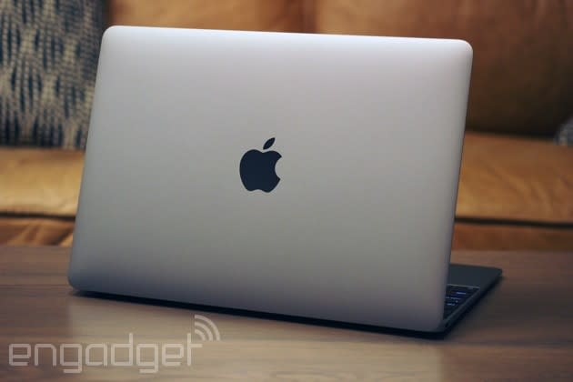
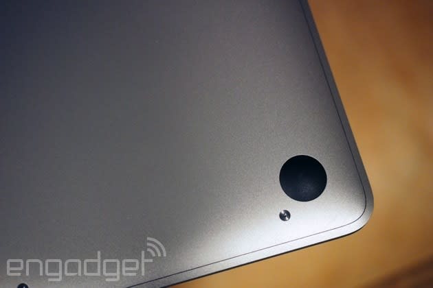
The 12-inch MacBook is exactly what it sounds like: a tiny MacBook, akin to the existing Air and Pro. It has a similar unibody aluminum enclosure, complete with a spacious glass trackpad and black keys against a metal keyboard deck. (Stop me if you've heard that before.) Still, this new machine is markedly skinnier than any other MacBook you've seen: just 13.1mm (0.52 inch) at its thickest, tapering down to a razor-thin 3.5mm (0.14 inch) -- about as thick as a stack of four credit cards. Particularly since there's no plastic hinge on the back, like on the Air, the MacBook basically looks like an iPad when it's shut. Speaking of the sort, this is the first time in years an Apple laptop has been available in anything but silver; it will also be sold in space gray and even gold. As much as I would have loved to get my hands on a gold unit (imagine how my photos would have come out!), I prefer the darker space gray color; it's the one I'd get for myself if I were going to buy one.
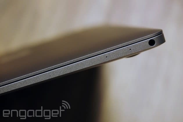
The other reason for all these iPad comparisons: The new MacBook barely has any ports. Just a standard 3.5mm headphone jack along the right edge, and a single USB Type-C connection over on the left. And... that's it. No SD card slot, no display outputs. Not even any full-sized USB sockets. It's a sparse setup, not unlike on an iPad, and it reminds me of the original Air too -- remember how pissed everyone was about the fact that it only had one USB port?
Before I get ahead of myself, though, let's take a step back and talk about USB Type-C. You may have already seen these miniature ports on other machines like the new Chromebook Pixel, and you're bound to see them on many more laptops in the future. In case you need a refresher, though, USB Type-C is a relatively new standard, with a smaller opening than full-size USB Type-A ports, and a reversible design allowing you to plug in a cable any way you like. Aside from that, the other main benefit to USB Type-C ports is how versatile they are. The USB socket here isn't just the charging port; it also supports DisplayPort 1.2 video output and is compatible with HDMI and VGA displays, with the help of an adapter. Eventually, the standard will be ubiquitous; I look forward to the day when I can charge my laptop and phone using the same cable. With time, too, we'll see more and more third-party accessories that use USB Type-C, no adapter required.
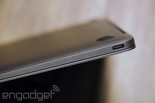
That's the thing, though: While USB Type-C ports will one day become industry standard, they're still uncommon enough that you will need a dongle to plug in any of your peripherals that use a full-sized USB Type-A connector. In my case, that meant I couldn't charge my phone off my laptop. I also couldn't use the USB headset I normally wear while podcasting and making voice recordings. If I did want to use my USB gadgets, I would have had to plug in a $79 adapter -- that's right, it's not even included in the box. Again, I expect USB Type-C will one day be the norm, and it's possible that your needs are simple enough that you can already live without the full-sized USB ports.
For now, though, it feels like either Apple is ahead of its time, or it had to settle on a single, not-that-common port for the sake of building a super-skinny machine. All things considered, I would prefer a setup like on the Chromebook Pixel, which combines a pair of USB Type-C ports with two traditional USB Type-A ones. But the Pixel is a thicker machine with a bigger footprint; that kind of port layout wouldn't have worked on a machine as tiny as the MacBook. And that's fine, I guess -- I just don't buy it when Apple tries to spin the one-port design as a good thing.
Display and sound
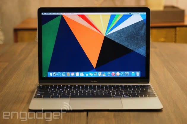
With a weight difference of around a third of a pound, the main reason to buy the MacBook over the 11-inch Air isn't necessarily size, but screen quality: This machine brings with it a 12-inch Retina display with 2,304 x 1,440 resolution, or about 3 million pixels. As ever, it's a lovely, lovely panel, with rich colors and wide viewing angles, whether it's from the sides, with the machine on your lap, or with the screen dipped forward, as if you were balancing it on an airplane tray. Every time I use a Retina display machine, I wish that every Mac, even the lowly Air, had a screen this nice.
The audio quality is also robust -- surprisingly so. Any time I see a machine this small, I assume until proven otherwise that the audio will more or less be an afterthought and indeed, the thin speaker grille above the keyboard doesn't look like it packs much punch. In fact, though, I found that five or six out of 16 audio bars was plenty in a quiet room. The quality was also balanced enough that I had a good time streaming Spotify for hours on end; I never wished I had a bigger laptop or a set of external speakers.
Keyboard
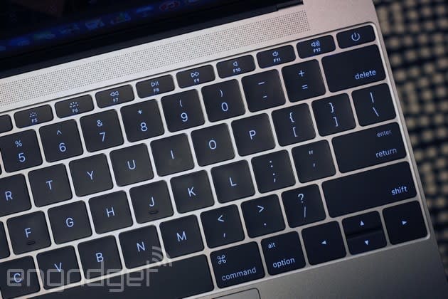
At first glance, the keyboard here doesn't seem very promising: It's so flat that the buttons basically sit flush with the keyboard deck. In other words, it's a big departure from the relatively cushy keys we're used to on the MacBook Air and Pro. Then you try it, though, and you realize it's not nearly as uncomfortable as it looks. It's quite nice -- and in some ways it's an improvement over traditional laptop keyboards.
As it turns out, although the buttons are indeed flat, there's actually a lot going on beneath the surface. Despite the fact that the keyboard is 34 percent thinner, the keys feel remarkably springy and well-supported. As Apple describes it, the trick here was using a custom "butterfly" mechanism that keeps the keys stable and level when you press down on them. The alternative would have been the sort of "scissor" mechanism used on many Ultrabook keyboards. Suffice to say, I'm glad Apple didn't go that route: Too many of the ultraportables I've tested have limp, lifeless keys that wobble and flop around in their sockets. Worse, I frequently have to go back and re-type things on those machines -- and that's precisely because the uneven scissor mechanism causes one side of the keycap to hit the bottom before the key press can actually register.
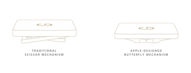
Image credit: Apple
On the new MacBook, though, the keys feel firmly attached in their sockets, and I rarely, if ever, have to go back and re-type something that didn't stick the first time around. Whereas other Ultrabooks I've used have taught me to type slowly and deliberately, so as not to miss anything, with the new MacBook I'm free to type at a fast clip. My hands feel more relaxed too, because I know I don't have to mash the buttons to ensure a key-register. Much like with the iPhone's onscreen keyboard, which was met with initial skepticism, you just have to trust the MacBook's flat keyboard; it's more effective than it seems at first glance, but you won't fully appreciate that until you try it yourself.
It also helps that the individual keycaps are larger than they would be on other Macs. Specifically, they have a 17 percent larger surface area, making it more likely that you'll hit the button you meant to hit. Even the arrow keys -- usually the first casualty of keyboard redesigns -- are easy to find by feel. Also, they have a deeper curvature than previous MacBook keyboards, allowing Apple to "increase the scoop by 50 percent." (Hokay!) As a result of these larger buttons, the keyboard stretches from one edge of the chassis to another, with barely any space left over on either side. This, it seems, was a necessity: How else was Apple going to squeeze all those big keys onto such a small system?
All told, I still prefer the Air's pillowy keyboard to the one on the new MacBook, but I could easily use either as my daily driver. Both are a clear step up from the flat, gummy keys used on typical Ultrabooks.
Trackpad
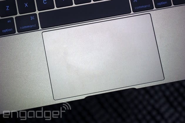
Along with the new 13-inch MacBook Pro, the MacBook is the first laptop in Apple's lineup to come with the "Force Touch," a pressure-sensitive trackpad that responds differently depending on how hard you press. For instance, you can bear down on a word in Safari to see a dictionary definition or a Wikipedia preview. A hard press, or a "Force click," on an address in the Mail app will give you a pop-up map. You can also long-press on items in Finder to preview them or, my personal favorite, Force-click the skip buttons in iTunes and QuickTime to fast-forward or rewind at up to 60x the normal speed. In addition, Apple has released an SDK to developers allowing them to incorporate this feature into their apps, though as of this writing, certain popular downloads like Chrome don't have it yet.
I said this in my recent review of the new MacBook Pro, but I'm not convinced most of these pressure-sensitive gestures are actually useful. Even now that I've had several weeks to play with Force Touch, on both the Pro and the MacBook, I still can't always pull off the "Wikipedia preview" thing in Safari on my first try -- sometimes I merely highlight the word; sometimes I succeed in pulling up the preview box. In any case, in the time I spend futzing with that, I could easily just Google whatever it is in a separate browser tab -- in which case I get not simply a preview, but a full site with all the information I'm looking for. With Finder, I can press down to see a preview of a file, and then, if I press even harder, that preview stretches from a small thumbnail to a full-size image. It's a clever feature, but that two-step press feels inefficient; it was far easier to use the space bar to open and close file previews. If anything, I find the speedy fast-forwarding to be the most practical use case, and even then, I didn't use it often.
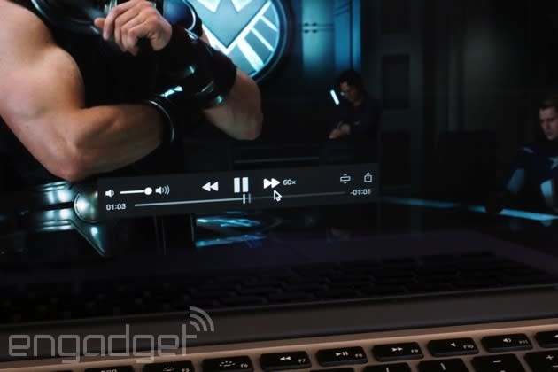
The Force Touch trackpad in action on the new 13-inch Retina display MacBook Pro.
Gimmick or not, there's another benefit to the Force Touch touchpad: It's thinner than the one used on the MacBook Air or older Pro models. In fact, I'm not even sure the old "diving board" trackpad would even fit on a machine this skinny. So how did Apple pull that off? Easy: Make it so that you can't actually click on the touchpad anymore. That's right, when the machine is turned off, the Force Touch pad is actually just a stiff sheet of glass that barely moves when you press down on it. Once you turn the machine on, though, Apple fools you into thinking you're actually clicking something. The secret: a "taptic engine" that delivers vibrating haptic feedback to simulate a button press.
It's an impressive trick; I often forgot I wasn't really clicking anything. Still, it doesn't feel like a "normal" button press, if by "normal" we mean the way a regular MacBook Air or Pro trackpad feels. The button here, as it were, feels much shallower than on a traditional diving-board touchpad, where you can only bear down on the bottom of the trackpad. Here, you can press anywhere on the pad, but it never feels like your finger is going down very far. The good news is, you get used to it. Some of this comes with time, although I also found it helped to enable tap-to-click. Ultimately, I find it easier to forgive the new trackpad here than I did with the 13-inch Pro. For all its shortcomings, the Force Touch allows the new MacBook to be thinner than it might have been otherwise. The MBP swaps in a new, less comfortable touchpad, but isn't any thinner or lighter for it.
Performance
OS X benchmarks | Geekbench | Xbench | Battery life |
|---|---|---|---|
New MacBook (1.1GHz Intel Core M, Intel HD Graphics 5300) | 3,891 (32-bit) / 4,425 (64-bit) | 388 | 7:47 |
13-inch MacBook Pro with Retina display (early 2015, 2.7GHz Core i5, Intel Iris 6100) | 6,293 (32-bit) / 7,062 (64-bit) | 487 | 11:23 |
13-inch MacBook Pro with Retina display (late 2013, 2.4GHz Core i5, Intel Iris graphics) | 6,288 (32-bit) | 428 | 11:18 |
13-inch MacBook Air (mid 2013, 1.3GHz Core i5, Intel HD Graphics 5000) | 6,021 (32-bit) | 304 | 12:51 |
In order to achieve such a compact design, Apple went with Intel's new power-sipping Core M chips, whose 14nm design has made possible other thin and light laptops, like the Lenovo Yoga 3 Pro. In addition, Apple also had to redesign the logic board, which is now 67 percent smaller than on the 11-inch Air. The result, as we've already seen, is an insanely lightweight laptop with zero fan noise, though the trade-off is that Apple couldn't use the same heavier-duty Core i5 and i7 processors that it does on the MacBook Air and Pro.
This means the new MacBook will have slightly slower performance, and indeed, that's borne out in benchmark tests. Still, depending on how you plan to use the computer, you might not even notice. According to my stopwatch, the laptop takes just seven seconds to cold-boot into the login screen, making it about twice as fast to start up as the new 13-inch Retina display MacBook Pro. The solid-state drive, meanwhile, which is based on the faster PCI Express standard, delivered average read speeds of 738.2 MB/s in the Blackmagic test, along with average writes of 451.7 MB/s. Mind you, that was under the heaviest load that test allows for: five gigabytes. Even then, the MacBook's transfer speeds are faster than most of its rivals -- and that includes other machines with PCIe SSDs. In addition, the MacBook comes with 8GB of RAM, allowing for swift multitasking and app load times.
So if startup and transfer speeds aren't a problem, where's the performance hit? As far as I can tell, graphics performance suffers the most. That's not surprising considering Intel's beefier fifth-gen "Core" chips have two-thirds of their die area dedicated to graphics, and deliver the biggest performance gains in tasks related to graphics processing. With Intel HD 5300 graphics (as opposed to HD 6000 on the latest MacBook Air), the new MacBook only reached an average of 21 frames per second in the six-year-old Batman: Arkham Asylum, and that was with medium detail, anti-aliasing disabled and the resolution fixed at the default 1,440 x 900 (as opposed to the max option of 2,560 x 1,600). In other words, it struggled even with moderate settings in an aging game. As I discovered, too, playing games causes the bottom side of the laptop to get hot, especially back toward the hinge.
That's probably to be expected during gameplay, but I also noticed overheating even in more mundane use. Which is surprising, since the processor only draws five watts of power; it's not supposed to get hot. At one point during my testing, I was typing this review in a Chrome browser tab while streaming music through the Spotify desktop app. I only had three browser tabs and three applications open, and yet the heat coming off the bottom side was so intense that at one point I could feel it through my pant legs. To Apple's credit, when the machine does heat up, it tends to subside within a few minutes. Again, though, as I discovered while using Chrome and streaming music, it's not always easy to predict in the first place what's going to trigger these temperature spikes.
Battery life
Battery life | |
|---|---|
New MacBook | 7:47 |
MacBook Air (13-inch, 2013) | 12:51 |
HP Spectre x360 | 11:34 |
Apple MacBook Pro with Retina display (13-inch, 2015) | 11:23 |
Apple MacBook Pro with Retina display (13-inch, late 2013) | 11:18 |
Chromebook Pixel (2015) | 10:01 |
Samsung ATIV Book 9 Plus | 8:44 |
Dell XPS 13 (2015) | 7:36 |
Lenovo Yoga 3 Pro | 7:36 |
Acer Aspire S7-392 | 7:33 |
Microsoft Surface Pro 3 | 7:08 |
Apple rates the MacBook for up to nine hours of web surfing or 10 hours of iTunes video playback -- in other words, the same claims it makes for the 11-inch Air. That's an ambitious promise on Apple's part, considering the 11-inch Air has a much lower-res screen. The more pixels to light up, the shorter the runtime, right? Usually, but in this case, Apple took extra measures to help compensate for the MacBook's pixel-dense Retina display. For starters, there's that low-power Core M processor; the one that sips just five watts of power. In addition, Apple created a new kind of "terraced" battery that does a better job filling out the laptop's interior, allowing for 35 percent more capacity than a typical rectangular battery, according to Apple. In addition, the company used individual lights underneath each keycap, as opposed to the old kind of backlighting technology that allowed light to bleed out from between the buttons. Finally, Apple says the screen's LED backlight is 30 percent more energy efficient than the Retina display on any other MacBook, thanks to redesigned pixels that allow more light to pass through.
I never did quite make it to the "10 hours of video" mark. The closest I got was nine hours and five minutes, which required lowering the brightness to four of 16 bars. What's interesting, though, is that Apple actually tests the battery with the brightness set at 12 out of 16 bars, or 75 percent, according to a footnote on its website. With the brightness set to 65 percent (similar to how I test Windows PCs), I got seven hours and 47 minutes of continuous iTunes video playback. While the battery life isn't as long as Apple said it would be, it's at least in line with what we've seen from some bigger, heavier 13-inch systems. When you think of it that way, nearly eight hours of video playback on an 12-inch system ain't bad.
Configuration options and the competition
The new MacBook goes on sale tomorrow, April 10th, which means as of this writing it's not listed in the online Apple Store. It will start at $1,299 with 256GB of storage, and there will also be a $1,599 model with a 512GB SSD. There's also a slight difference in processors -- one comes with a 1.1GHz Core M chip, while the other steps up to a slightly faster 1.2GHz CPU. That said, they're both configurable with a 1.3GHz processor, and both come standard with Intel HD 5300 graphics. Other than that, everything -- the Retina display, battery life, 8GB of RAM -- is the same.
So far, it should be obvious that there's nothing else quite like the new MacBook... in Apple's lineup, anyway. But look and you'll find a few similar options from other laptop makers as well. Perhaps the best comparison would be to the new Samsung ATIV Book 9, a 12.2-inch fanless laptop that also uses Intel's Core M processor and has a similar 2,560 x 1,600 display. It weighs 2.09 pounds -- virtually the same as the new MacBook, and measures 0.46 inch thick, making it slightly thinner than the new MacBook. It's also rated for longer battery life (up to 12.5 hours), although I haven't yet tested this claim first-hand. And yes, if you're wondering, it has full-sized USB ports -- two of 'em. The ATIV Book 9 starts at $1,200, around the same price as the MacBook, but for the money, it has half the storage (128GB) and half the RAM (4GB).
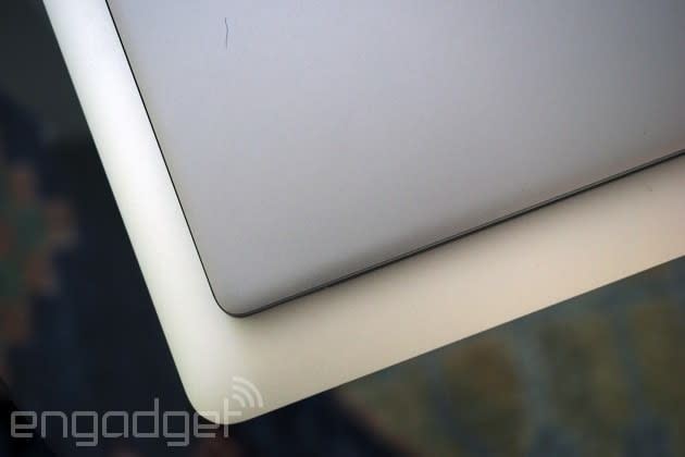
The Dell XPS 13 crams a 13-inch screen into the body of an 11-inch laptop, making it nearly as small as the new MacBook. For scale, it's pictured here next to a 13-inch MacBook Air.
There are other options too, but be prepared to make some trade-offs. The new Dell XPS 13, for instance, has a 13-inch screen stuffed into the body of an 11-inch laptop. In terms of its footprint, then, it's about the same size as the new MacBook, and it also has a similarly sharp 3,200 x 1,800 display option. It also has slightly longer battery life, along with beefier fifth-gen Intel Core processors and a wider selection of ports. The catch: It's 30 percent heavier, at 2.6 pounds. Also, if you do want it with that sharp display, it costs $1,300, right in line with the new MacBook, but at that price it comes with half as much storage. If you want, you can also get it with a 1080p screen for $800, and the battery life would be longer too. Again, though, you'd be giving up the Retina-caliber display. You can't have it all.

The Lenovo Yoga 3 Pro also measures about a half-inch thick and uses one of Intel's low-power Core M processors, but it weighs nearly two-thirds of a pound more, mostly because it has a 360-degree hinge.
It's a similar story with Lenovo. The Yoga 3 Pro weighs 2.62 pounds and measures a half-inch thick -- and that's with a 360-degree hinge that allows you to fold the screen back into tablet mode. It, too, has a fanless design with an Intel Core M CPU, along with a 3,200 x 1,800 screen. As with the XPS 13, it has several full-sized USB ports. It also starts at $1,149 with 8GB of RAM and a 256GB SSD, meaning it offers better specs for the money than just about any of its rivals. On the downside, the battery life is slightly shorter than on the MacBook. It's a great option if you want a lightweight machine that can double as a tablet. If not, you're better off with the new MacBook or the Samsung ATIV Book 9; both are lighter, and the Samsung almost certainly has longer battery life. Additionally, Lenovo is getting ready to ship the 1.72-pound LaVie HZ550, which packs a Core i5 chip and an optional 2,560 x 1,440 screen. But, it feels flimsier than the MacBook, and last we checked, it was rated for somewhere between seven and eight hours of video playback. That means the runtime is likely on par with, or worse than, the new MacBook.
Lastly, the new MacBook may face some competition from yet another machine in Apple's lineup: the 11-inch MacBook Air. On the one hand, it's a lot cheaper, at $899, but that lower price comes with a markedly lower-res screen (1,366 x 768). Still, there are plenty of reasons someone might get this instead. The battery life should be about the same; it runs a more powerful processor; it has full-sized USB ports; and it only weighs slightly more, at 2.38 pounds. The Air is still the better choice for the masses; the new MacBook is the one to get if portability and screen quality matter above all else.
Wrap-up
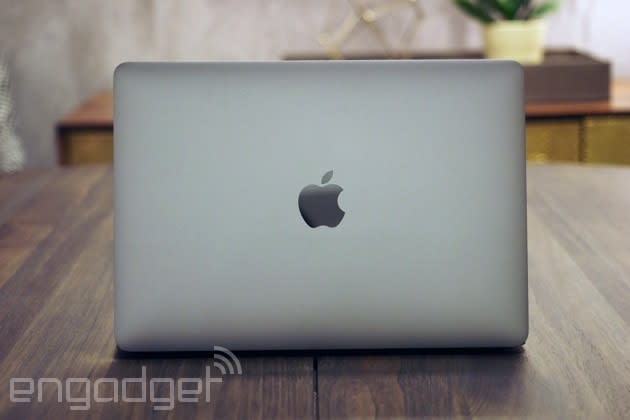
It's not for everyone, but if it's anything like the Air, it might one day become the standard.
At the top of this review, I compared the new MacBook to the first MacBook Air. But that's not totally fair, because even in its first generation, the 12-inch MacBook is a much better product than the first Air was back in 2008. Whereas the original Air suffered from problems like short battery life and spotty wireless performance, most of the design decisions Apple made on the new MacBook are smart; well-thought-out. Even though Apple went with a less-powerful processor than on the current Air, this new model still delivers brisk boot-up times, quick disk speeds and fast everyday performance. Although the keyboard is flatter than on other Macs, it's almost as comfortable to type on; in that respect, I could easily make the new MacBook my daily driver. Also, despite having such a pixel-dense display, it has roughly the same battery life as the similarly sized 11-inch Air. Again, most of the compromises actually seem to have paid off.
The two exceptions are the trackpad and the absence of full-sized USB ports. Don't get me wrong, the Force Touch pad is usable, and I realize it's one of the reasons Apple was able to build a laptop this thin. I'd even go so far as to say that Apple deserves credit for being able to simulate a button press on a trackpad that doesn't actually move. Still, it's not as comfortable as the trackpad on the MacBook Air and other laptops. It's a similar story with ports. I'd much prefer a setup like on the Chromebook Pixel, which offers a mix of full-sized and USB Type-C sockets. Alas, it seems that Apple's decision to include just one port, and not even a common one, was a concession made for the sake of achieving a slim design.
Much like the original Air, the new MacBook is expensive, and it's not for everyone. In particular, it's for well-heeled shoppers who demand the most portable machine possible, and who also don't want to compromise on screen quality. That might not be persuasive to would-be Windows users, who have several compelling alternatives, many with equally sharp screens and a bigger selection of ports. But for loyal Mac fans who wouldn't dream of switching, the new MacBook is by far the lightest-weight machine in Apple's lineup, especially with this caliber of screen. It's not for everyone, especially not right now, but if it's anything like the Air, it might one day become the standard.
Edgar Alvarez contributed to this review.


