LG Watch Urbane review: a premium watch that falls short of greatness
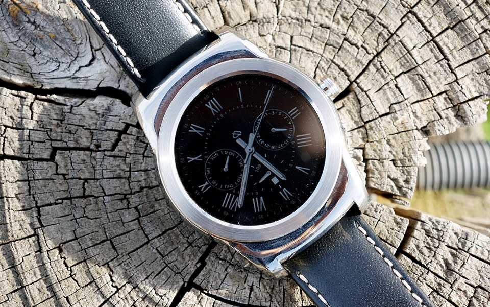
There are only a few companies out there with as much experience making Android Wear watches as LG. After all, the platform's only been part of the public consciousness for a year and yet this Korean giant has already made three of them. Its first sequel -- the G Watch R -- was a marked improvement over its dull, plastic predecessor, but the progress isn't quite as clear with the new Watch Urbane. Sure, it's running a fresh version of the Wear operating system, with some neat new features that haven't yet trickled down to the rest of Google's wearable ecosystem. Hell, it's even got a look that's meant to rival the Patek Philippes in your collection. All that said, after over a week of testing, I still couldn't help but want more out of the Urbane, and you probably will too.
Hardware
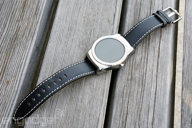
We can keep this part brief, if you're in a hurry: The Watch Urbane is mostly an aesthetic upgrade from the company's last attempt. A heartfelt sorry to everyone who loved the subdued, dark chassis of the G Watch R -- there's very little of that chromatic subtlety here. The stainless steel Urbane is available in both gleaming silver and brassy gold finishes for $349 a pop, making them far and away the most expensive Android Wear watches out there. I've been testing the silver model for a week now, and I'm terribly grateful for my luck. The gold version (which we tried on back at MWC) is so garish, some of you will have to shield your eyes when looking at it. Beyond all that curb appeal, though, lies a very familiar beast. The Urbane sports the same 1.2GHz Snapdragon 400 ticking inside as last year's GWAR (as I've come to call it), along with the same 512MB of RAM and the same 410mAh battery, just inside a more premium shell. That'd be a bigger deal if the GWAR was some pokey little chump, but it wasn't then and still isn't now. (I'll dig into how well the whole shebang actually works in just a bit). Still, we haven't yet hit the ceiling for what we can cram into our wrist computers, and it'd be nice if the $100 premium actually yielded some technical improvements.
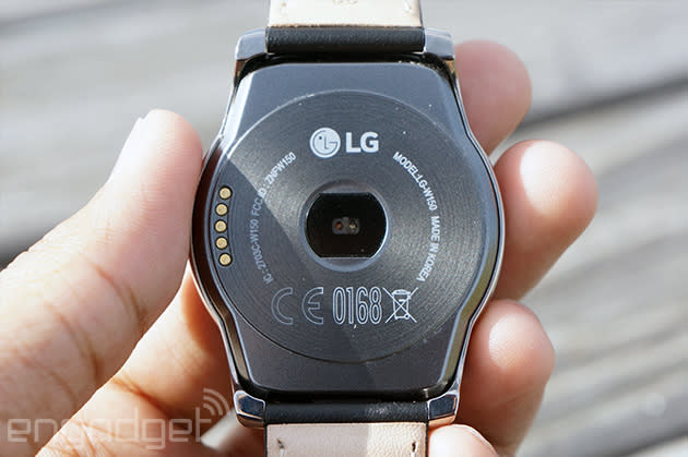
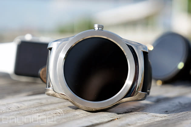
For a timepiece that's meant to be an upscale counterpart to the G Watch R, though, it isn't exactly a dramatic leap forward in design. The Urbane has cleaner lines than the chunky Watch R and the bezel encircling the round screen have been trimmed down just a hair. Even better, the truly heinous hour markers have been excised completely, leaving behind nothing but brushed, spotless metal. The thing is, even though the main, round section of the Urbane's body is pretty small, the lugs (also known as the bits that the watchband locks into) jut out straight from the rest of the body, making it feel wide and a little unwieldy. Maybe if you've got a seriously tiny wrist, the Urbane will feel like a slab latched to your arm, but mine is pretty petite and even I was able to manage. That's at least partially because the 22mm leather strap that ships with the Urbane is comfortable and handsome (I especially dig the contrasting stitching), if a little stiff at first. LG's gone a little gaga over the leather lately, but it's simple enough to swap straps with the right tools and just a modicum of patience.
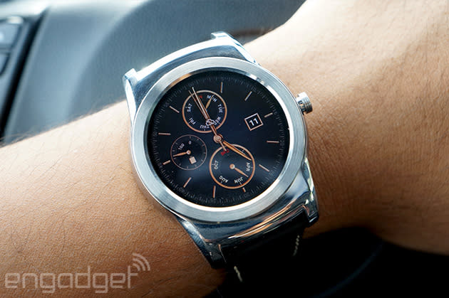
I'm not terribly thrilled by the Urbane's screen, though. It's essentially the same as the P-OLED one we saw in the GWAR last year, meaning it's 1.3 inches across and produces some vibrant, natural colors when the occasion calls for it. That makes it smaller than the Moto 360's display (hooray for higher pixel density!) but it's not as bright either. The lack of an ambient light sensor to automatically crank screen brightness up or down is a curious misstep too -- for a watch that's meant to help streamline your day-to-day doings, having to fiddle with the settings when you enter a building or go outside doesn't make sense. To be fair, the GWAR didn't have one either, but surely it wouldn't be too much to ask of a watch that costs $349, right? While we're on the subject of things the Watch R didn't have, you can now bypass your phone completely since the Urbane has a working WiFi chip and antenna (more on that later). The last part of the Urbane equation is the tiny magnetic puck that charges it. It lacks the elegance of a wireless charging system (a la the Moto 360), but it gets the job done and doubles as a place to stick your loose paper clips.
In use
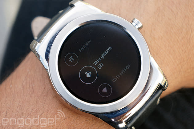
My days with the Urbane -- and just about any shiny wrist computer -- were spent seeing how it fit into my life and also running the thing into the ground. The latter was, unsurprisingly, more fun. We can't talk about how the Urbane package works, though, without first digging into the updated version of Android Wear it runs. The broadest strokes remain unchanged here, so you'll be swiping through cards and pulling down the Quick Settings shade and telling Google to do things. (An aside: I love that Google's voice recognition renders this thing's name as "Washer Bane.") Anyone who's so much as watched someone use Android Wear will feel comfortable with an Urbane strapped to their wrist. So what does the update bring to the table?
Gesture controls, for one. Once enabled, you can quickly rotate your wrist forward to scroll down through your list of notification cards (but not your list of apps, strangely). Winding up and then jerking your wrist in the opposite direction takes you up through your list of cards. They're nice to have in theory, but they're hardly ever better than just flicking at the screen with your finger. Chances are you just had to touch the screen to interact with cards in the first place, so why not just keep touching it? It's faster, not to mention more natural. (That fingering a touchscreen has started to feel "natural" is a rant best saved for another time.) The other thing is, they'll only work when the screen is awake in the first place; kind of a tricky proposition if your hands are really full. If you absolutely, positively can't spare another hand to unlock the screen, you can try snapping your wrist around more to wake it up, but it usually took no fewer than three times to actually make it happen. That said, it's not completely useless: The gestures came in handy precisely once, while I was furiously scouring a crusty baking dish.
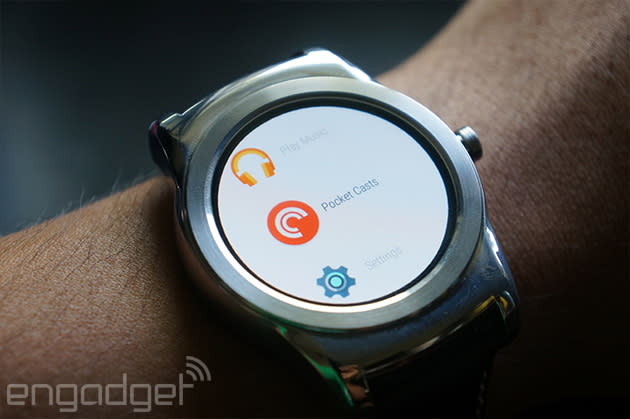
Sadly, those gestures don't extend to another new facet of the Android Wear experience: a full-blown app list. In its earliest days, Wear basically insisted that you bark out a command at your watch, which would then figure out what app was already connected to that action. "OK, Google, tell me my heart rate," for instance would inevitably fire up Google Fit or LG Pulse, or whatever you'd assigned as the best choice from your phone. Now, though, you can just flick through a list of Wear apps you've already installed and leap right into the mix. It's a welcome change -- there's no more hesitation when you want to do something slightly more arcane -- but it is a pretty interesting interface concession on Google's part. It's probably for the best, though, considering some of the common issues that still pop up when talking to your Watch.
There were a few times when I'd speak some responses aloud and get a big, friendly checkmark to confirm they've been sent, only to get a notification card moments later saying they actually haven't gone anywhere. (Minor niggle: I hate that Google's voice-to-text engine won't properly capitalize my first spoken sentence, but handles the rest just fine.) At that point, I had to fire up the Hangouts app on the phone, and wouldn't you know it? The logjam chose that moment to break loose and all of the messages would get sent at once. My ASUS ZenWatch and Moto 360 were guilty of this too, so it hardly seems fair to crucify the Urbane, but man, Google, there's got to be a better way to handle this. Beyond that and the occasional Android Wear crash, swiping around and actually using the Watch is as smooth and reliable as ever -- the Snapdragon 400 chipset isn't showing its age just yet. Turns out, the Urbane is even pretty good at sussing out stuff you draw on-screen. Another recent addition to the Wear formula is improved emoji support, which you can either select from a list (boring) or render a rough approximation of one with your finger. It does a fine job of figuring out what you were going for, but I never managed to remember how to draw the funnier ones I prefer peppering my dumb conversations with.

Also new to the fold is a low-power mode for most of LG's (generally quite pretty) stock watch faces. Now, when you clamp your hand over the screen to turn out the lights, you'll be treated to a full-color watch face (sans second hand) ensuring for the first time that your watch actually looks the way it's supposed to when you're not using it. They're all pretty legible under the unrelenting spring sun, too, though you'll have to squint and/or fire up the Brightness Boost mode to help get you through those moments when the sun's directly overhead and you're feeling sort of miserable because of it.
Like I mentioned about a thousand words ago, you can connect the Urbane straight to a WiFi network (if it's secured, you'll have to complete the process on your phone) to keep the notifications rolling in. This part, thankfully, works just fine. I'd occasionally forget to grab the Android phone the Urbane was lashed to on my way out the door in the morning, but the steady hum of messages and Swarm updates resumed without hesitation once I wandered into our New York City office. Since it's easier than ever to keep the Urbane connected to something, I was worried that battery life might take a hit as a result. That's not exactly the case.
Gauging the battery life on smartwatches is always a bit tricky, since everyone uses them a little differently. While pretending to be a power user -- responding to every message I could using my voice, running apps to kill time here instead of whipping out my phone, cranking brightness all the way up to fight solar interference -- I found the Urbane would stick around for just under a full day. When I just focused on using the Urbane as a watch by keeping app usage and notifications to a minimum, I could squeeze way more out of it than expected. After one sad day when absolutely no one wanted to talk to me, the Watch leapt between Bluetooth connections to my phone and my home WiFi network for nearly two full days before finally taking a trip back to its magnetic charging cradle.
The competition
If your wallet has seen better days and you're still clamoring for a Wear watch, you might consider ASUS' ZenWatch. It'll set you back a relatively scant $200, and while it doesn't have niceties like a wrist-facing heart rate sensor (it's baked into the bezel instead), the surprisingly stylish ZenWatch does a respectable job of blending in with your wardrobe. Then, of course, you've got LG's own wares to consider. The $249 G Watch R is still one of our favorite Android Wear devices, and there's a decent chance you'll prefer its slightly less ostentatious looks. Save for the hardware-centric bits like WiFi connectivity, all of the new software tweaks found on the Urbane will find their way onto the Watch R (and just about every Android Wear device with the proper hardware) in due time.
The thing to keep in mind about buying decisions is we've still got a pair of handsome, premium options waiting in the wings too. With all the hinting that it's done, Motorola might as well have announced its Moto 360 sequel already, and Huawei, of all companies, has a (pretty thick) looker in the Huawei Watch, which should start hitting store shelves any time now.
Wrap-up

The Urbane is a clear (and mostly thoughtful) improvement) over LG's last two watches, and stands right up alongside the rest of the Android Wear greats. In fact, the blend of LG's hardware and Google's updated software makes the Watch Urbane the most complete example of Mountain View's wearable vision to date. With all that said, though, its broad, chunky design, hefty price tag and lack of any dramatic technical improvements make the Urbane a hard sell. If you're gung-ho about Android Wear and need something that won't clash with your suit, the Watch Urbane is your single best choice right now. Still, with Google I/O basically right around the corner and some interesting new hardware in the offing, waiting to weigh out your options is probably your best move right now.


