OnePlus One review: a $300 smartphone has never looked so good
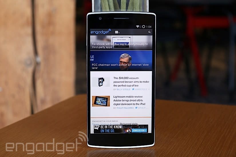
Look at your phone. If you can honestly admit that you love every single thing about it, I have good news: You can stop reading this review, since it won't have an impact on your happiness. But if there's even one thing you wish your smartphone could do better, it means you had to make compromises when you bought it. Everybody wants a perfect phone, but such a thing simply doesn't exist. So, we settle on a phone that has only 95 percent of the features we want, and that... kinda sucks.
OnePlus believes it doesn't have to be this way. Its motto, "Never Settle," represents the fledgling Chinese company's mission to build and sell the perfect smartphone. Its first attempt is the One, a premium-looking device that has customizable firmware and top-shelf specs. Oh, and it'll sell for $299 unlocked and free of contract, which is even less expensive than Google's Nexus 5. Seems a little over-ambitious for a small startup with no official track record, doesn't it? Let's find out if the One is too good to be true.
Hardware
The OnePlus One doesn't look like a $299 phone. Its arched back, polycarbonate build, elegant chassis and top-of-the-line spec sheet could easily fool someone into thinking you paid $600 for it. That's probably because a lot of other companies are trying to sell the same kind of device for that much money.
How is it possible, then, for a startup like OnePlus to sell a flagship device at a lower cost than many of its closest competitors? Easy: Use the same business model Google used with the Nexus 4 and 5. In other words, it doesn't plan to make any money for a while. OnePlus has no track record to rely on aside from the fact that its founder and much of its workforce came over from Oppo, which has a reputation for making great devices (albeit at a much higher cost). Keeping the price down is an investment for the nascent company; it's got a lot to prove, and the One is meant to be exhibit A.
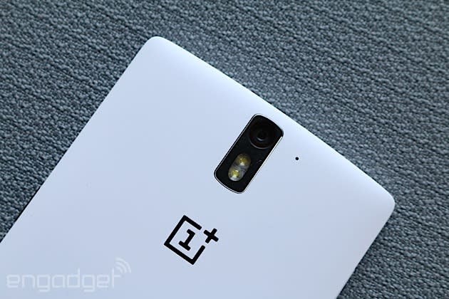
There's not much to hate for a first-gen product, unless you're simply not a fan of larger smartphones. That's because the One sports a 5.5-inch display and is 1.7mm taller and 0.6mm thicker than the Samsung Galaxy Note 3. It is, however, roughly four millimeters narrower and six grams lighter than Samsung's 5.7-inch flagship. If you're not used to holding phones bigger than a Galaxy S5 or Nexus 5, you may feel like you're stretching hand muscles you never knew you had. I'm used to devices this size, however, and I found that using the OnePlus One was as pleasant an experience as you're going to get with any phone larger than 5.3 inches. It features an arched back, which makes it rest more naturally in my hands, and its blunt edges give my fingers plenty of room to rest comfortably.
Doing the calculations, the One's 5.5-inch 1080p IPS LCD panel has a pixel density of 401 ppi. The pickiest of pickies will automatically discount the quality of the screen based on the fact that it's not quite as crisp as devices like the HTC One M8 and Samsung Galaxy S5, but I'm sure you won't notice the difference. And dare I say, I actually enjoy the One's display more than most flagship smartphones, and it's leaps and bounds better than the Nexus 5. Because it uses an IPS panel, the One's viewing angles are among the best in the industry, keeping pace with the One M8 and absolutely destroying the GS5. It's not quite as bright as the GS5, but it's still respectable for a flagship-caliber device; heck, even its whites are whiter than those three other phones. Most importantly, the colors are natural, making them more satisfying to stare at than the saturated GS5 and overblown Nexus 5. In case this isn't your style, however, the firmware lets you customize the amount of color saturation, intensity and contrast.
The display rises slightly above the rest of the frame, which means it's more exposed than most smartphone screens. Fortunately it features a slab of Gorilla Glass 3 for scratch resistance, which should help for those chance encounters with keys, pens and other similar objects. There's a 5-megapixel front-facing camera near the top next to the earpiece and sensors, and you'll also find a set of three capacitive buttons at the bottom, which can be turned off in favor of virtual soft keys (more on this in the next section).
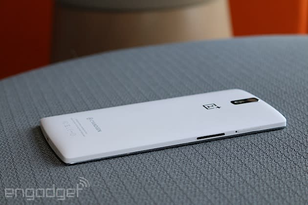
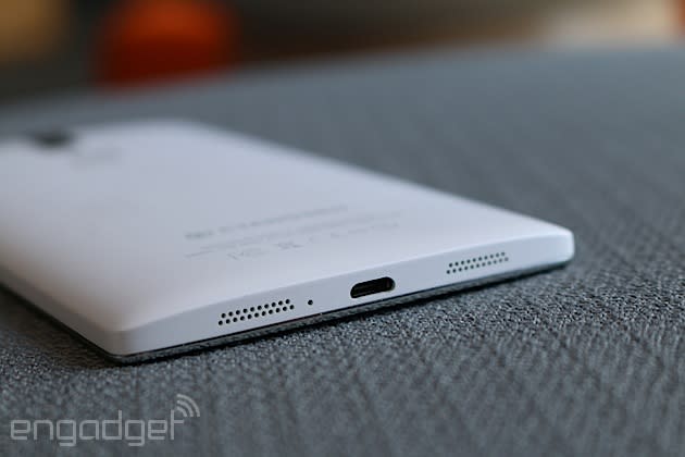
A volume rocker and micro-SIM slot line the left side of the One, while a power button adorns the right. There's a 3.5mm headphone jack on top, and you'll find twin speaker grilles flanking a micro-USB port on the bottom. Some potential buyers might complain about the lack of a microSD storage slot, but if that's really an issue, you can just spend an extra $50 for the 64GB version. This is a fantastic deal compared to other flagships that make you pay another $200 for that amount of space.
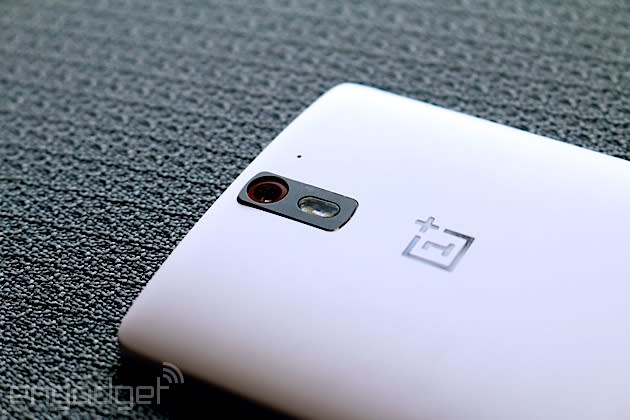
The gently curved back is minimal, featuring a 13MP camera with dual-LED flash, noise-canceling mic and logos for OnePlus and Cyanogen (unless you have the Chinese version, which doesn't have the latter). The back cover is interchangeable, which gives you the ability to customize your hardware somewhat. Five plates have been announced so far, each with different colors and/or textures, but only two will be available at launch time. You'll need the extra time to practice removing the back, though, because the process is about as painful as changing the oil in your car. To do it, you'll need to first eject the SIM tray and then, using a mixture of fingernails, luck and prayer (if that's your thing), pry open the back methodically. OnePlus made it difficult to take off on purpose, since nothing underneath the cover is removable -- not even the 3,100mAh battery. Plus, think of the fine sense of accomplishment you'll feel when you've actually succeeded.
The One will come in two variants: one for China (with Chinese-specific bands and TD-SCDMA) and another for the rest of the world. OnePlus has tried to cram as many connectivity options as possible into the One, with seven LTE bands (1, 3, 4, 7, 17, 38, 40), as well as penta-band HSPA+ (up to 42 Mbps) and quad-band GSM/EDGE. For US readers, that means you can use this on AT&T or T-Mobile, but not Verizon or Sprint. It also supports Bluetooth 4.0, USB OTG, WiFi 802.11b/g/n/ac, GPS/GLONASS and NFC.
As an aside, my review unit is a white 16GB model and is a pre-production device. OnePlus reps tell me the hardware and firmware are "almost final," but improvements and bug fixes may be made between now and when the final units hit the assembly line. Once I have a final unit in my hands, I'll take another look and update my review if anything gets fixed (or broken, as it were).
Before moving on, a disclaimer: Despite the company's "Never Settle" mantra, a few of you may still feel like you'd be settling with the One. OnePlus couldn't realistically pack every possible feature that now exists into its perfect phone -- especially at such a low price -- so if you want something with wireless charging, a microSD slot, waterproof design, aluminum build or a removable battery, this may not be the perfect phone for you.
Software
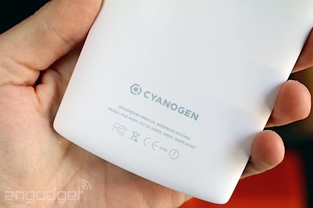
As if the One wasn't unique enough, it also comes with a much more customizable Android experience than what 99 percent of users currently enjoy. This is because OnePlus is an exclusive partner with CyanogenMod, so naturally its very first phone comes with the firmware (build 11S, based on Android 4.4.2) directly baked in.
Hold up. What exactly is CyanogenMod? It's custom firmware based on the Android Open Source Project (AOSP) and gives the user more freedom to fiddle around with settings, icons, themes and... well, nearly every aspect of the Android experience. Cyanogen's one of the most popular pieces of third-party firmware in the Android universe and can be installed a wide variety of devices, but the experience is even better on the One because it was built into the phone; since CyanogenMod could work with the hardware early in its development, it was able to add a bunch of optimizations that you won't find on other phones.
At first, it doesn't appear that different from stock Android, save for a few style changes (think: icons and buttons). But don't let its understated facade fool you: There's a lot of power behind the scenes, and it becomes more evident as you continue to poke around. There are several new features, with tweakable settings thrown in everywhere. Many of you are simply looking for an inexpensive phone and don't care about making dozens of tiny adjustments to your Android setup, and the beauty of CM is that it can fit your style just as easily as it can fit the preferences of power users -- it's completely customizable, and it's fantastic. Here's a crash course on what you can tweak.
Thanks to a healthy modding community, there are tons of different CyanogenMod themes to choose from. Prefer LG's or Samsung's interfaces for some weird reason? No sweat, just go to the Themes Showcase app and download what you want. Most of them aren't perfect ports (some only feature select parts of the UI, like icons, buttons or fonts), but they will at least offer you some of the familiarity of what you're used to. You can also choose to download a number of different fonts, sound packs, boot animations and wallpapers.
The One comes with a set of capacitive keys below the screen, but you can deactivate them and opt for a virtual bar of soft buttons instead. It may not make sense to do that if you're trying to squeeze as much real estate as possible out of your screen space, however. If you choose to keep the on-screen bar, CM will let you add, take away and rearrange the buttons that appear there.
You can also customize the status bar to show the clock, battery percentage (and the type of indicator it uses) and the number of notifications for certain apps, like Gmail. You'll also be able to adjust screen brightness just by sliding your finger to the left or right on the bar, and you can choose to add a double-tap-to-sleep option.
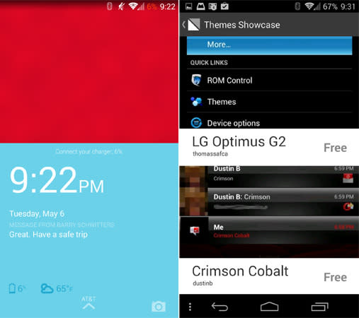
If you want to change which tiles show up in your quick settings menu (and the order in which they're shown), you can do that by hitting a plus icon near the top. And by the way, instead of having to use a two-finger gesture to open that menu, it's possible to pull down on the right side of the status bar to get there -- pulling down on the left would bring up the standard notification bar. Finally, you can also change which shortcuts show up on the lock screen, as well as the quick launch shortcuts that appear when you slide up from the home button. I could keep talking about more stuff you can tweak, but you get the idea -- you can do a lot. And part of the fun is discovering new settings to tweak.
The One lets you use gestures to activate different parts of the phone. Oddly, this is one of the few parts of the OS that isn't customizable. A double-tap wakes the device; a V motion activates the LED flashlight; two fingers up/down will turn on your music; and a circular gesture gets you straight into the camera. These gestures were incredibly sensitive on my pre-release unit, so I would often hear music coming from the phone as it sat in my pants pocket. Hopefully OnePlus and Cyanogen will fine-tune this as the One gets closer to an official launch.
Lastly, during the course of my review I stumbled upon one of the One's best features: always-listening voice recognition, thanks to Qualcomm. CM throws in a few modifications of its own to add more customization. After the phone learns your voice, you can say "Hey Snapdragon" "OK OnePlus" to activate Google Now or any app of your choice.
Camera

The Nexus 5 has a lot of endearing traits, but the camera isn't one of them. Sure, it has its moments of greatness, but I can't help think this is a case of settling. The OnePlus One, on the other hand, uses a 13-megapixel rear camera with a Sony sensor, six-element lens setup and f/2.0 aperture for lower-light shots. Additionally, the front-facing camera tops out at 5MP -- a sizable improvement over the 1.3-megapixel sensor on the N5.
The camera app is a special flavor made by the CyanogenMod team. It consists of three circular buttons on the side for taking stills, video and panoramic shots. Along the top sits some settings, scenes and a toggle for the front-facing camera. In addition to HDR, night mode, landscape and a few other standard options, the One has less-traditional scenes like snow, sunset, party and theatre. These may offer some fun ways to experiment with your camera, but I found that auto mode took care of most scenarios perfectly well. But if you want to switch back and forth, all you have to do is swipe your finger up or down on the viewfinder.

When it comes to performance, the camera is decent, but hardly stellar. Colors appear more natural than on the Nexus 5, but they're still slightly less saturated than they should be. The sky isn't as blue as I'd like, and some of my sample images suffer from soft focus. For low-light shots, the large aperture didn't help the camera capture as much light as I expected, as the level of detail is nowhere close to what I got from the HTC One M8 or high-end Nokia Lumias. It's also quite noisy. Compared to the N5, it gets about the same amount of light, but the One's white balance is much better at night. Lastly, HDR mode is a little too strong; it does so well at highlighting the shadows that it ends up making the rest of the picture look a tad cartoonish. All told, the camera is one area in which flagship devices still outperform the One, but at least it's a slight improvement over the Nexus. (I've added an album of full-res photos to Flickr, and will continue to add more as new updates come out.)
That said, the built-in editing software has some serious chops, in case your photo needs a little post-production flair. If you feel the HDR effect is too strong (or you want to bump it up even more), you can change filter strength or switch to a different preset style. You can also adjust the color, focus, sharpness and brightness. Even better, you can select certain areas of each image that you want to tweak. There are also heaps of filter options thrown in for good measure.
Video recording here is solid, with up to 4K resolution and a bit rate of 20 Mbps. You can also film in 60 fps slow motion at 1080p and 120 fps at 720p. Since the One doesn't have optical image stabilization, CM had to tweak the software to ease the pain a bit. It certainly helps, because footage is noticeably smoother. It can't fully replace actual hardware, of course, but the software enhancements at least make a difference. The front mics seemed to pick up more sound than the rear ones, so when taking movies of my children, my voice came out much stronger unless they were close by; when filming them outdoors, however, they sounded muffled when they were more than a few feet away.
Performance and battery life
It's hard to believe that a $300 device like the One has as much muscle underneath the hood as the Galaxy S5 and Oppo Find 7. In fact, you technically can't get any faster, since the phone sports a 2.45GHz quad-core Snapdragon 801 (MSM8974-AC), a 578MHz Adreno 330 GPU and 3GB of RAM. Until the Snapdragon 805 comes out later this year, this is the absolute best silicon that Qualcomm has to offer. But what does it mean to you? Smooth everything, fast everything and no lag as far as the eye can see. If you don't mind my nitpicks: The gaming experience is still slightly sluggish with the occasional frame skip, but it's not very noticeable unless you're paying close attention. Additionally, since the phone's still running on a pre-release build, there are a few kinks that OnePlus needs to iron out before it releases the One to the world.
CyanogenMod's firmware gives you the option to change your performance profile to one of three modes, ranging from power conservation to battery sucker. If you don't want to use any presets, you can adjust some of the settings manually, such as minimum and maximum CPU frequency. This is definitely in advanced territory; I don't recommend you try it unless you know what you're doing.
One such issue is soft audio output, both on the external speakers and in the earpiece. All of my conversations were much quieter than they should have been, and I could barely hear music blaring at full volume. (OnePlus tells me this will be resolved in an upcoming update, and I'll amend my review as soon as that happens.) Fortunately, none of this was a problem when I used headphones; in fact, I often had to turn down the volume to make my ears feel comfortable. In addition, the One has an equalizer app called AudioFX, which lets you fine-tune the audio.
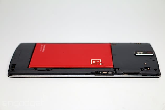
Battery life, at least, is a bright spot. The One has a 3,100mAh non-removable cell that's just a tad smaller than the battery inside the Note 3. What's more, it's actually larger than what you'll find in the GS5 and One M8. On most days, I made it to the end of the evening with around 5-10 percent life remaining. (On average, this constituted 14-15 hours of solid use, and roughly four hours of screen-on time.) These were days full of emails, calls, travel, social networking and a little bit of gaming. All told, our standard video rundown test yielded 10 hours of life. This isn't the best I've seen, but I'd consider it well above average for a smartphone -- and I'm hard-pressed to ask for more from a $300 device.
The competition
Good things come to those who wait. Phones with lower asking prices often come with excruciating delays, and OnePlus' first handset is no exception. The company is going to have a difficult time meeting demand right away, which is one reason why it's offering the One on an invite-only basis at the beginning. The $299 16GB option, which will come in white, will go out to the first batch of invites in mid to late May; the $349 64GB model, offered in black, starts shipping in early June. For the rest of you still waiting for an invite, OnePlus is hoping to send one your way by the end of June.
At launch, the OnePlus One will be available in 16 countries: Austria, Belgium, Canada, Denmark, Finland, France, Germany, Hong Kong, Italy, Netherlands, Portugal, Spain, Sweden, Taiwan, the UK and the US. Once it's ready, the One will face intense competition. The most notable device in its price range is the Nexus 5, which you can get for $349 (16GB) or $399 (32GB). It comes unlocked and has the full native Google experience, but admittedly, it doesn't have as extensive a spec list as the One. The Nexus 5 is still the best option if you want timely updates, but CyanogenMod has a good track record of pushing updates quickly, and since the ROM is baked into the device (rather than requiring a separate install), it makes the chances of getting prompt refreshes even more likely. CM's also pledged that it will support updates for the One for at least two years.
Wrap-up
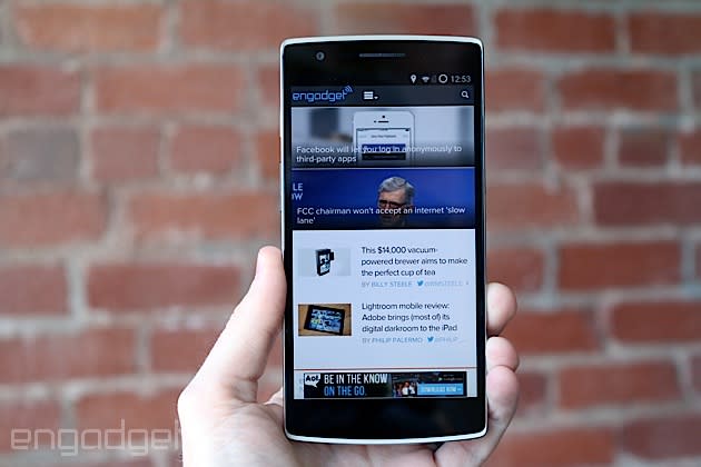
It doesn't make sense that the OnePlus One should be this inexpensive. It looks elegant, feels solid and performs smoothly, and it doesn't show any signs that it's a first-generation product from an unknown company. Regardless of how well it sells, the industry will see this as a benchmark for what an affordable phone really can be. All told, it outperforms Google's Nexus 5 in nearly every way -- and it does so at an even lower price. Heck, it's better than many flagship phones that sell for twice as much.
The OnePlus One gets close to the perfection it's aspiring for, but it's not for everyone. Many will despise its large form factor, non-removable battery and lack of external storage. To a nitpicky reviewer like myself, a truly perfect device would also include wireless charging and some type of waterproofing. But let's be real: It just isn't going to happen in a $299 device, especially one that's already filled to the brim with flagship features.
Here's the thing: The One doesn't have to be perfect for me to recommend it. A few missing features? Sure, no problem. What matters is that it's perfect for you, and it fits all of your needs. Besides, imperfections make us eager to see what's around the corner. In the meantime, we keep dreaming of perfection, and perhaps one day we'll actually find it.
Edgar Alvarez contributed to this review.


