Samsung Galaxy S5 review: a solid improvement, but don't rush to upgrade
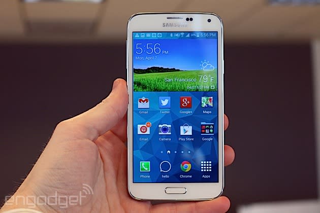
When Samsung unveiled the Galaxy S5 and a trio of Gear smartwatches, the company made a big to-do about how it listens to its customers. We know, we know: Every company's supposed to be doing that. But remember, this is Samsung we're talking about. It dominates the Android market by such a wide margin that it makes rivals like LG and HTC look like quaint startups. Put it another way: Samsung could release a phone with no improvements, and it'd still sell millions.
At least, that's how it used to be. The smartphone market has seen a downturn of late and even mighty Samsung has been affected. Sales are down, and the manufacturer must now make phones that give people what they actually want (shocker, we know). So what can we expect from a humbled Samsung? A durable phone that brings a toned-down TouchWiz UI, a better camera, longer battery life, improved performance, a fingerprint scanner and enhanced health tracking. I received an unlocked review unit from GSM Nation, which was the first outlet to start shipping the phone in the US with AT&T- and T-Mobile-compatible LTE. Now that I've been testing it for a few days, let's see if the Galaxy S5 lives up to all those promises.
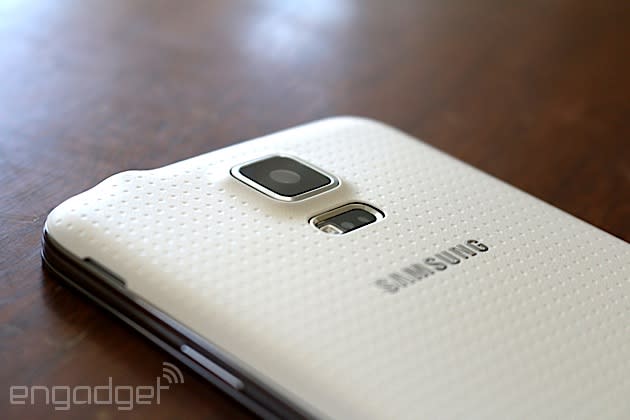
If you've seen one Galaxy S device, you've seen 'em all. Each iteration of the popular smartphone series has had a few nips and tucks, but overall it's maintained the same look over the years. The S5 is no exception: The only new features here are its squarish shape and its plastic, waterproof casing — dimpled to look sort of like leather (it doesn't really). Even then, you can tell at a glance that it's a Galaxy S.
If there's one word we'd use to describe the Galaxy S5 design, it's "inoffensive." It's not exactly a visual treat like the new HTC One M8, but it's not ugly either. And that's not surprising, really: Samsung usually plays it safe with its designs. This time around, I've heard plenty of jokes referring to the GS5 as the "Band-Aid Phone," a nod to those dimples on the back. Truly, though, I only see that in certain colors, especially the gold version. Fortunately, my white unit doesn't look like a Band-Aid at all; in fact, I prefer it to the glossy covers used on the GS3 and GS4.
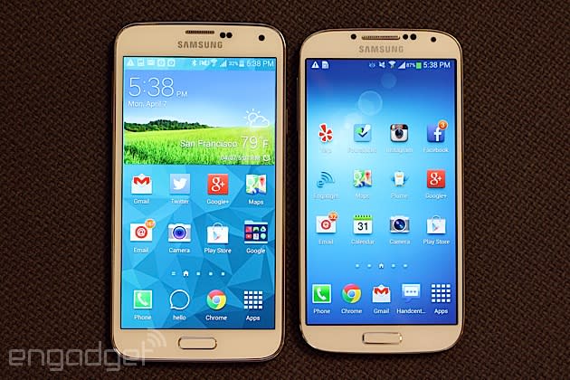
Indeed, there's something to having a less slippery design: I was able to grip the 8.1mm-thick phone without feeling like it was going to slip through my fingers. In particular, the blunt edges and mostly flat back make it easy to wrap your fingers around the device. And that's a good thing, since the GS5 is larger than its predecessor in every way (5mm taller, almost 3mm wider and 0.2mm thicker). In other words, if you thought the GS4 was too large, this year's version may be too much. It's also 0.52 ounce (15g) heavier, but I only noticed the difference when I was holding one device in each hand. And besides, by modern-day standards it's compact: Compared to the One M8, the GS5 is shorter, thinner and lighter, and that's with a slightly larger screen, too.
I mentioned earlier that the GS5 is waterproof. More specifically, it's IP67-certified, which means it can be immersed in up to one meter of water for up to 30 minutes. But before you decide to take it for a swim, make sure to close the back using the rubber gasket and seal the charging port. Curiously, the headphone jack is completely open, but somehow is impervious to water.
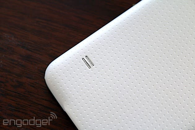
There are only a few changes to the button layout, compared to last year's GS4. The power button and volume rocker are still on the right and left, respectively. There's now a micro-USB 3.0/MHL 2.0 port on the bottom, which is protected by a waterproof tab. The IR blaster, meanwhile, sits on the top left, with the 3.5mm headphone jack over on the top right. Additionally, the home button now includes a capacitive fingerprint sensor, which I'll discuss in more detail later on. Around back you'll find the small speaker grille, but the biggest change can be found farther up: Samsung installed a heart rate monitor next to the LED flash, just underneath the rear camera.

As ever, Samsung included a removable back cover and a swappable battery, with a capacity of 2,800mAh (up from 2,600mAh). There's also a microSD slot for up to 128GB of external storage. Out of the box, you get either 16GB or 32GB of built-in storage; just remember that the operating system takes up a lot of space before you even get around to installing apps or downloading movies. In fact, my 16GB unit had a little under 12GB of space when I started using it, so if you're even slightly concerned about storing large files, I recommend going with the 32GB model or buying a big memory card to compensate.
I won't spend a lot of time on connectivity because it will ultimately vary depending on where you live and which carrier you use (that last bit is particularly true in the US). That said, most variants feature quad-band GSM/EDGE, quad-band HSPA+ 42.2 Mbps (850/900/1900/2100) and LTE Cat 4 (which offers speeds of up to 150 Mbps). The GS5 also supports carrier aggregation, which basically means that it can fuse together LTE from different towers to increase your data speeds. But again, this will largely depend on whether your carrier even supports that technology.
Finally, you'll also get Bluetooth 4.0 + LE, GPS/GLONASS, DLNA, USB OTG, MHL 2.0 and WiFi Direct. There's also dual-band WiFi 802.11a/b/g/n/ac, but the GS5 is the first phone that we've seen with two-channel MIMO support. In English, it includes an extra antenna, with which you could theoretically double your speed — provided you have the right kind of supporting equipment, of course.
Oh, and while I'm on the subject of speed, most versions of the GS5 come with a new feature called Download Booster, which essentially combines the power of LTE, WiFi and Grayskull to help large files download faster than they would on any one connection. The service won't work on anything smaller than 30MB, and doesn't apply to certain protocols like FTP and UDP. But if you're trying to install an app, load a YouTube video or save a movie your cousin shared with you on Facebook, Download Booster should do the trick. If you don't have an unlimited data plan, however, be very careful about how often you use this — if you're not keeping tabs on your usage, your next bill might give you an aneurysm.
Display

The S5's 5.1-inch Full HD Super AMOLED display has the same resolution as last year's flagship despite the larger size screen. Yes, pixel-density snobs, that means you're subjected to nine fewer pixels per inch (441 vs. 432). In any case, those nine pixels were worth the sacrifice: The display here is a surprising improvement over the S4. The difference is easy enough to see with the naked eye, especially when you put the two devices side by side.
For starters, the S5 is much brighter than the S4, not only indoors, but also in direct sunlight (with auto-brightness turned on, the display goes up to around 450 nits). At the same time, it's also capable of dimming down to as low as two nits in pitch-black rooms. This makes for a more comfortable viewing experience when you're reading in a dark bedroom or (tsk, tsk) catching up on Facebook during a movie. The viewing angles have improved significantly as well: Even from a severe angle, the colors are more lifelike, and it's easier to read onscreen text. Admittedly, the HTC One M8's S-LCD panel does a better job with whites and darks, although the GS5 offers more color saturation (and it's not even over-the-top saturation this time, either). As you can see, I'm being rather nitpicky here, but I believe most users will be happy with either display.
And if you're not happy? Unlike most non-Samsung phones (save for Nokia), the GS5 has five screen modes: Professional Photo, Cinema, Dynamic, Adapt and Standard. They all use a different color gamut; so if one doesn't fit your fancy, try the others to see what works best.
Fingerprint scanner
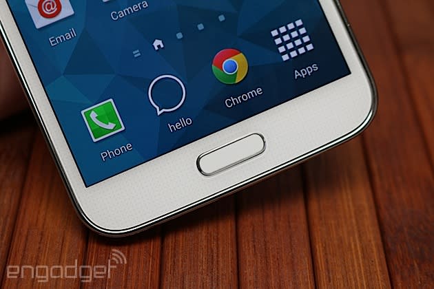
Until the iPhone 5s came out, the last flagship phone with a fingerprint scanner was the Motorola Atrix 4G — and that was three years ago. Back then, it was clear the technology wasn't ready for prime time, mostly because the sensors didn't actually work very well. Now, in 2014, the S5 comes with a capacitive fingerprint scanner built into the home button — yep, just like on the iPhone. It remains to be seen if this leads to another court battle, but regardless, you can't fault Samsung for choosing the home button: We touch that part of the phone dozens (if not hundreds) times a day.
So, how exactly does the scanner work here? Samsung's setup features Synaptics' Natural ID, which consists of a tiny sensor that sits underneath the button. (Synaptics calls it "a miniature touchpad with built-in capacitive sensing.") When it's time for the phone to learn your prints, you swipe your finger over the home button several times, allowing the sensor to read the inner live layers of the tip of your finger. Using signal strength, the sensor can draw a "map" of your fingerprint and presto — you're all set. You can store up to three prints total, although I'd prefer even more.
If the sensor doesn't recognize your finger after five attempts, the phone will prompt you to enter an alternative password. It's an alphanumeric password, mind, so you'll have to include both numbers and letters instead of a simple four-digit PIN code. On one hand (no pun intended), Samsung likely did it this way to make the phone more secure, but I still believe users should be able to choose what type of password they want.

Speaking of security, should we be concerned about privacy? According to Samsung and Synaptics, the answer is no. When the sensor talks to the processor ("Hey, this print checks out just fine. Go ahead and let them in."), all information is encrypted. What's more, the prints are stored locally on the phone, and instead of storing an actual image of your print, it only logs a virtual map. Spoofing also wouldn't work; Synaptics says that any change in the physical properties of the phone will result in rejection.
All in all, Samsung makes more use out of its fingerprint scanner than Apple does with Touch ID. Both the GS5 and iPhone 5s use the scanner to unlock the phone, obviously, but that's where the similarities end. The only other thing Touch ID can do is approve App Store and iTunes downloads. Samsung, meanwhile, lets you make online payments through PayPal, as well as access a private "locker" for confidential files. I'd also like to see these companies open up their sensors to third-party developers; all in due time, hopefully.
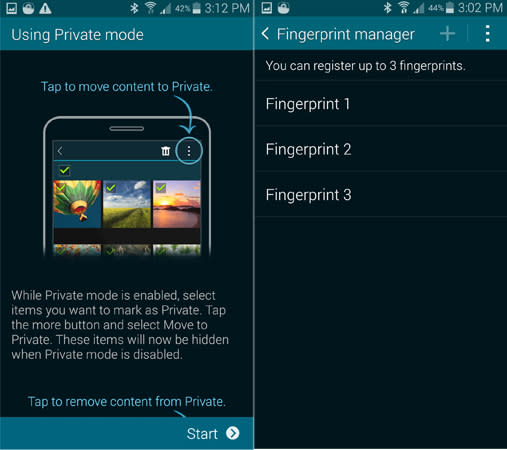
Getting down to brass tacks, how well does the thing actually work? It depends. I trained the GS5 to recognize both of my thumbs and my right index finger, since those are the three digits I use the most when waking up the phone. Over the course of several days, I made dozens of attempts with each finger and it only recognized me on the first try about half the time — and that's a generous estimate. More often than not, I had to swipe my finger two or three times before it let me in; typing in a PIN code would've been more efficient. Worse, there were other times when the scanner wouldn't recognize me at all, even as I adjusted my swipe speed, angle and finger pressure. And even when it works, there's a small delay after you swipe before the phone accepts your print.
As for one-handed use, don't even bother. It's technically possible, but the odds of success are so low I have a better chance of seeing Narnia each time I open my closet. Normally, I hold the phone in my left hand and try to swipe the sensor with my left thumb; however, my thumb is at such an angle that the sensor simply can't recognize it. Sometimes it'll work if I push the phone up a little higher and try to position the thumb at a more shallow angle, but even then, it takes multiple attempts, and it's so off-balance that I've come close to dropping the device several times. Apple's sensor, on the other hand, has no problem picking up my fingerprint from any angle.
To be fair, my experience may get better over time (although in Apple's case, it got worse for a while). It's obvious there's a learning curve here; it can take practice to place your finger in just the right place, at just the right speed with just the right amount of pressure. However, I don't believe most people will be that patient — after a few frustrating attempts, users might simply turn the feature off (or worse, attempt a warranty swap because they think it's defective).
There's a bit of a silver lining, at least: If you don't like it, don't want to use it or it simply doesn't work for you (or all of the above), you don't have to use it. And unlike the HTC One Max, whose fingerprint scanner sits below the rear camera, the sensor itself isn't visually distracting.
Heart rate monitor
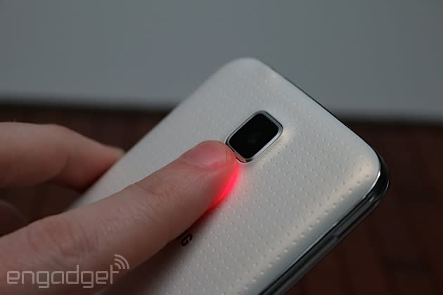
Samsung's been making a big deal about health recently. It's offered an app called S Health for quite some time, which helps users track their exercise and food intake. Starting with the GS4 in particular, the app's been able to monitor heart rate and steps with the help of third-party accessories. Now, though, both of these features are built directly into the GS5, giving you one or two fewer fitness gadgets to carry around. That said, the heart rate monitors built into the new Gear 2 and Gear Fit smartwatches integrate with S Health, so the company's hoping you'll buy some fitness wearables after all (so long as they're made by Samsung, of course).
To get started, go to the Heart Rate section of S Health. Then, once prompted, put your finger over the sensor, keep still and stay quiet. Be careful where you put your finger, though: The sensor, which uses a light that allows it to "see" and measure your pulse, is positioned almost directly beneath the camera lens. Without your eyes directly guiding your finger to the right place, it's easy to mistake the camera lens for the heart rate monitor. (Pro tip: You'll want to keep a cloth handy to wipe off the lens if you do this a lot.) As with the fingerprint scanner, positioning is crucial. If my finger was even slightly off, the monitor couldn't measure my pulse and I'd have to redo it. When you've done it right, you'll know pretty quickly since it only takes five seconds or so to complete the process.
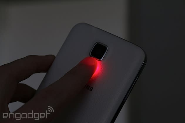
Our team tested the heart rate monitor against more dedicated fitness devices like the Garmin chest strap (connected to a Vivofit) and the Adidas Smart watch. After a series of tests, we noticed that the GS5's results averaged about five or six beats per minute lower than the Garmin and Adidas. That said, the scores did match sometimes, but this was the exception rather than the rule. In other words, the GS5 sensor will do a good job getting you an "in the neighborhood" reading, but you're still better off with a standalone monitor if you want the most precise results.
Software
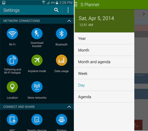
As with the hardware design, Samsung's TouchWiz software tends to err on the safe side; in the past, Samsung only made minor tweaks to the UI. With the GS5, however, the company's Android skin has received quite the face-lift, resulting in a design that's flatter, more modern-looking. If you ask us, it's a step in the right direction — and a sign that Samsung knows it needs to freshen up TouchWiz. Even so, the layout is confusing. The old TouchWiz used tabs on nearly every screen, but no longer. Meanwhile, Samsung introduced a new font, and for whatever reason, the interface uses a lot of circles. Oddly, too, there are some inconsistencies; the settings menu uses large, circular icons (though you can switch to list or tab view at any time), which makes it more of a chore to scroll through the menu. Icons in the main app drawer, on the other hand, hew to the old-school TouchWiz look. And that's not all: There are elements of stock Android (4.4.2 KitKat) sprinkled in as well.
Most core apps have been redesigned to be more visually appealing, and even the recent apps menu has a fresh look. But given that Google recently had a discussion with Samsung about how it can down its Android skin, it's frustrating that there are at least two versions of most core apps — Samsung pushes its own in-house software, even though Google provides similar apps of its own. This means there are two app stores, two music players, two browsers, two photo gallery apps, two voice assistants and three messaging apps (four on the AT&T version). While there's something to be said about choice, this is just a tangled mess, and I have to wonder if the extra baggage bogs down the phone's performance. Fortunately, you can hide the apps you don't plan to use, which at least cuts down on the clutter.
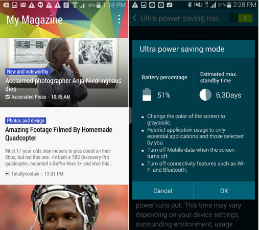
My Magazine has carried over from the Note 3, but it's now accessible by swiping from left to right. If Samsung is indeed interested in getting on Google's good side, I'd like to see the company give us the choice between My Magazine and the Google Now experience. Curiously, it's not even part of the TouchWiz launcher, but, rather, a separate application. As for the feature itself, it's basically Flipboard with a few customizations — in fact, clicking on categories and links will often take you out of My Magazine and into the actual Flipboard app.
Older Samsung features like Air browse, Air view, Smart stay, Smart scroll and Smart rotation are all still here, though they aren't quite as in-your-face as they once were. In fact, most of them are buried in the settings, so you have to want them in order to find them. Safety Assistance, Blocking Mode and Easy Mode are also around.
In the settings menu, you'll find a small, but important addition: a search function. If you know what you're looking for, but don't feel like spending an hour swiping through 20 menus to find it, you can search for the term and head straight there. Heck, if you're searching for a checkbox, the search results will include that box in the list, so you don't even have to go into the menu to toggle it.
Like the HTC One M8, the GS5 features an extreme power-saving mode (Samsung calls it, "Ultra power saving mode"), which promises to conserve power when you find yourself getting dangerously low and need to stay afloat in case a call comes in. When you turn this feature on, it changes the launcher to a simple grayscale theme, caps your display brightness and restricts most apps from working, reserving your battery for only the tasks you'd need in an emergency. Mileage will vary, but even at 10 percent, you should be able to eke out nearly a full day of battery life.
One last thing worth mentioning: the built-in "baby crying detector," which can be used with a Gear Watch. Put your phone within a meter of your little one and anytime they have a fit, your watch will vibrate. Of course, Samsung's quick to point out that this isn't intended to replace your babysitter, so if you're thinking of sneaking out for a spell, don't.
Camera
Samsung has a history of making smartphones with good cameras, but that doesn't mean it can rest on its laurels. The competition is getting fiercer: Nokia, Sony and even Chinese outfits like Oppo are doing some fantastic things with imaging. And so must Samsung. With the GS5, the company added a 16MP rear camera, some clever new editing tricks and a new "ISOCELL" technology that improves sharpness, low-light performance and color accuracy. (In case you're wondering, the front-facing camera is still capped at 2MP.)
Just like the One M8, the GS5's top resolution uses a 16:9 aspect ratio for widescreen images, rather than the traditional 4:3. Fun fact: If you don't like going widescreen, the highest res you can get is 12MP, which is actually a lower resolution than the GS4's 13MP 4:3 camera. Obviously, pixel count isn't everything, and there are other aspects of the imaging experience to consider, but I still found this a tad disappointing.
Resolution is likely the least interesting imaging spec on the camera, so let's take a quick look at the other stuff. The GS5 has the same f/2.2 aperture as its predecessor, as well as a focal length of 4.8mm (up from 4.24mm on the GS4). The 1/2.6-inch sensor is larger, but utilizes the same pixel size of 1.12 microns. Fortunately, ISOCELL addresses the concern with having such small pixels, and we'll cover that shortly.
The new camera settings, meanwhile, are easier to navigate now that they're accessible from the viewfinder and can all be found in one place. While this may be confusing to some, I prefer it this way over the GS4, which has multiple levels of menus. Unless you knew exactly where to go, it was difficult to find what you were looking for. Fortunately, there's space on the sidebar for up to three custom shortcuts, so you can drag over the settings you'll be adjusting the most.
The camera modes have also been streamlined here. Quite a few are no longer listed by default, but if you press the "download" option, you'll be taken into the Samsung Store, where you can find all of them. What's more, Eraser, Drama and Best photo modes have merged into one mode known as "Shot & More." This is a lot like what Nokia has done with its Smart Camera. While it makes more sense to combine them into one mode, there's still a lingering problem: I don't always know that I need Eraser until after I've already taken my shot. As an example, I usually don't know that a photobomber is going to step into my shot until I'm actually taking the picture; switching to Shot & More mode means I have to know there's a good chance that some random dude is going to try to become part of my family portrait. Lastly, the default auto mode is now smart enough to detect when it's nighttime, so it can adjust to that particular setting automatically. (That said, you can turn on the photo stabilizer effect to get even more light, if auto doesn't work well enough.)

The HTC One M8 has UFocus; now Samsung is introducing something called Selective Focus. As with UFocus, you can blur out the background or a target in the foreground. The catch: You have to be within 1.5 feet of whatever object is in the foreground. Even then, there were many times when I couldn't get it to work. Small objects, large objects — it didn't matter. The feature is temperamental, it seems, but at least it saves the image as a regular photo if you don't succeed. Even when it does work, it's not perfect. In the image above, I took a picture focused on the red sundial and when I shifted the focus to the buildings in the background, not everything in the foreground actually blurred out, as you can see below.

I was particularly impressed by the GS5's real-time HDR feature. Normally, I have to chance it with HDR images because I don't get to see how it will turn out ahead of time. The GS5's processor is powerful enough, however, that it's now possible to see what the image will actually look like before taking it, which increases my likelihood of taking a good photo. This feature is also available in the One M8.
Samsung also says the camera is capable of focusing on targets in 300ms (0.3 second), making it just as fast as the M8. This is made possible through phase detection (PDAF). Unlike most smartphone cameras, which determine focus through contrast, PDAF divvies up incoming light into a pair of photos and then compares the two. If you don't have enough light coming in, the camera will shift back to the traditional contrast autofocus method. I couldn't see a noticeable difference in focus lock times between the GS5 and the M8 (same goes with default shutter speed). Either way, both were quicker than the GS4.
The GS5 also lets you manually tweak the settings to your liking, but it doesn't offer quite as many options (or as good a UI) as the new HTC One. It's not much different from other Galaxy phones, either: You can set white balance, metering method, exposure and ISO (up to 800). Still, HTC adds extras like shutter speed and focus type, along with sliders and the ability to save presets, so you can easily switch back and forth between modes instead of having to change each setting every time.

The GS5 may not have an extra camera to add depth information, but it brings plenty of great editing features that make you feel as if you're enjoying Photoshop on your phone. You can still rotate, crop and resize; add stickers, frames and drawings; throw in portrait effects; and adjust color saturation, contrast and temperature. What's different this time is the ability to select a specific part of your photo and tweak just that part while leaving the rest of the picture untouched. In other words, if one part of your image is blown out, you can select that area and tweak the settings to tone it down. In case you don't really know how you want to adjust the shot, there's also an auto-enhance feature that might give you a nudge in the right direction.
The size of each pixel on the GS5's main camera remains the same as on the GS4, so does Samsung do anything else to improve low-light performance? It does, in the form of its new ISOCELL technology, which first debuted last fall. The explanation of how it all works is pretty technical and I'll let the video above do most of the explaining. In short, ISOCELL adds tiny barriers between individual pixels, which increases image sharpness, color accuracy and light sensitivity — all aspects that come as disadvantages for most BSI sensors. The new tech also allows the lens to be closer to the sensor, which makes it so the camera module can be smaller.

All told, ISOCELL improves Samsung's imaging quality, but the results aren't quite as good when compared to the One M8, Lumia 1020 and iPhone 5s. I'm not saying nighttime images on the GS5 are horrid — they're still perfectly usable in most cases — but the performance just isn't up to par with other devices that have popped up on the market in the past year. Simply put, most night shots appear darker and noisier.
Fortunately the GS5 holds up well in good lighting conditions. My pictures were slightly more detailed than they were on the GS4 and One M8. I didn't have to make any adjustments to the settings in direct sunlight, whereas the M8 tends to take blown-out shots if I don't dial back the exposure a notch or two. Image quality was also on par with the iPhone 5s, with only slight variations in color saturation.
(Note: I've uploaded a gallery of full-res photos here.)
Performance and battery life

In the year since the GS4 came out, we've seen two new generations of high-end Snapdragon chipsets: the 800 last fall, followed by the 801, which is what Samsung used on the GS5. As is too often the case, it won't be long before the muscle behind Samsung's state-of-the-art model is no longer the best available, as the Snapdragon 805 will land in a few months, with the 64-bit octa-core Snapdragon 810 landing this time next year. Heck, maybe that's what we can expect in the GS6!
With a quad-core 2.5GHz processor, 2GB of RAM and a 578MHz Adreno 330 GPU, the GS5 is predictably powerful. Even so, I can't shake the feeling that something in the bowels of TouchWiz is preventing it from reaching its full potential. Despite having a faster clock speed than the One M8 (both phones use a Snapdragon 801, but the M8's version has a lower max speed at 2.3GHz), most transitions seem to take longer to complete and apps load slightly slower than they do on the One.
Again, it may feel like I'm making a mountain out of a molehill, but this slight lag also translates into some odd happenings on the graphics side. My game tests of choice were Asphalt 8 and Dead Trigger 2, since both need some serious horsepower to run smoothly. Most of my gameplay unfolded without incident, but the titles slowed down and even froze up more often than they should have, considering the powerful chipset being used.
The S5's battery held up well during my week of use, and it's a slight improvement over the GS4. Still, the HTC One M8 is even better. With heavy usage, I tended to get concerned near the end of the day that the 2,800mAh battery wasn't going to make it. Thankfully, though, it never completely gave up on me. In other words, the battery got me through a full day, but more often than not, it came a little too close to empty. In our formal rundown test, meanwhile, the battery kept going through nearly 10 hours of video playback. That's not as impressive as the M8, which lasted 11 and a half hours, but it's still better than the GS4, which gave out after nine hours and 15 minutes. With more moderate use, you should last into a second day; naturally, mileage will vary depending on what you're doing with your phone and how strong your signal is.
Audio on the GS5's speakers isn't quite as loud or clear as BoomSound on the One M8. Worse, the sound rattled the back of the phone anytime I cranked up the volume. In fact, the louder the music got, the more muffled and blown-out the sound became. Plugging in a pair of headphones helped me to sidestep the problem, at least. Likewise, call quality on both my unlocked handset and my AT&T version sounded clear with no complaints on either end of the line. Bluetooth connectivity worked flawlessly, even with several devices connected at the same time, and NFC performed as well as I'd hoped. GPS navigation didn't have any noticeable issues, either.
Wrap-up

Chances are, you'll be happy with the Galaxy S5 if you choose to buy it. It's a solid upgrade to the Galaxy S4, with reasonable improvements to the design, software and camera. I can't say this is your most visually appealing option, especially compared to the all-metal HTC One M8, but the dimpled back and waterproof casing at least add more durability than we've enjoyed on previous Galaxy S devices.
The fingerprint scanner and the heart rate monitor, on the other hand, need some work. Each delivers inconsistent results and can be quite frustrating to use. The good news is that you don't have to use them if you have the same experience that I did; the bad news is: If you don't take advantage of these features, you have fewer reasons to buy the phone in the first place. What's more, Samsung put a lot of energy into integrating these features into both the GS5's hardware and software, which makes me wonder what the company could have included instead if it left those out. If you're looking for a good Android phone, the GS5 won't let you down. I'd be happy using this as my daily driver. That said, I wouldn't waste an early upgrade on it, either.
Edgar Alvarez produced the video review.


