Amazon Fire phone review: a unique device, but you're better off waiting for the sequel
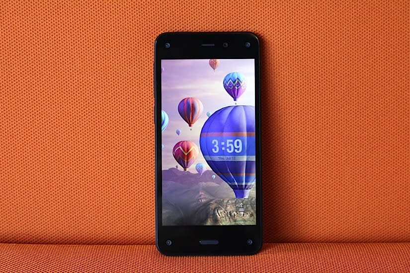
After producing a long line of e-book readers and tablets (not to mention a set-top box), Amazon has its sights set on the smartphone market. But finding success here won't be easy, even for an established tech giant like Amazon. With the Fire phone, the online retailer is coming in as an unproven underdog, hoping to bring iPhone and Android users into its fold. CEO Jeff Bezos says the only way to do that is to differentiate; to wow potential buyers with new features they didn't even realize they needed. These unique offerings include 3D head-tracking, product scanning and fast help from customer service agents.
Regardless of the bells and whistles on offer here, Amazon is walking down a difficult path: The Fire is only available on AT&T, and at $200 on-contract ($650 full retail), it's going up against high-end devices from companies that have been making phones for years. In order to win over customers, Amazon has to convince them that the Fire is worth dropping loyalties, switching carriers, resigning contracts and handing over a lot of money. Unfortunately, the company has a few lessons to learn before that's going to happen.
Hardware
Amazon appears to have put so much effort on the Fire phone's unique features that it didn't focus on making the device attractive. It looks more like a prototype than a phone that's supposed to compete against well-designed beauts like the iPhone 5s, LG G3 and HTC One M8. The use of glass on the front and back is a throwback to the Nexus 4 and iPhone 4/4s, which means it's a fingerprint magnet and more susceptible to breaks than polycarbonate. The sides are protected with a rubberized polyurethane material, however, which should improve the phone's chances of survival if dropped.
The Fire is thicker than the iPhone 5s and Galaxy S5, just as thick as the LG G3 and thinner than the One M8 and Moto X. Yet Amazon's inaugural phone feels thicker than all of them due to its blocky design: The sides are mostly blunt, but they taper toward the back, which lies completely flat. And at 5.64 ounces (160g), it's heavier than the competition. The only exception is the One M8, which weighs exactly the same as the Fire and has a more premium-feeling aluminum body.

Amazon's goal was to make the Fire ideal for one-handed use, and indeed, it succeeded: The screen measures a manageable 4.7 inches and the sides are easy to grip. It's comfortable to hold and my thumb could reach nearly every part of the display, so I rarely felt like I had to use two hands unless I was typing a message.
The back isn't as busy as I expected. Despite being an AT&T exclusive, the carrier's logo is nowhere to be seen on the device (front or back). All you'll see here is Amazon's logo near the top and the obligatory federal certification details near the bottom; aside from that, the camera, LED flash and mic are neatly tucked away in the top-right corner.
Sadly, the front is a massive contrast to the minimal back, with the five lenses being the primary culprits. There's a Kinect-like sensor on each corner and a selfie cam just to the right of the earpiece on the top. (If you're already wary of Big Brother, the idea that five eyes are looking back at you won't help your anxiety.) The only button is a Samsung-esque home key that protrudes out of the glass underneath the display.

Finally, the bottom of the phone houses a stereo speaker, mic and micro-USB 2.0 charging port, while the left side features a volume rocker, camera/Firefly quick-access button and nano-SIM slot. The other stereo speaker is on the top, between the 3.5mm headphone jack and power key; the latter is placed on the left side, which is perfect if you hold the phone in your right hand. Since I prefer using my left hand, however, this was a big pain point.
Though it's not horrible by any means, the Fire's display quality is not on par with other flagships. It has a 4.7-inch 720p LCD panel, which offers a relatively unimpressive pixel density of 315 ppi. This is far lower than the GS5, One M8 and G3, and only a few ticks below the iPhone 5s. On a positive note, the viewing angles are good and text is still crisper than I would've expected. Its colors are accurate and the 590-nit display is incredibly bright, which makes a difference when you're trying to read the screen in direct sunlight. The video quality isn't quite as good as other flagships, but otherwise there's very little to complain about aside from the difference in resolution.
The $200 model comes with 32GB of internal storage, which beats out the 16GB that the iPhone 5s and GS5 offer at the same price. It doesn't feature a microSD card slot, however, so you'll need to shell out another $100 if you want the 64GB model.

One of the biggest disappointments about the Fire phone is its agreement with AT&T. It's also not launching with any international availability. Even worse, the phone is locked to only function with AT&T SIM cards, so if you plan to travel internationally, you'll need to be lucky enough to get an unlock code, either through the carrier or unofficial means. All of these factors will severely limit the number of phones Amazon can sell; very few people will want the Fire desperately enough to switch carriers or go through the hassle of unlocking it. If Amazon wants to make the Fire phone successful, it's not going to do so by making it available to just one network in the world. (On a related note, the phone is locked even when you buy it at full retail price directly on Amazon.)
It seems pretty clear, then, that Amazon is trolling us. The Fire's loaded with cellular connectivity: The phone is compatible with nine LTE frequencies for use in most parts of the world, in addition to penta-band HSPA+ and quad-band GSM/EDGE. But the only way you can use it is by paying an arm and a leg for international roaming plans or finding a place willing to provide you with the proper unlock code.
Amazon also made a misstep with the Fire's primitive Bluetooth connectivity. Most, if not all, competing devices support version 4.0+LE, which makes it possible for phones and wearables to communicate with each other. I've confirmed that the Fire's hardware technically supports this version, but its firmware doesn't -- at least, not yet. This means that if you use a smartwatch or a fitness band, you'll want to hold off on buying the Fire until it's updated with official support. Out of curiosity, I sideloaded the Pebble app (it's not available in the Amazon Appstore) and tried to pair my Steel with the Fire; it connected successfully, but the Pebble consistently dropped its connection within a couple minutes.
Fire Phone | Samsung Galaxy S5 (AT&T) | |
|---|---|---|
Pricing | $199 on contract; $650 retail | $199 on contract; $650 retail |
Dimensions | 139.2 x 66.5 x 8.9 mm (5.48 x 2.62 x 0.35 in.) | 142 x 72.5 x 8.1 mm (5.59 x 2.85 x 0.32 in.) |
Weight | 160 g (5.64 oz) | 145 g (5.11 oz) |
Screen size | 4.7 inches | 5.1 inches |
Screen resolution | 1,280 x 720 pixels (315 ppi) | 1,920 x 1,080 pixels (432 ppi) |
Screen type | IPS LCD | Super AMOLED |
Battery | 2,400mAh | 2,800mAh |
Internal storage | 32 or 64GB | 16GB (AT&T version) |
External storage | None | Up to 128GB, microSD |
Rear camera | 13MP, OIS | 16MP |
Front-facing cam | 2.1MP | 2MP |
NFC | Yes | Yes |
Radios | LTE: (700/800/850/900/1700/1800/1900/2100/2600) HSPA: (850/900/AWS/1900/2100) GSM/EDGE: (850/900/1800/1900) | LTE: (700/850/1700/1800/1900/2100/2600) (AT&T) HSPA: (850/1900/2100) (AT&T) GSM/EDGE: (850/900/1800/1900) (AT&T) |
Bluetooth | v3.0 | v4.0+LE |
SoC | 2.2GHz quad-core Snapdragon 800, Adreno 330 GPU | 2.5GHz quad-core Snapdragon 801, Adreno 330 GPU |
RAM | 2GB | 2GB |
WiFi | dual-band a/b/g/n/ac | dual-band a/b/g/n/ac, WiFi Direct, |
Operating system | Fire OS 3.5 (Android-based) | Android 4.4.2 (TouchWiz) |
Unique features
Dynamic Perspective
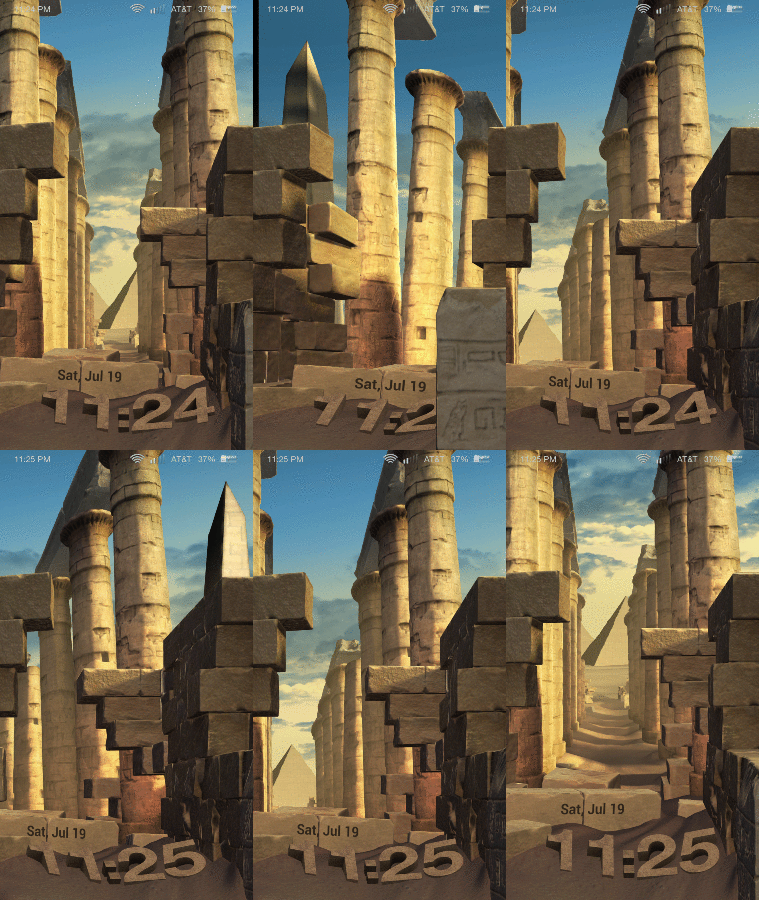
The 3D fad didn't die -- it just went on vacation for a while. After taking a hiatus from smartphones for a couple years, it first made its big comeback on Google's Project Tango phone and then on the Fire phone. But there's a twist. It uses Kinect-like cameras "invisible infrared illumination sensors" that can detect where your head is positioned and how far away it is from your phone. (Only two work at a time, but Amazon added four total lenses just in case a couple are obscured.) The device takes the details of your position and adjusts the field of view on your display to mimic the way you'd actually see things in real life.
Think of it like a window or doorway: When you move your head to the right side, you can peer through and view more stuff to the left that you couldn't see when looking at it straight on. You can also look at objects from different angles -- in a Rubik's Cube game, you can see "around" the sides of the cube just by moving your head -- and if that object is in the foreground, you can actually take a look at what's behind it, simply by shifting to the left or right of the screen.

Dynamic Perspective is primarily used in games, lock screens and maps (iconic landmarks seem to poke out of the screen if you look at them from the right angle), but Amazon subtly applied it to app icons as well; as you tilt the phone or lean your head to one side, you can see the icons move too. The company opened up the software to developers last month, and the Appstore already boasts over 60 titles with the 3D effects added in. It works well in some games, such as the Rubik's Cube one, and an adventure game called Lili, which lets you steer by moving your head. But many apps only use the tech as an afterthought. In Sonic Dash, for instance, you can only use it to look around the main menu, so there's no in-game functionality; Mint.com's app uses Dynamic Perspective in its home screen so that each box looks like it's moving. Unless Amazon can drum up stronger developer interest, you're likely to see lots of apps like this with half-baked implementation.
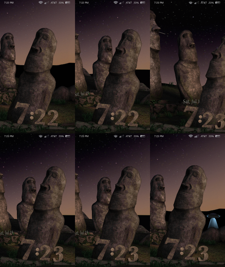
I wish only third-party apps were half-baked, but unfortunately the performance issues are more far-reaching than that. Dynamic Perspective works well most of the time, but I still noticed plenty of flaws. Choppiness was the most frequent issue, and it usually occurred because I was moving my head around too much and the sensors simply couldn't keep up. In these cases, the effects would pause for a couple seconds before catching up with my movements. On a few occasions, the feature stopped working entirely after I sideloaded and ran apps that aren't available in the Amazon Appstore (more on that later); it immediately began working again after I stopped running those apps. As long as you stick to official Amazon titles and services, you likely won't run into the same issue.
Is there a reason to be concerned about having five cameras staring back at you? Not according to Amazon. Executives emphasized that the Dynamic Perspective cameras act as sensors, and any images or data they collect are never stored anywhere on the phone; everything is deleted almost immediately, and none of it can be accessed through another part of the device.
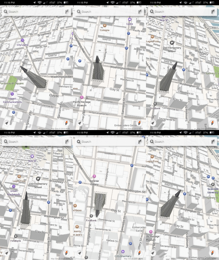
Concerned about how Dynamic Perspective may affect those with motion sickness, I asked Amazon reps if they've received any negative feedback so far. They told me that they hadn't; it's less likely to make you sick, they said, because the user is in control of how far and how fast the effect goes (the same way many people experience less motion sickness when driving than they do in the passenger seat). So they challenged my wife -- who's susceptible to getting sick from viewing moving backgrounds -- to try it out. We accepted the challenge... and it didn't work; she had to put the phone down after just two minutes. Its effects were just as strong as the parallax feature introduced on iOS 7. If that bothered you as well, you'll want to turn off Dynamic Perspective in the settings right away.
Even if Dynamic Perspective performed better, and even if it doesn't make you sick, it's still a tough sell. It's a neat feature and developers may come up with some cool uses for it, but it isn't enough to persuade millions of iPhone and Android users to leave their preferred platforms, and possibly carriers, to try it out -- even if they are loyal Amazon shoppers. It simply doesn't benefit the user enough.
Firefly

Another new feature on the Fire is called Firefly. Long-press the camera button on the side of the phone, and you're presented with a viewfinder with white bubbles moving all over the screen. Point the camera at a phone number, email address, website, product, book or bar code, and the bubbles will congregate over the relevant information. From there, the camera snaps a picture. The phone then scans each detail and places it into a clipboard that you access by swiping up from the bottom of the screen. Now you can perform an action related to the item: Call a phone number; visit a website; or purchase something through Amazon. It'll also catch TV shows, movies and songs so you can buy or rent flicks at your leisure, find them on streaming services and locate a band on StubHub.
If you've heard of this before, that's because it's been done before, to an extent, by Microsoft, Google, Apple and app makers like Shazam. The difference is that Amazon's implementation is more extensive than the rest (it comes with more features and boasts a catalog of 70 million products to draw from) and it's open to developers, so other services can take advantage of the feature. It could be the ultimate guilty pleasure for the impulse buyer: Scan a friend's Blu-ray disc; immediately compare several online prices; and order the cheapest option right away.
Much like Dynamic Perspective, my experience with Firefly was hit-or-miss. It scanned music and shows with near-perfect accuracy. It could easily pick up a large number of products within a couple seconds -- even something as basic as an office telephone popped up immediately as I waved the phone in front of it -- but this happened roughly 75 percent of the time. The other 25 percent was an exercise in frustration: Either it'd take too long to find anything, or it wouldn't pick anything up at all. It had a hard time looking through sun glare and shrink wrap, and Firefly couldn't grab information from an angle or at a distance (read: more than 10 feet away). Even when phone numbers and websites were nearby, it'd sometimes take two or three tries before giving me an accurate read. On one occasion, I scanned an "888" number and Firefly thought it started with "408."

At times, it'd scan an object and present me with a similar item, but not the actual product itself. When I scanned a Super Mario game's instruction book, for instance, it showed me a Mario backpack. Doing the same for a bottle of Coke, I was prompted to buy a soundtrack of every Coke commercial from 1962 to 1989. (A $22 value -- what a steal!) This might make sense if the products I scanned weren't available in Amazon's store, but they were.
Firefly's missing out on a few golden opportunities. It isn't able to scan street addresses, which you could then pull up on a map; it can't read information on a whiteboard or notepad; and it can't see signs for restaurants or other businesses. Firefly has a lot of potential, but it's only scratching the surface when it comes to convenience and usefulness. I don't expect it to get everything right within a couple seconds, but it needs to be able to recognize more types of stuff for it to become a part of my regular app selection.
Another miss is the fact that Amazon isn't planning to port Firefly over to iOS or Android. The company claims that's because Firefly is optimized for the Fire, and while that may be true, availability on other platforms would translate into more sales on Amazon's site -- the company's bread and butter.
Mayday
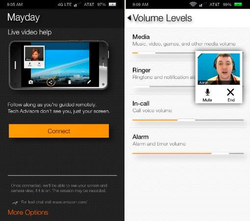
One of Amazon's most brilliant features is Mayday. The service, which debuted on the Kindle Fire HDX tablet, promises to connect users with knowledgeable tech advisors in 15 seconds or less. (If you're a tech enthusiast and you have relatives who aren't as savvy as you are, you understand why Mayday is such a smart idea.) The Fire phone also comes with the feature built in; head to the quick settings to find a dedicated Mayday button.
If any good can come out of Amazon's partnership with AT&T, it's this: If you ring up Mayday with a bill concern or carrier-related technical problem, the Amazon rep will "warm transfer" you to AT&T's tech support department. This means the rep will stay on the line with you and answer other questions while you wait.
My calls into Mayday connected between 10 and 20 seconds, with my average wait time coming out to the promised 15 seconds. With my permission, each rep was able to view and remotely control my device to answer my questions; one rep even drew on my screen to show me how to get to a desired feature.
Gestures

Thanks to its relatively petite size, the Fire functions well as a one-handed device. But if you're making the move from a smaller smartphone -- an iPhone, perhaps -- it's going to take some time to get used to a larger handset. Amazon has added one-handed gestures to help you navigate through different parts of the operating system without needing to use a second hand. Flick the phone right or left to open up side panels with menus, settings and other features; a swivel motion opens the quick settings and notifications panel; and moving your head up or down tells the phone to begin scrolling through text (yep, just like Smart Scroll on Samsung phones). Finally, you can tilt the device slightly to "peek" at your status bar if it's normally hidden. Although the gestures effectively allow you to get to different places in the phone with only one hand, it becomes less effective when you have to actually use a finger to select something.
Software

Existing Fire tablet owners may be the most willing group of people to buy Amazon's first phone because they're already tied into the company's ecosystem. The device comes with Fire OS 3.5, a proprietary operating system based on the Android 4.2 open-source platform (AOSP). It's similar to the approach used on the Nokia X and other devices sold in China because this gives manufacturers the flexibility to build whatever they want without being forced to use Google Play Services like the Play Store, Gmail, Games and Google+, to name a few.
This means Fire OS is all about Amazon. Instant Video, Kindle books, Newsstand, Music, Audible audiobooks and Games are all included here. If you want to download apps, you'll need to do so through the Amazon Appstore, which features 240,000 titles. That may sound like a lot, but this is only a fraction of the Play Store and iOS App Store size; it's even smaller than Windows Phone's selection! Quality certainly trumps quantity, of course, and I'll give Amazon some credit for having a lot of popular apps, but I recommend you check out the store before you buy the phone to see if your favorite apps are in there. Also keep in mind that if you paid for an app in the Play Store, you're going to have to pay for it again.
Of course, since Fire OS is based on Android, it's easy to sideload apps (known as APKs) as long as you know how to get them. Programs based on Google Play Services, such as Gmail, immediately crash. Other apps may not work properly either, and as I mentioned earlier, some of them may even adversely affect the defining features on the Fire.
User interface

The Fire OS experience is much different than what you'll find on any other phone in that it has both vertical and horizontal components. Vertically, it has a carousel on top and a standard app grid below; horizontally, there's a slide-out menu for Amazon apps and services on the left and a tray for weather and upcoming appointments on the right. These menus change based on which app you're in.
Arguably the most intriguing part of the OS is the Carousel. As you spin it, you'll find many of your recent apps with timely notifications. Each app has a list of relevant details underneath it, and the content often depends on what you look at the most. You'll see your most recent emails -- complete with the first two lines of each one -- as well as missed texts, settings you've opened lately, your most frequented websites, suggested apps in the Appstore and even third-party stuff like a Zillow app that displays a list of the last few houses you've looked at. You can pin specific apps to the front of the carousel and remove unwanted ones altogether, but you can't reorder them.
I discussed gestures earlier, but there are a few other tricks worth noting. First, the Fire has no official back button, as you're supposed to swipe up from the bottom bezel instead. You can do the same from every side: The top pulls down quick settings and notifications; the left brings up the Amazon tray; and the right accesses your miscellaneous drawer. Be careful, though: On several occasions, I found myself looking at an unwanted drawer when I was actually swiping through my photo albums. Just don't get too close to the edge and you'll be fine.
You can also double-click the home button to bring up a list of recent apps, whereas a long-press will prompt the Fire virtual assistant. It's not as feature-rich as Siri, Cortana or Google Now, but it's better than nothing: You can tell it to make calls, do web searches and send texts or emails.
Whether you use security or not (and you should), a swipe to the left on the lock screen pulls up Amazon's "photo locker," a quick-access picture album that you can customize as you see fit. You can have as many as you'd like. This is most useful for bragging rights; all you have to do is whip out your phone and in two seconds you can show your friends how much those kids of yours have grown.
One of the nicer, but more low-key touches on the Fire is a setting that allows you to change your sound profile to silent for three hours, after which time it'll revert back to normal mode. This is perfect anytime you need a nap or have a work project you want to focus on. Most phones have some sort of quiet hours feature, but this option comes in handy if you need to do it quickly or simply don't feel like messing with your Do Not Disturb settings. If I may be picky, I'd like to customize this setting to fit whatever length of time I want; otherwise, it's a feature I'd like to see on more phones.
Camera

Amazon didn't skimp on imaging performance: The camera here has a 13-megapixel sensor with a five-element lens, f/2.0 aperture and optical image stabilization (OIS). These specs sound great on paper, and we were hopeful when Bezos showed photos where the Fire's shooter clearly beat out the iPhone 5s and Galaxy S5. And though the camera takes perfectly acceptable shots with the appropriate amount of detail, my own image comparisons with the same three phones didn't always come out in the Fire's favor.
I'll break down the Fire's low-light performance first, since this was one of the camera's top selling points. The Fire outperformed the Galaxy S5, and it wasn't even a close call; the images on the Fire picked up more light and were far less noisy. Of course, this is one of the Galaxy's major weaknesses, so that wasn't much of a surprise. The real test came against the iPhone, which holds its own in dimly lit conditions. The comparison was much closer this time, but the iPhone ultimately came out on top because it was able to grab more errant light and with less noise. Also, I found the Fire was less consistent about keeping shots in focus in these conditions. In most cases, I had to remain completely still in order to get a clear picture, and had to discard several shots that came out blurry. Also, the LED flash on the Fire is noticeably less bright than on the iPhone and GS5.
The Fire's camera did a good job capturing detail in daylight, but it had a warmer white balance compared to competing phones. HDR was subtler and less cartoonish on the Fire than on the Galaxy and about the same as on the iPhone. I prefer it this way. White balance aside, the camera is decent enough for both night and day, even though it's not the best in either situation. Click here to see my sample shots in their full-res glory. I've also uploaded test shots I took with the iPhone and Galaxy S5, which you can find here and here.
Many lackluster cameras can at least earn a few brownie points by adding manual controls to let you take matters into your own hands, but the Fire has a minimal interface that features a toggle for HDR and flash, as well as the option to take pictures in lenticular mode (aka, GIF-making mode) and panoramic mode.
It's also capable of taking 1080p video at 30fps, recording at a bit rate of 20 Mbps. Again, it sounds great on paper, but I wasn't impressed. On a positive note, it didn't have a problem keeping motion smooth; however, it did so at the expense of detail -- and it re-focused more than it should have in broad daylight.
Performance and battery life
Deep inside the Fire phone, a 2.2GHz quad-core Snapdragon 800 chipset is running the show. Despite the fact that it's now two generations behind the current flagship processor, it's still a solid enough chipset that it should take care of business handily. As I mentioned earlier, Dynamic Perspective struggled from time to time, but unfortunately it also seemed to have an effect on other areas of the OS. I monitored CPU usage with the 3D effects turned on and off, and indeed, there was a considerable difference; all four cores worked harder and more consistently when the feature was turned on. And since Dynamic Perspective is used in tasks both small and large, it seemed to have an impact on the performance of the entire phone.
Turn the extra features off, and you'll have a grand time using the phone. You'll encounter fewer frame skips and stutters. Meanwhile, apps load reasonably fast and I didn't experience any crashes. Gaming was exactly as fast and smooth as I've come to expect from a Snapdragon 800. In general, the phone's performance is solid.
Fire phone | Samsung Galaxy S5 (AT&T) | LG G3 | |
|---|---|---|---|
Quadrant 2.0 | 20,195 | 22,236 | 25,548 |
Vellamo 3.0 | 1,784 | 1,676 | 1,761 |
3DMark IS Unlimited | 14,145 | 10,757 | 16,662 |
SunSpider 1.0.2 (ms) | 752 | 791 | 918 |
GFXBench 2.7 T-Rex 1080p Offscreen (fps) | 22.8 | 27.4 | 27.9 |
CF-Bench | 29,321 | 35,352 | 30,414 |
SunSpider: Lower scores are better. GFXBench 3.0 not supported on Fire phone, so 2.7 was used. | |||
I prefer real-world experience over numbers, but for our readers who prefer the opposite, check out the benchmark-comparison table above. In most areas, the Fire can contend in the big leagues despite the fact that it's on a previous-generation chipset running at a lower clock speed. It topped the other two devices in a couple benchmarks and held its own on most of the others. That said, the Fire's lower-res screen likely had an impact on at least one or two scores.
Gestures were inconsistent, however, and I noticed quite a few hiccups. Many times, a flick of the wrist or hand swivel wouldn't do anything, so I'd have to exaggerate the gesture once or twice before it did what I wanted. But there were other times in which barely tilting the phone at all triggered a gesture. On several other occasions, wrist flicks would bring up the exact opposite menu of what I intended.

The Fire only packs a 2,400mAh battery, which is small compared with the competition. Battery life is average and will last a full day... as long as you don't activate Dynamic Perspective and Firefly. (You know, the phone's two most unique features.) These two things are such a huge drain on the device's battery that I had to charge it up twice in the same day -- once in the early afternoon and again later that night. It wasn't uncommon to lose 10 percent of my charge in a half-hour. So if you plan on using Firefly for comparison shopping, make sure you shop for an external charger first.
In my endless-video loop test, meanwhile, the phone lasted nearly nine hours before dying. This is about average for a battery of this size, but then again, Amazon's fancy features weren't running at the time.
The audio quality is better than most. Calls were clear; in-call volume was more than adequate; and the stereo speakers were loud, if a little tinny. The phone's GPS also performed admirably, helping me navigate multiple routes without any lost connections.
The competition
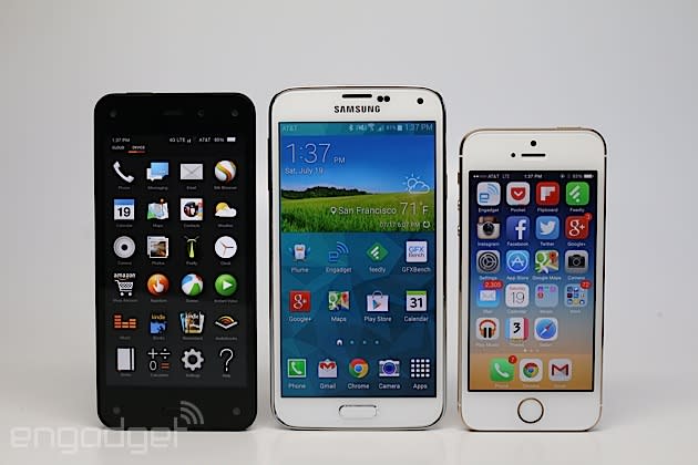
As I mentioned earlier, the Fire's exclusive deal with AT&T severely limits its potential. It simply can't reach as many customers when it's only available on one carrier in the entire world. This strategy worked out fine for the original iPhone in 2007, but times are different now, and Amazon doesn't hold enough sway to get its members to switch platforms or carriers (or both) on top of paying $200 on-contract.
At least the Fire comes with a free year of Prime membership (a $99 value) to sweeten the deal, but the same price can also get the Samsung Galaxy S5, HTC One M8, iPhone 5s and LG G3, all of which have better displays, faster performance, stronger ecosystems and, in most cases, longer battery life. Although the Fire doesn't lag too far behind its flagship competitors, Amazon put so much effort into what makes it unique that it didn't focus enough on everything else.
Wrap-up

The Fire's defining features are fun, but I can't help but feel as though they're merely gimmicks designed by Amazon to demonstrate the company's brilliance -- and at the expense of battery life, to boot. Dynamic Perspective might be useful in a few cases (games, mainly), but it won't provide the user with functionality they'd sorely miss if they went with an iPhone or flagship Android device.
Not only is the Fire lacking in useful new features, but its high price and exclusivity to AT&T guarantee its irrelevance. The company owes its success to millions of loyal online shoppers and bookworms who use Amazon for its convenience and aggressive pricing, so why come out with a smartphone that isn't particularly convenient, and isn't particularly cheap? By no means is the Fire a horrible phone, but it's a forgettable one. You might want the eventual Fire Phone 2, perhaps, but for now, you're better off sticking with what you know.


