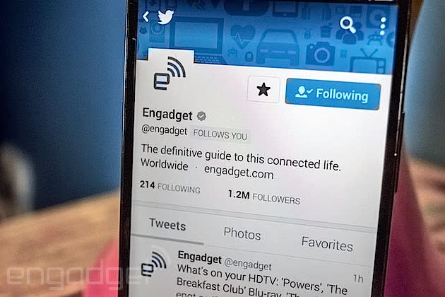
Twitter profiles on Android look much better now

Twitter's mobile app has seen a fair bit of newness as of late, and its latest tweak brings the Android version's profile pages in line with iOS'. What's so different? Let's start at the top. Header images and avatar photos have gotten a bump in size for starters, and, what's more, the bio has its own bit of screen real-estate now instead of being a swipe to the left. Rather than only the three most recent tweets showing, now you can scroll through an infinite amount of a user's 140-character updates too -- same goes for photos and favorites.
Thankfully, this has streamlined profiles a ton and eliminates the need for lots of tapping to navigate. You can swipe right or left anywhere on your device's display, for example, to move from tweets to photos to favorites, respectively, while the bio, avatar and header stay static. The simplicity is quite refreshing, to be honest. Compared to how the timeline itself has evolved (for better and for worse), it'd be surprising if this ruffles users' feathers the way incessant ads for a certain mobile game has.
We're rolling out new profiles on Twitter for Android: it's now easier to view bios, Tweets and photos. https://t.co/MMnvuuHaxh
- Twitter (@twitter) March 10, 2015

