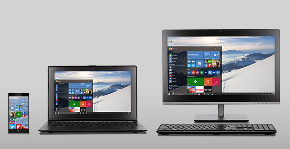
The design of Windows 10: a consistent look across all devices

We knew that Microsoft was planning to tuck that Modern UI inside the resurrected Start Menu for Windows 10, and today, the company provided more details on the next installment's aesthetics. When the update arrives, there will be a version that's designed specifically for devices that are smaller than eight inches in size. This means that the look and feel of the desktop and larger tablets will carry over, and universal apps will allow for seamless transitions from mobile to office sessions. Apps like PowerPoint and Word carry a similar look in mobile versions, and features, like a list of recently opened files, sync across phones, slates and desktop machines. The goal here is an easy-to-use cross-device experience that's accessible anywhere, and consistent aesthetics will certainly help.
Let's recap of what we already knew ahead of today's event. For those folks that liked the Windows 8 layout, that menu, complete with Live Tiles, can be expanded into fullscreen mode. There's also a retooled Action Center docked at the bottom-right of the home screen for notifications and useful items like calendar events, Skype calls and more. A new Continuum feature allows a 2-in-1 device, like Surface, to have both desktop and tablet modes. For example, when the keyboard for Microsoft's device is removed, a pop-up will ask if you want to enter slate mode with touch input. The transition seems to be quite smooth, and even in tablet mode, the Start Menu and taskbar still reside along the bottom for a full Windows 10 experience, both in the office and on the go. Continuum aims to make Windows 10 more aware about how you're using it at any given moment, and shifts the look and tools to better suit keyboard/trackpad or touch controls.

It's no surprise that Office tools are part of the so-called universal app fleet, and items like Calendar, Maps, Music and Photos are included, too. Microsoft says that by implementing the changes to these new apps all at once, it can ensure that consistent experience on whichever device you pick up. Xbox gets an app that'll be accessible on both desktop and mobile as well, with access to the Activity Feed and captured photos and video. Not only is the design and layout similar, but also cross-device multiplayer is on the way, with streaming of Xbox titles in tow. Cortana is making the move to the desktop, and the virtual assistant is accessible from the bottom-left of the desktop interface, which means that the handy tool can keep tabs and lend a hand in more places.

Microsoft's goal to offer consistency across devices spans beyond your phone, tablet and computer. It'll extend to new gadgets like the Surface Hub: an 84-inch, 4K all-in-one. Sure, this is targeting the workplace, but presentations, edits and tweaks sync for all attendees, whether they're watching on a laptop or Surface Pro 3. And then there's Microsoft's augmented reality efforts. The main goal of Windows Holographic is to leverage Windows 10's prowess to serve up spatial interactivity for things like 3D modeling and more, but those universal apps are in play here, too. The framework for using the holographic project in other apps is baked into the operating system, and while the HoloLens headset may look like a set of ski goggles, it'll offer views of the company's new world. The folks in Redmond are certainly taking Windows to more places, and on the way, looking to make sure the things you see and the tools you use are consistently right where you need them.
