YotaPhone 2 review: niche and expensive, but seriously cool

YotaPhone was inarguably one of the quirkiest smartphones released last year, with not one, but two displays. This curious marriage of LCD and E Ink was certainly a manufacturing achievement, but limited uses for the secondary screen meant it simply couldn't live up to its potential. Undeterred, Yota Devices announced earlier this year it was cooking up a sequel, and today it's ready to launch the new and improved YotaPhone 2. Its fresh design, high-end specs and bigger, higher-resolution displays are welcome upgrades, but most importantly, a thorough overhaul of the handset's software means you can now make full use of the low-power E Ink screen, which has also been granted touch functionality for this generation.
I've spent a fair amount of time with the device, and have to say that it's the most interesting smartphone I've ever used. Like its predecessor, the YotaPhone 2 is still very much a niche proposition with narrow mainstream appeal. That being said, Yota Devices has more or less achieved what it set out to do last year: Make a handset with an E Ink display that has several, legitimate use cases. Whether these will actually tempt you into picking one up is another matter, but the second screen is no longer an oddity; it's an asset.
Hardware

As expected, the main design element of the YotaPhone 2 hasn't changed from the previous generation: It's still sandwiched in displays, with your standard color screen up front, and an E Ink panel behind. In all other areas, though, you're looking at a completely redesigned device that's almost identical to the prototype model shown off earlier this year. The first YotaPhone's distinctly blocky build has been replaced with soft, sweeping corners reminiscent of old Nexus handsets crafted by Samsung, particularly the Nexus S. If you took away the E Ink display, there'd be nothing revolutionary about the design of the YotaPhone 2, though that's getting harder and harder to achieve nowadays, with so many companies competing in the smartphone space. Nonetheless, its oblong shape is charming in its own right, and much more pleasing to the eye than Yota Devices' first attempt at a dual-screen handset.
With a price tag of £555/€700 comes the expectation of premium build quality. While the YotaPhone 2 lives up to that unspoken promise for the most part, it's neither bound in anodized aluminum, nor can it boast any kind of waterproof or dustproof credentials. The majority of your investment goes toward the dual-screen format, not metallic accents and other flair. It's a sturdy device, however, with commendable engineering tolerances, which is to say it's put together neatly. The glass fiber-reinforced plastic band that wraps the edges of the device will creak under pressure, but the Gorilla Glass 3 panels that span the entire front and back of the handset make it hard to flex by any meaningful degree.
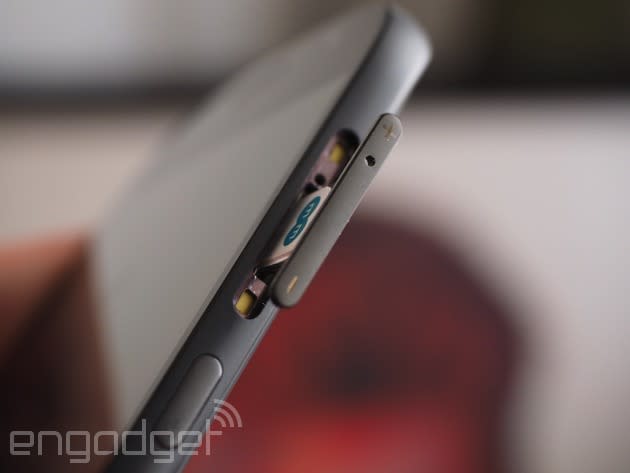
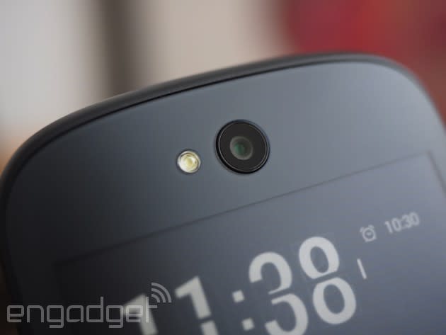
Around this smooth plastic band, you'll find the sum of the phone's ports and buttons. Up top is the headphone jack, and on the bottom edge you'll locate the micro-USB port flanked on both sides by a small loudspeaker grille. The right side is home to a power key and volume rocker in their standard positions, with the latter doubling as the nano-SIM tray (something I probably took way too much pleasure in discovering). In terms of other physical details, it's no surprise to see an oblong earpiece and front-facing camera above the main display, and the primary camera/companion LED flash occupying the same space above the E Ink screen, with a small YotaPhone logo beneath.
At 144 x 69.5 x 8.9mm (5.70 x 2.74 x 0.35 inches) and 145g (5.1 ounces), the YotaPhone 2 is comparable to pretty much every handset with a 5-inch display. It's a little taller than average due to an abundance of bezel above and below the primary display, but this slightly bloated dimension isn't something that'll put you off. Mainly because you'll be too busy trying to figure out how they crammed two displays, a 2,500mAh battery, Qi wireless charging and everything else that makes a phone tick into a body that's less than 9mm at its thickest point.
The level of comfort you'll experience while using the YotaPhone 2 depends entirely on which display you want to look at. The E Ink side of the device is slightly smaller than the front, and begins to curve in toward the plastic perimeter as it approaches the left and right edges. The border itself also tapers in to meet the rear glass, so as far as your palm is concerned, it's got comfortable curves in all the right places -- if you're using it like a regular smartphone and poking at the primary display. (As an aside, the matte, grainy texture of the rear glass that's common to e-paper displays feels great on the skin, even if it provides less purchase than normal glass would.)

Flip the phone over to make use of the E Ink side, and it's a different story: The edges that come into contact with your hand are now sharp, unwelcoming, 90-degree intersections of glass and plastic. This hasn't stopped me holding it this way for extended periods of time, but the fact I even have to think about hand positions that spread pressure efficiently is frustrating when the whole point of the handset is to have two displays at your disposal. No doubt the YotaPhone 2 looks much more desirable than the original, but I wonder whether a blockier form factor is more suitable to this kind of handset, since it places equal emphasis on both orientations. At least, it's something Yota Devices might want to think about if it's considering a third-generation device.
Having a display on both sides is something potential users might struggle with psychologically, as weird as that sounds. I mean, when do you ever put your mobile down on a surface face-first? Well, with the YotaPhone 2, you have to put it down face-first; you just get to choose which face that is. It really doesn't bother me personally -- I trust the two panels of Gorilla Glass 3 to ward off any scratch threats -- but more careful (or clumsy) users might want to spring for the bumper case accessory. This wraps the device on all sides and provides some extra protection in general, whilst also elevating both screens so they don't come into contact with surfaces. I imagine it'll also make the phone slightly more comfortable to hold the "wrong" way 'round, but as I haven't had the chance to test that theory... well, it's still just theory at this point.
Displays
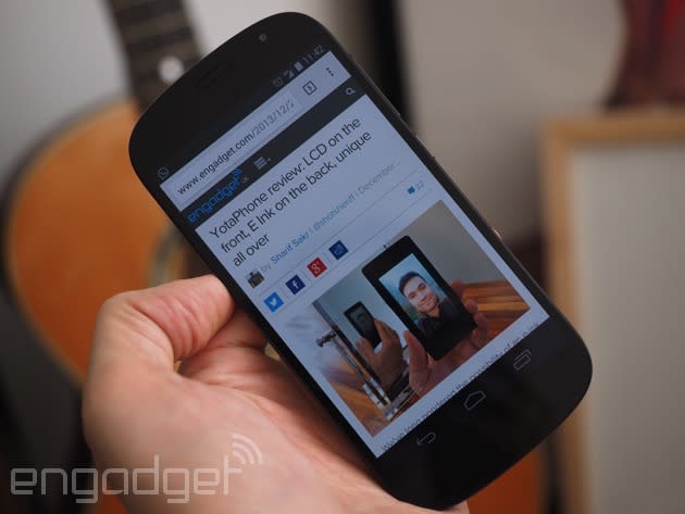
Both the YotaPhone's displays have received significant upgrades this generation, but I'll start with the primary panel. What was a 4.3-inch, 720p LCD display is now a 5-inch, 1080p AMOLED affair (442 ppi), and my, is it gorgeous. The only issue I can report, though it's not strictly a fault with the display, is an overly fidgety auto-brightness setting. This isn't abnormal, however; I have the same grievance with practically every handset I've ever used. Otherwise, I've mostly praise to dish out. AMOLED displays are known for their deep blacks and vibrant colors, and that rings true here. Color temperature is pretty much perfect, as far as I can tell, and viewing angles are superb. Sunlight readability is pretty good, too, though the display doesn't quite reach brightness levels that completely cut out glare on a blinding day.
The secondary E Ink display is bigger on the new YotaPhone, too, at 4.7 inches on the diagonal. It also sports a higher resolution of 960 x 540 (up from 640 x 360) and is capable of producing 16 different levels of gray. At 235 ppi (that's slightly more than the second-gen Kindle Paperwhite, if you're after a familiar comparator), there are plenty of pixels available to the second screen. By far the most important upgrade to the E Ink display on the YotaPhone 2 is that it's now fully multitouch-enabled, so you can poke at it like you would any other touchscreen.
It's this functionality, coupled with an entirely new software package that includes the ability to mirror full Android on the E Ink display (more on this later), which really hammers home the device's ingenuity. It comes with one slight problem, too, in that when you're using the handset normally (AMOLED side facing you), your fingertips, which naturally rest on the back of the handset, can unlock the rear display and lock the front one, as both can't be active simultaneously. This is because the E Ink screen is reacting to the three-finger lock gesture that's enabled in Android by default. Turning off the setting resolves this niggling issue, for the most part, but you can also unknowingly unlock the rear display by accidentally performing the correct dragging gesture with one of your trailing fingers, though this happens infrequently.

The E Ink display's refresh rate and responsiveness are highly dependent on what software platform it's running at the time. When poking around full Android, it refreshes extremely quickly, to the point where you can legitimately watch video (at around 15 fps, if I had to make a ballpark guess). Touchscreen responsiveness is similarly impressive, and you'll find it almost impossible to catch an unregistered tap or gesture. The YotaPhone 2 also has its own front-end that's in charge of the E Ink screen by default, and it's significantly more sluggish to navigate. Refresh rates approach a full second when moving through this UI, and the touchscreen becomes unresponsive during this period, leading you to issue repeat commands if the display wasn't quite ready to receive them yet. As you'll discover in greater detail in the software section, this really isn't that big of a deal, since there are few instances you actually need this native platform to respond immediately. And when you do, such as responding to a text via the native Yota messaging app, it picks up pace accordingly (though not always flawlessly).
Now, there is one issue with the E Ink panel that can be genuinely annoying at times: The dreaded incomplete refresh, which leaves a ghost of the previous image lingering where it's not wanted. This happens fairly regularly, and mostly when mirroring full Android, but can also occur when using Yota's own platform, too. This is undesirable at best, and unacceptable when you're trying to read on the thing, which is what e-paper displays are best suited for, after all. I'm told this is a facet of the non-final software my device is running, and it's been fixed in the consumer-ready build, but that's something I simply can't confirm at this point.
Camera

Both of the cameras on the YotaPhone 2 are different from those found on its predecessor, but only one's changed for the better. That would be the front-facing shooter, which is now 2.1 megapixels, compared with the original's 1MP sensor. It's not much of an upgrade, and nothing to write home about, but at least it delivers that extra bit of acuity for making video calls and taking selfies (not that you need it for the latter). The main camera module is now eight megapixels, down from 13MP on the first YotaPhone. Considering the high price of the handset, it's a notable blip on the spec sheet, but it's the dual-screen setup you're paying for, not the imaging clout.
The YotaPhone 2 uses the stock Android camera app, and thus has but a few fancy modes, such as panorama and Photo Sphere. Otherwise, it's a simple point-and-shoot experience, with white balance, ISO and other settings taken care of automatically (though you can add a manual exposure slider in the advanced settings, if you choose). Personally, I like the simplicity, and a smartphone camera of this caliber isn't going to win you any photography awards, anyway. I prefer snapping away without having to worry about whether I've picked the appropriate scene mode, or not.
As is the case with all cameras, the 8-megapixel main shooter does its best work in bright, sunlit conditions. Even then, though, images are noticeably washed out and lacking any real depth of color. Luckily, the HDR mode can be employed to add more intensity and contrast, though that requires a steadier hand and a second or two of patience while the image is processing. Focus and shutter speed/response times are pretty rapid in general, but as you'd expect, these begin to decline as conditions worsen. Under artificial light, the auto-white balance setting doesn't cope well. It jumps around skittishly, so chances are when you press that shutter, it'll have compensated erroneously at that specific moment in time.
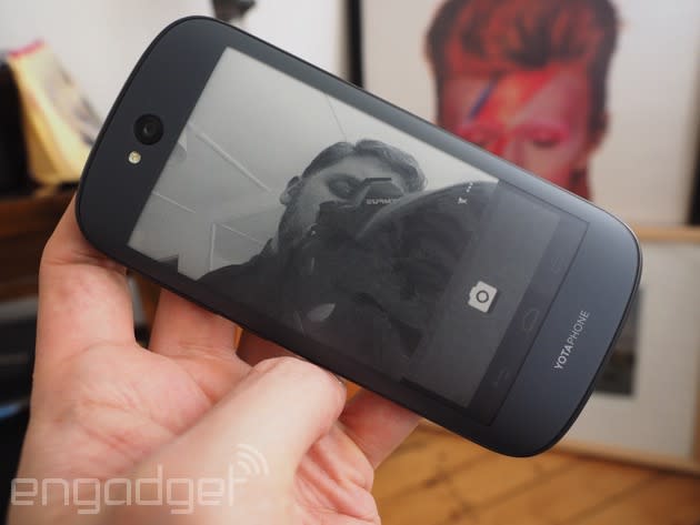
It's in low-light conditions that performance really gives up the ghost. In dim circumstances, the camera app simply offsets the lack of photons by overexposing the scene, resulting in at least a discernible image. When the light's really failing, though, the sensor just can't pick up enough of it to produce anything but a horribly dark, grainy photo. The one saving grace of the main camera is that you can use it to take selfies. This is achieved, of course, by mirroring the camera app on the rear, E Ink display. It's a novelty, sure, but neat nonetheless.
Still-image performance leaves a lot to be desired, so it's no shock video doesn't fare much better. The main shooter is capable of recording 1080p clips at 30fps, though the results aren't nearly as sharp as those numbers would suggest. The camera struggles to keep the right focal length when panning, and the auto-exposure setting is even more erratic, though I've encountered both of these issues on innumerable handsets. In low-light scenarios, I find video comes out slightly brighter than stills, but it's a minor improvement. Audio capture isn't fantastic, but it does the job. Slightly ill-defined and muffled, but clear enough for you to hear what's going on in front of and behind the lens.
Software

The YotaPhone 2 arrives with almost stock Android 4.4.3 KitKat on board -- various Yota customizations are running behind the scenes -- and I'm told it'll be upgraded to Lollipop at some point in the future. Google's services are all present, and it's nice to see that duplicate browsers, music players et al aren't around to clog up the app drawer unnecessarily. There's hardly any bloatware on the device, too: Office Suite, a multilingual dictionary/translation app and a Russian e-book service (non-removable). All easy to ignore, and discounting them, you're left with stock Android. I did notice one intermittent and peculiar bug that turned WiFi off at random, but a reboot seemed to address the problem and it hasn't returned since.
The main problem the first-generation YotaPhone had was a lack of software that could interact with the E Ink display. It's in this area that the new device really comes into its own. Your journey begins with a slick tutorial that teaches you everything you need to know about making the most of the second screen the first time you boot up the handset. The walkthrough has you flipping the phone back and forth between displays, and since it can tell which of them is currently facing you, you're guided seamlessly through all the features. And within a few minutes, you're fully prepped to go it alone.
YotaMirror

By far the most powerful new feature, YotaMirror allows you to transplant fully functional Android onto the E Ink screen. To make this happen, you press and hold the Android home key on the primary display and drag your thumb to the left to select the YotaMirror icon, after which you're prompted to flip the phone over. You can do this anywhere, in any app, and there you have it: normal Android running on E Ink. It's what I'd call the phone's killer feature, since it opens the secondary screen up to any use case you can fathom. It's worth noting, though, that while the E Ink display's touchscreen responsiveness is fantastic, meaning you can use Android at full speed, anything that requires a high refresh rate -- a video, let's say -- actually drains the battery quicker on the E Ink side than it would if running on the AMOLED panel.
Thus, the E Ink screen is suited to more static pursuits, not 3D gaming or YouTube binging. Its potential is still relatively broad, however. Of course, I've had fun pushing all kinds of things to the E Ink display that have no place being there, but on a day-to-day basis, I've been using YotaMirror almost exclusively with Amazon's Kindle app. The main benefit of E Ink is that it's simply nicer to read than a backlit display, and the YotaPhone 2 makes for a solid miniature e-reader, and one you can use with any e-book store, to boot. On that note, I would've loved it if Yota had added some kind of front-lighting technology to the E Ink panel, but I'm willing to concede this may have simply not been viable option, in this generation of YotaPhone at least.

Beyond the YotaPhone 2's obvious calling as a pocket-friendly e-reader, its E Ink screen can perform other tasks that require low refresh rates while conserving your precious battery life. You can leave your Spotify queue, your to-do list or the calculator app open, for example, knowing that they're not eating into your juice reserves, which is something that can't be said of regular backlit displays. Battery management is the peg, but in reality, the low-power E Ink screen allows you to use your phone in ways that just aren't feasible normally.
It's easy to describe what YotaMirror does, but much harder to explain how it does it. That's because it's not simply pushing Android to the E Ink screen, but also converting it so it plays nice with the lower-resolution, grayscale-only panel. There are all sorts of processes running in the background to optimize contrast, but in my opinion, this could use some tweaking. Text will often appear a lighter shade of gray than you'd like, and a far cry from the deep black lettering you find on a dedicated e-reader. It's still easy to read, and preferable to using the AMOLED side for the same task, but it's not perfect.
YotaCover and YotaPanels

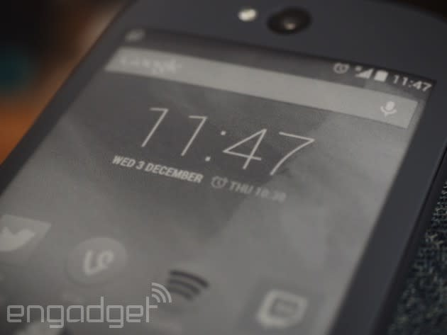
When you're not using YotaMirror, Yota's own platform is powering the E Ink display. YotaCover and YotaPanels are the collective names for this native software, and they're configured using the YotaHub Android app. The former essentially just refers to the always-on lockscreen, which can be as dynamic or static as you choose. (By the way, the E Ink side can be protected with a PIN or other unlocking procedure, just like the primary display. You enable this in Android security settings.) The YotaCover image can be set to change at intervals from five minutes, to once a day, to never. You can ask it to pull images from various sources, like your Facebook albums, Instagram feed or photos stored on the device.
I really dig this feature, if only because now and again I'll look at the E Ink display and see a Facebook photo from yesteryear that I'd completely forgotten exists. Four bubbles sit above and toward the bottom of this image by default, showing if you have a missed call, unread text, email or other notification. You can disable this for maximum privacy, but it's handy to have there, permanently in front of you, so you don't have to keep powering up the AMOLED display to check the Android notification bar. I did have issues with these bubbles not refreshing, meaning I had to disable and re-enable them to get it all working again, but apparently this is another problem with the non-final software build my review handset is running, and is fixed in the consumer-ready release.
YotaPanels is what sits behind YotaCover, and is best described as a carousel of screens that host live-updating widgets. You can fill up to four YotaPanels with preset layouts, or ones of your own creation. There are tons of widgets to choose from in various sizes, such as a clock, battery life indicator, music player, calendar, appointment schedule, recent call list and a notifications pane that does the same job as the bubbles on YotaCover. My favorite widget, by far, is the app launcher, which lets you pick three Android apps to boot immediately in YotaMirror mode -- my choices are WhatsApp, Kindle and the main camera selfie mode, if you're wondering. You can lock the E Ink screen with any of these YotaPanels showing, too, and therefore see all the information they offer at a glance. I haven't quite gotten into the habit of checking this as regularly as I could, but if you're simply after the time, or a reminder of your next appointment, you don't have to power up the more inefficient AMOLED display to find that out.
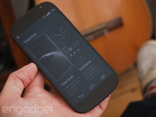
YotaPanels demonstrates another great use case for the E Ink display. It's always on, consuming only a sliver of power when, for example, the time changes, and offers up lots of info you'd otherwise turn to the primary display to get at. YotaPanels give you access to more than just widgets, too. You can reply to texts, tweet, browse your calendar, initiate a call and more using native "apps" built into the YotaPanel UI. These feed off their Android counterparts, so you don't have two different inboxes for texts; that inbox is just presented differently in native YotaPanel form. Yota hopes developers will dive into its SDK and create more apps and features that run natively on the YotaPanel platform (a couple have already signed up), but it could also do with giving its front-end some TLC.
As I said in the display section, YotaPanels runs sluggishly compared with how slickly YotaMirror functions. This doesn't frustrate me to any great extent, mainly because you don't rush around the UI or hop in and out of apps in the same way you might when using Android proper. I catch myself unconsciously exaggerating gestures and exercising a modicum of patience when thumbing through YotaPanels to deal with the slower pace. It could certainly use polishing to speeds things up, however, and to get rid of random, infrequent bugs like when a panel flat-out refuses to load. But, it's some of the widgets and apps that need more immediate attention. I'm not a fan of the native messaging experience, for one. The keyboard is as responsive as you need it to be (even if you're a fast touchscreen-typist); it's just clunky in comparison to the regular Android messaging app. I also can't get the Twitter feed widget to link to my account properly, rendering it essentially useless. These are things that can be improved over time, surely; I just don't know how long that might take. YotaPanels shows a lot of potential for maximizing the utility of the E Ink display, but it isn't quite there yet.
YotaSnap
YotaSnap is a feature that passed for "mirroring" on the first-generation YotaPhone. Effectively, it takes a screenshot of whatever's on the AMOLED display, and pushes it to the E Ink side. You take a YotaSnap in the same way you launch YotaMirror, by holding down the Android home key and dragging your thumb across to the relevant icon. The idea is that it saves way more battery than mirroring, since it only refreshes the E Ink screen once and leaves it with a static image. This is especially useful when your phone is on the brink of running out of power. Because the E Ink display only uses juice when it's refreshing, the handset can completely die and the YotaSnap will remain on-screen. It could be a map, an important note-to-self, a boarding pass or anything else you absolutely need to keep on hand if your battery dies. You can access saved YotaSnaps straight from a YotaPanel widget, too, so you don't need to bother with the AMOLED display at all if it's something you've already captured for posterity.
YotaEnergy
As the name implies, this is the YotaPhone 2's energy-saving feature. It dims the AMOLED display, urging you to use the YotaPanel UI and the E Ink side alone. You can control exactly what the energy-saving mode will do when enabled, like limit the processor clock speed or turn off Bluetooth, WiFi, GPS, mobile data, et cetera. One of the options is to limit the E Ink display to showing just one YotaPanel that lets you see remaining battery life and access the dialer, messaging app and saved YotaSnaps. It's also possible to set it to come on automatically when you reach a specific battery life threshold. YotaEnergy is intended to get you using the E Ink display to perform basic phone functions, and thus extend your battery life significantly. According to Yota, 15 percent remaining battery will keep you going for eight and half hours of runtime on the E Ink display, compared with less than two hours if you're using the handset as you normally would.
Yota-specific apps

In addition to the native features of the YotaPanel UI like the messaging and calendar apps, Yota has developed a few standalone pieces of software to run on the E Ink display exclusively. Yota Reader is an e-reading app that you can import e-books into. The fact that it's not an e-book store in itself greatly limits your likelihood of using it, but it's the one e-reading app that can occupy its own YotaPanel and doesn't require YotaMirror to use. YotaRSS is, unsurprisingly, a native RSS reader that pulls from Feedly accounts and can be accessed directly from YotaPanels. The same is true for the chess and checkers games developed specifically for the E Ink display, which require minimal screen refreshing to play.
Performance and Battery Life
Yota's made several compromises on the YotaPhone 2 to keep it even vaguely affordable, but luckily, it's not really reflected in the raw specs. The handset packs a quad-core 2.2GHz Snapdragon 800 chip, paired with 2GB of RAM, so we're dealing with flagship-grade internals here. There's 32GB of on-board storage, but that's your lot -- no other configurations are available and there's no microSD card slot for increasing the storage capacity, which I was told had to be omitted because there simply wasn't enough space to incorporate it into the dual-screen design. It's enough for me, but anyone with a huge music collection they like to carry around with them should bear that ceiling in mind.
A 2.2GHz Snapdragon 800 is nothing to balk at, and needless to say, it can handle anything you throw at it with ease. Navigating around Android at pace, jumping in and out of apps, browsing the web and other simple tasks happen as fast as you would ever need them to. Gaming is a similar story. My go-to test games of NBA Jam, Shadowgun: Deadzone, Real Racing 3 and Asphalt 8: Airborne all run flawlessly at the maximum graphics settings, and to the extent that I have no other comment on all-round performance apart from saying it's spectacular. According to Yota, the reason it didn't opt to put a newer Snapdragon chip like the 801 or 805 in the YotaPhone 2 was due to potential problems with heat management that could mess with the E Ink display. The company admits these are more battery-efficient options, but added that users won't suffer because of the inherent efficiency that comes with using the E Ink panel.
In terms of connections, the YotaPhone 2 supports all the major protocols: dual-band 802.11 a/b/g/n/ac, Bluetooth 4.0, NFC, GPS and GLONASS. The handset also sports a Cat 4 LTE radio (maximum download speeds of 150 Mbps) that plays nice with bands 3, 7 and 20. This covers the overwhelming majority of European and Middle Eastern carriers, which makes sense given the YotaPhone 2 is now available to those regions through Yota's website. When it inevitably starts launching elsewhere, expect the band support to be adjusted or expanded accordingly.
Since most smartphones also double as their owners' primary means of listening to music on the go, audio performance is important, and the YotaPhone 2 doesn't disappoint. As long as you have a decent pair of noise-isolating headphones, anyway, because max volume tops out well below ear-spitting levels. That being said, the quality of audio is better than I've experienced on most smartphones: It's rich, well-defined and has just the right amount of bass. Stick to using headphones, though, as the small loudspeaker isn't suited to playing music through, but it's just fine for making hands-free calls.
Considering long battery life is being touted as one of the standout features of the YotaPhone 2, I expected more from the 2,500mAh unit hidden somewhere between those two displays. It's not terrible by any means, and you wouldn't expect it to be with all that juice available. But, since reviewing Sony's Xperia Z3 Compact, which lasts several days without needing a wall socket, my perspective on battery life has been warped somewhat. I'm a power user that's constantly on my phone, and I can get through one day and a little into the next using the YotaPhone 2 before the remaining percentage indicator drops to alarming levels.
As far as I'm concerned, that's a pretty average result. I'm willing to take some responsibility for my experience, though, as I don't believe I've used the low-power E Ink display to quite the extent that Yota expects customers would. Out of habit, I've been checking for notifications by powering up the AMOLED display, rather than letting the E Ink screen tell me when something needs my attention. With more time, I could see myself becoming more reliant on the always-on, secondary display, but for now, all I can say is that the battery life is nothing special.
The Competition
It's kind of hard to assess how competitive the YotaPhone 2 is, since there's nothing else like it. As of now, the handset is available in 20 countries across Europe, the CIS and the Middle East from Yota's website (Londoners can pick one up at a pop-up store outside the launch event today) for £555/€700. That works out at roughly $860-870 depending on the currency you're converting from, though when it eventually comes to the US, it'll almost certainly sell for a lower dollar price. When exactly that'll happen, Yota isn't sure. The general plan is to launch the device in several Asian markets early next year, before bringing it to North and Latin America "soon after."
In the UK, £555 is enough to buy you any Android flagship on the market and leave you with a significant amount of change left over, or cover the cost of a 16GB iPhone 6. None of these have a secondary E Ink display, but they all have top-tier specs and other bells and whistles like metal unibodies, amazing cameras, Quad HD screens, fingerprint readers, heart rate monitors, diver-grade waterproof ratings and more. What you've got to consider, then, is whether a secondary E Ink screen is something you're actually going to use, and how much you're willing to pay for the privilege of owning an unrivaled handset. There's no two ways about it: The YotaPhone 2 is an extremely expensive, niche proposition. Yota's under no illusions about that, though, admitting that its newest handset isn't going to appeal to everyone. Those who it will appeal to, however, are people with loose budgets that find the YotaPhone 2 a compelling and fresh alternative to what's already out there.
Wrap-Up
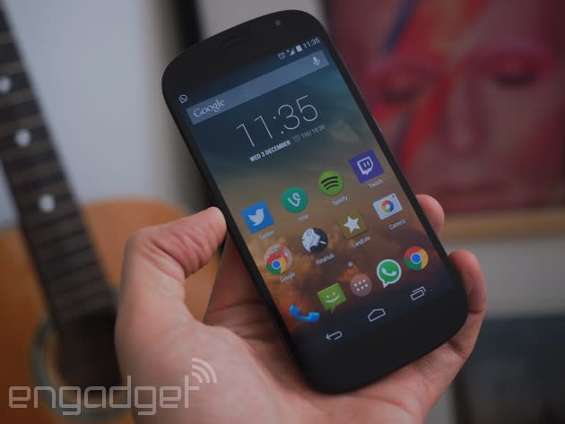
On the one hand, the YotaPhone 2 is prohibitively expensive, has a mediocre camera, sports average battery life and boasts none of the typical value-added features other flagship phones do. On the other, it has an unparalleled dual-screen design and top-tier performance. But, in my hand is easily the coolest, most interesting mobile device I've ever laid eyes on. It's a novelty, a head-turner and something you can't help but enjoy fooling around with. Playing a YouTube video on an E Ink screen makes zero sense, but the fact is, I can do what I want. And that's very much the point of the YotaPhone 2: Do with the E Ink screen as you please; explore its potential. Take a selfie with the main camera; use it as a pint-sized e-reader; extend your battery life by ignoring the AMOLED display, however gorgeous it is. Yota's managed to achieve what it failed to do with the first-generation YotaPhone. By giving users free rein on the E Ink display with YotaMirror, it's fostered a plethora of legitimate use cases, and many more illegitimate ones.
It's not without its faults, of course. You're paying a nigh-extortionate amount for that second screen, and if stripped of this feature, the YotaPhone 2 would be just another Android handset. Yota's software that powers the E Ink display when you're not mirroring full Android is a ways away from being polished, and the device's designers should've made sure it was comfortable to use no matter what screen you're staring at. There are many reasons why the YotaPhone 2 won't appeal to the majority of mainstream consumers, but I dig it. If you're looking for something fresh and completely different, here it is.


